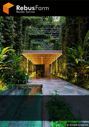
James Burrell created this outstanding image and posted it on our Facebook group a few weeks ago. We asked him to write this Making of in which he describes his workflow and some useful tips. One of the best points in this shot is the atmospheric environment with a lot of post production work. Enjoy it!

Firstly I’d like to thank Vasilis for inviting me to write this article. I haven't posted a lot of work online before and have definitely never written a makingof article, so here goes.
My name is James Burrell. I’ve been working in Architectural Visualization for around 5 years now, and have been working for Woods Bagot Architects in Melbourne for a little over two years. I learned everything I know about visualization from the various online resources such as Vray World. So a big thank you to the people like Vasilis out there working hard to further the industry!
The first step for any project is, and should be; preparation. Sourcing plans is probably the most important part of this step. My first point of reference is usually ArchDaily which has the predictably small plans I usually have to make do with. However a quick visit to the Architect's website provided some much larger and clearer plans.
A great tip I picked up from the chaosgroup forums recently to combat nitrous’s lack of viewport bitmap sharpness when setting up viewport blueprints is to use a directx shader (blend_dxsas.fx type) and load your plans into the “top texture” slot. This will give you razor sharp plans in your viewport.
If the project is a already built, I’ll also download as many relevant photos of the project as I can find. In this case there weren’t many more than the official project photos, but there was enough information there to get on with the project.
Once I’ve gathered all my resources I will then start thinking of the mood and atmosphere I’d like to achieve with the image. Within my project directory, I’ll also create a folder of images sourced from around the web to be used as inspiration images. These images can range from photographs and illustrations, to renders, and can be of literally anything; landscapes, architecture, paintings. Anything that captures the mood I want to convey. Any particular inspiration image may contain a finish or lighting condition, a use of colour or perhaps even a compositional style that I think might work well with this project.
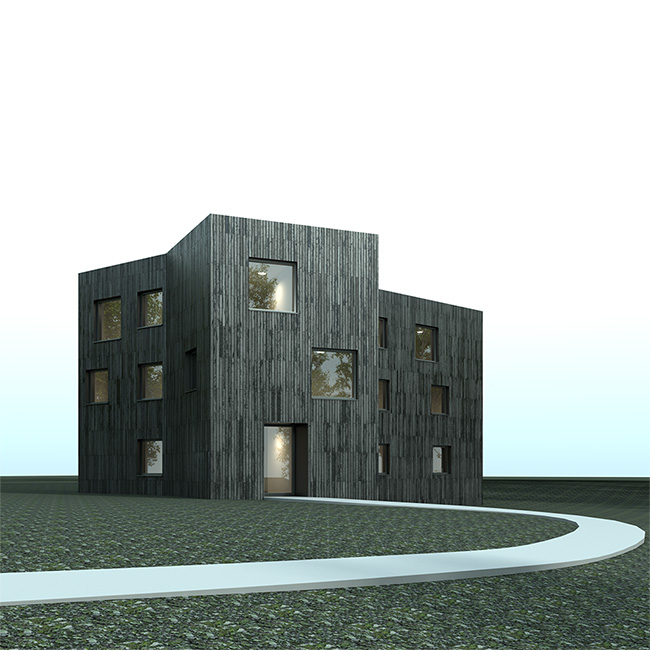
At this stage of the process I knew I wanted an image that contained an overcast and foggy atmosphere with a blown out, diffuse lighting style peeking through the forest canopy. I iterate through this phase throughout the project in an increasingly considered way which I will talk about later.
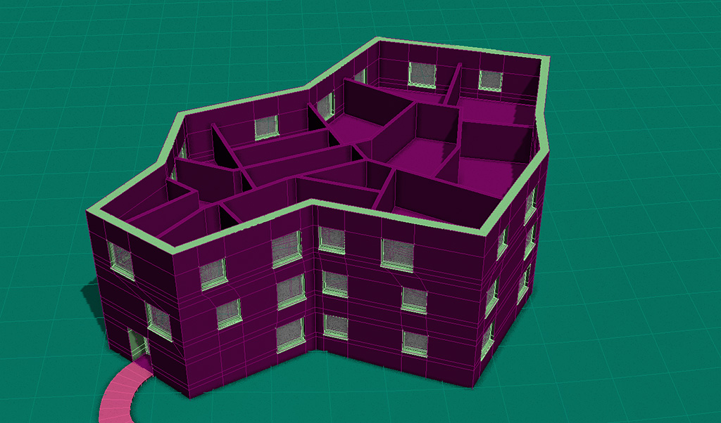
Modelling the project was about as straightforward as it gets. The clear plans allowed for stressfree and easy modelling using splines, extrusions, edit poly and shell modifiers. I also used a selection of trees scattered around the perimeter of the building with Itoo’s Forest Pack Pro to add some reflections to the building’s windows.

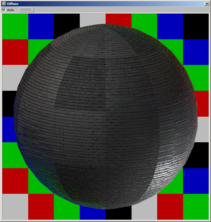
Immediately after I’ve finished modelling, I open up my trusty material creation and test scene available from Bertrand Benoit and start building my materials. I strongly advise using a testing scene like this to aid you in your material creation. Creating shaders in a controlled testing environment like Bertrand’s scene as opposed to throwing them together on the fly for each project will keep your materials behaving in a more predictable way across varying lighting conditions.

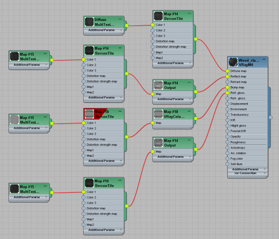
There’s a whopping total of 7 materials in the entire scene, most of which aren’t even visible so I’ll only go over the wood cladding. I started off with an Arroway texture for the cladding, but even a huge arroway map wasn’t big enough to cover a whole side of the building without tiling, so I had to go with a different method. I spent a grueling afternoon chopping up the diffuse, spec, and
bump maps into individual boards for use in the fantastic BerconTile plugin. This, used in conjunction with the multitexture plugin was perfect for my needs. Below is the material setup with both standard and slate material editor modes. Essentially each BerconTile node uses exactly the same settings except for the maps loaded into the child multitexture node, with an output map handling the contrast adjustments for both the reflection slots.

Lighting was a simple affair. I’ve started stepping away from HDRI’s recently when reflections aren’t a ‘focal point’ of the image as I find the vraysun and vraysky flexible, quick, and clean to render. I used the CIE overcast sky model with a low intensity sun and a large size setting to obtain a soft shadow and low contrast lighting setup that gave the building’s cladding a little bit of specular highlighting towards the top of the facade facing the camera, suggesting a break in the forest canopy above.

The camera settings here are so irrelevant I won’t go over them. Instead I’ll speak about camera position and composition. The trick was to find the balance between the distance from the camera to subject and focal length. It’s amazing how much you can change the ‘character’ of a building purely by adjusting these two parameters. I chose an angle that somewhat follows the
rule of thirds, gives a bit of information about the interesting shape of the building, and with a focal length that aids in the mood I’m trying to create. Somewhere between a distant/observant perspective and a tall/looming perspective, the camera just seemed to be in the right spot. The choice to go square format was also based not only around the geometry of the building, but how
the building seemingly reacted to being forced into either a portrait or landscape orientation. Anything other than square format and the building felt cramped or lost within the frame.
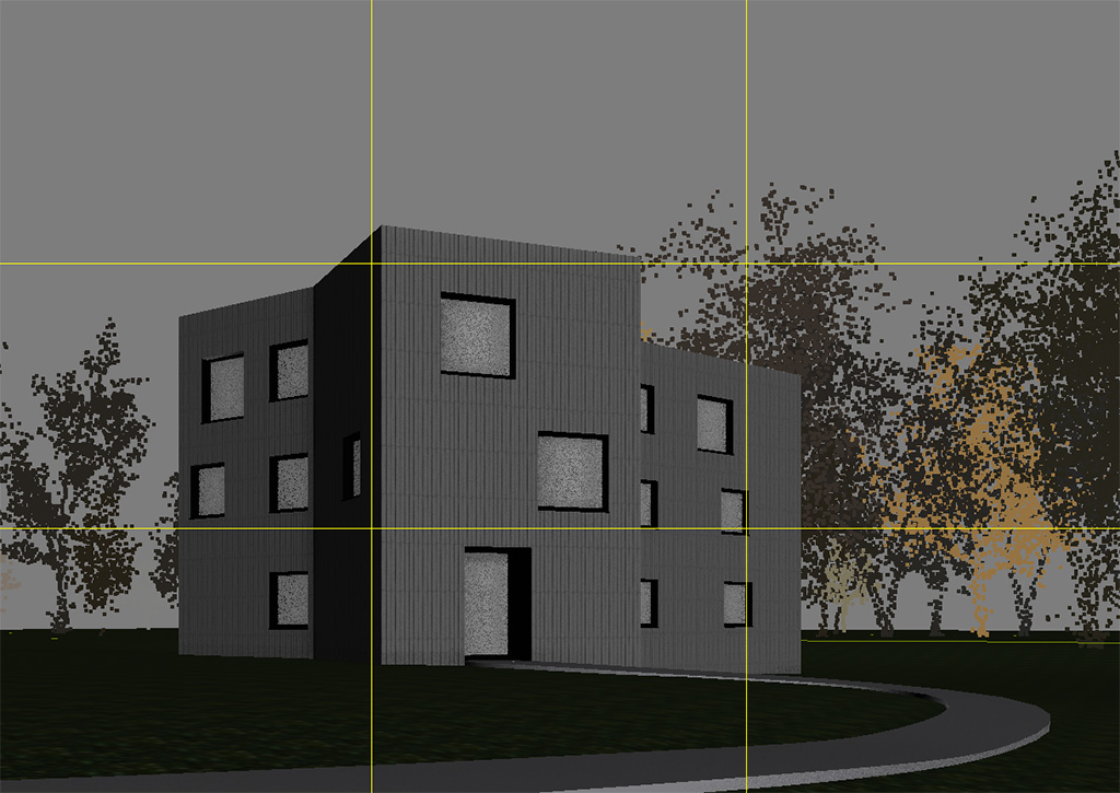
Render settings are as irrelevant as camera settings for a project like this. All that needs to be said is that I used the Universal method (which even for this type of image was overkill). I also rendered out MultiMatteElements, Ambient Occlusion passes of various sizes, vrayreflection, vrayspecular and vrayrefraction passes for flexibility in photoshop editing.
Now I enter the first phase of postproduction; the second and more considered planning phase of the project. I personally have a hard time previsualizing how a render will turn out until I have messed around with it in photoshop first. Usually I will move back and forth between Max and photoshop throughout the various stages of modelling, lighting, and material creation to not only understand how my lighting setup and materials will behave in photoshop, but to also stay motivated! I love getting a sneakpeek of how the image is turning out especially after, say, spending time on really tedious detailing work or having reached a particular milestone.
It’s now time to think more about the direction of the image. The story, the mood, the atmosphere, and which colours, compositional elements and effects are going to help create this mood and story.
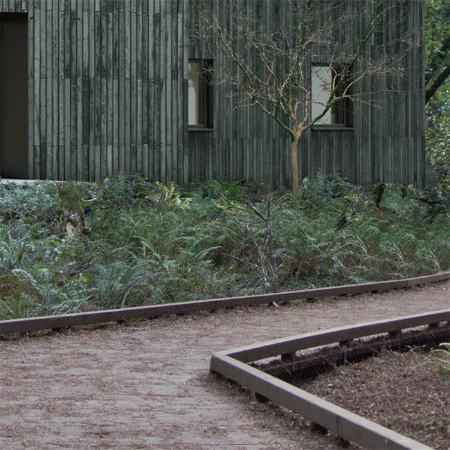
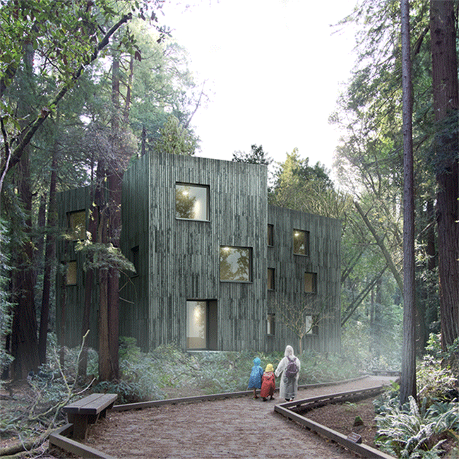
As I mentioned above, the composition was already giving a feeling of observance, so the idea of having a figure or figures come to discover the building in a forest clearing seemed like a good one. The viewer has a distant, almost voyeuristic perspective of this little moment in time.
I’m constantly thinking of the image’s story from here until the end of the project, mindful of how each step forward can strengthen the story whether it be during matte painting, effects and entourage, or colour grading.
For some more reflections on the glass I used a bit of "raw-reflection" and what I really love is the effect around the light cubes which stand in the plants. I painted the "vray-shadows"-path with a mask around the cubes, using the mode screen. Now it looks like the light shines through the green leaves.
After loading in my render passes and masks into photoshop I typically go through a corrections phase. For me, this is a very important part of the post process, as tweaking and adjusting materials and elements at this stage helps to bring them towards a more balanced image that will tend to behave better when I’m colour grading. The corrections include adding ambient occlusion and dirt maps, general contrast and brightness adjustments, and masked adjustments.
Something that I always do at this point is to take each material in the rendered image and add a masked curve adjustment layer before hitting the ‘auto’ button. The results can vary quite a bit, but can also give some really interesting effects. I’ll usually tone the effect down or take it as an insight into how far I can push a given element. An interesting example is to try this out on rendered foliage. Photoshop will usually add blue and boost contrast to your curve adjustment layer as it tries to balance that element. If the effect is too strong, just try dropping the opacity of the adjustment layer or start playing around with the colour curves to suit. It sometimes can really help with flat looking rendered foliage.
This process helps to bring all the elements within the image into a cohesive and balanced range of colours and tones. I’m aiming to end up with an image that looks like a pretty flat photograph without much contrast before I move to the next phase. By having this solid base to work from, the elements within the image will keep a consistent look all the way through grading, particularly when doing more aggressive global colour and contrast adjustments.
Matte work, predictably, is always going to be a major part of a project largely created to learn more about matte painting and get some practice in. Matte painting for me, is still a very new thing.
I visited America in 2011 and took a trip to Muir Woods, just outside San Francisco. While there I took hundreds of photos which ended up being a fantastic stock library for this image, in particular for two reasons. The first being almost pure luck that the angles of some of the elements I used from the photos matched up perfectly for what I needed, and secondly, all the photos were taken at the same place, at the same time, with the same camera, the lighting of the stock imagery was perfectly consistent. For me, one of the most difficult and unknown parts of matte painting is relighting matte elements, so this was a fortunate situation to be in.
Because of this situation, the matte painting phase was relatively straightforward. There was a bit of tricky masking, erasing, and cloning to be done here and there, but apart from that, it was just about picking the right photos for the right spots in the composition. Having the forest rise up either side of the building but leaving the negative space above, helps give the building a little more implied height.
Finding the right people for this image was tricky. I had initially wanted the kids from the movie E.T riding their bikes down the track, but without good stock images from the film, it was going to be difficult to pull off. I then decided to change the idea and go with something along the lines of children in bright raincoats running after each other towards the building. I scoured the internet for appropriate images and after looking through thousands of photos I came across the image I ended up using. I chose this image due to the angle of the source image matching almost perfectly with where I wanted the figures to sit in the composition. The figures were posed in such a way that implied a sense of unexpected wonder upon coming across the building and I still got the bright raincoats like I wanted! A splash of colour in somewhat foreboding surrounds.
Nows the time where I do any effects such as light flares and atmospheric work. This way they’ll be above the matte and render elements in the layer stack, but below the final colour grading to come. There’s nothing much to explain about this part, just some simple light flares and painted fog both set to screen mode.

Now for the fun part. All the hardest work has been done and I get to go crazy with colours and effects! This is the first time I’ve properly used Magic Bullet Photolooks on a project and I was really impressed with what it did for this image, in particular the Edge Blur node and Chromatic Aberration node. The CA node seems to add a really subtle blur to the entire image which gives a really authentic photographic look. The CA, Edge Blur and Diffusion nodes working together can create some stunningly realistic effects. While I’m comfortable with the fast and flexible nature of photoshop’s colour balancing tool, I find the colour grading tools in Photolooks tend to keep things balanced and in control better. The direction of the colour grade was to employ a general blue/green overtone to emphasize the waterlogged feel of a forest without it being overpowering. Below is the final breakdown including each photolooks node as well as some final corrections and effects.
I’ve decided to insert some vignettes of the image to give an idea of how Photolooks helps the 3D elements sit well with the matte elements. This is mainly the work of the Chromatic Aberration node helping to soften those hard 3D edges a bit.

The last thing I would like to mention is how important a second or even third set of eyes is. This type of work and this type of image can become very unconvincing if any one element doesn’t sit well within the image. Have someone whose opinion you trust critique your image. They’ll help you find problems that you may have missed and this certainly was the case for me on this project.
Thank you for reading!
Cheers,
James Burrell