An in-depth evaluation of the project "Master Bedroom in KSA" by Ahmed Nagdy which didn't make it to enter the gallery due to our *Quality Standards.
5-10 rating system. In order to approve a project to be published on VWArtclub Group, it needs an average of 7+ rating.
Modeling: 6.5
Framing: 6
Lighting: 7,5
Materials: 6
Post Process: 7
Difficulty: 7
Total: 6.75
"Master Bedroom in KSA" by Ahmed Nagdy.
The project is a good effort and there are some interesting parts here and there. We like the combination of cold and warm tones and the overall function of the apartment itself. Nevertheless, too many things are fighting over each other for our attention. It’s hard to distinguish the direction of design (different fabrics, materials, structures) and the condition of the day (very bright and cold at the same time). Try to keep in mind that sometimes "less is more."
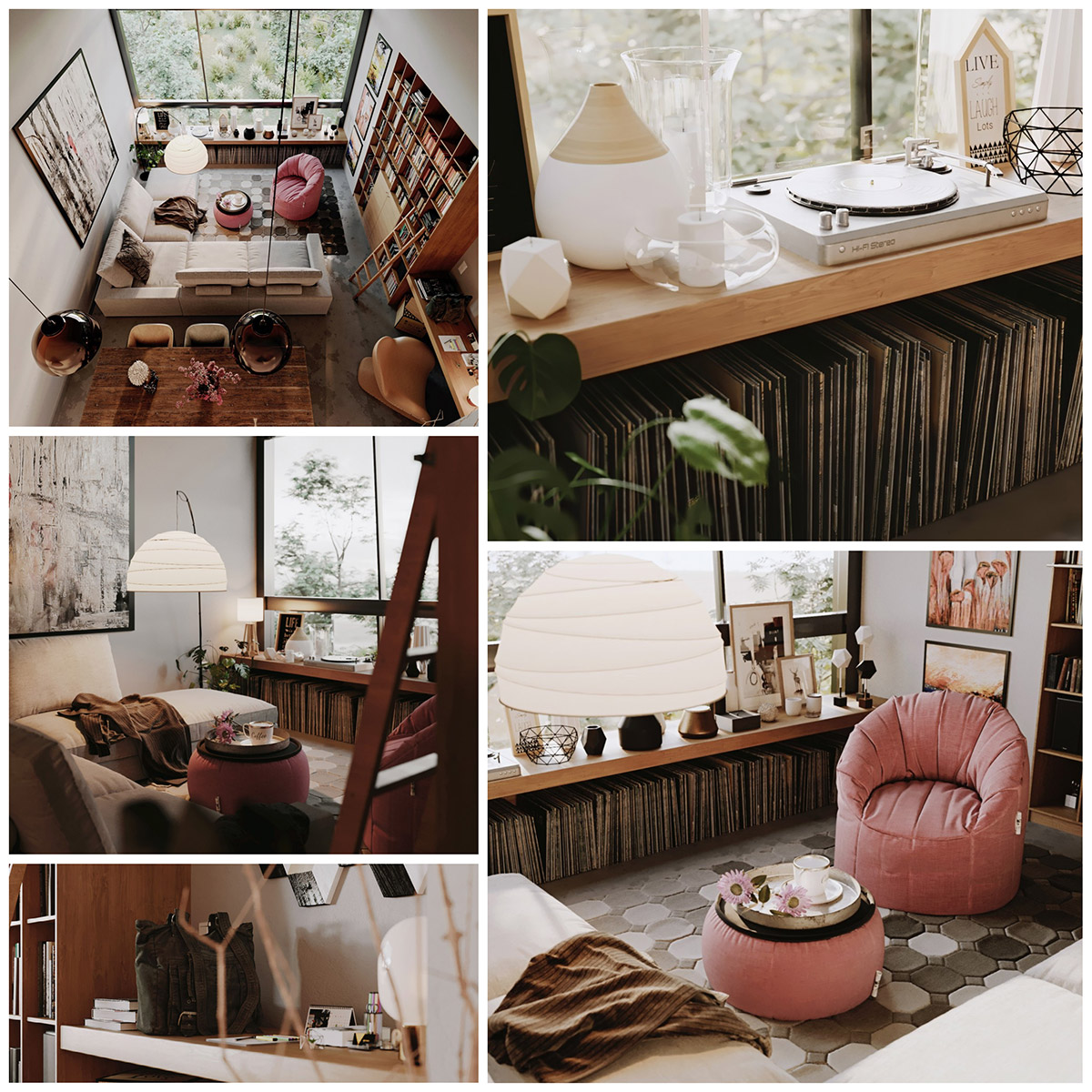
Before we speak separately for each part of the rating, it would be essential to mention that this project is a normal scene, and with mixed lighting conditions. We would like to show you a great example by Konstantinos Anninos; it's worthy of taking a more in-depth look at this PROJECT. We suggest you observe the framing (position of views & composition), the pleasant color palette, and the advanced materials which are supported by great mixed lighting (Natural & Artificial). A lighting scenario close to yours.
"Small apartment" by Konstantinos Anninos.
In an interior space, we usually have to model some simple boxes as walls, piece of cake. Nevertheless, when you use bad-looking models, you don't get a good score. For example, the pillows and quilts. Details like cables, smooth geometry in close-ups, fillet on the walls, and so on.
Generally, you did a good job with modeling but you missed some details. The highest possible score in similar scenes is 9+, but you lost 2.5 points because:
1. The curtains have exactly the same foldings. Randomization is a must even we speak about geometry or textures.
2. The air-condition 3D model you used could be much better and detailed.
3. The wooden floor has a one and only horizontal grout which is something really unusual for interior floors. We can see how bad it looks in another shot.
4. Missing details in some models which you can find later in this article.
Concerning the randomization in modeling, you can learn how to use the Paint Deform tools. It's actually some kind of enjoyable sculpture.
What's the most important of VW *Quality Standards? "The Composition"
Why? "Because almost everything else sounds easy in our days."
1. Only the shot below has a nice composition. We would like to give some general tips for an even better and balanced composition.
1a. We don't see the meaning of the usage for these two models. Neither aesthetically nor practically. By removing them "the image can breathe" and you will describe how space works. You already have a stool.
1b. We see the same painting everywhere in this house. It's a good idea to change it. Also, learn what the Bitmap Fit (UVW modifier) does. It actually keeps the normal-real proportions of the maps.
1c. We notice 3 lanterns on a small bedside table. Better to keep only one, probably the medium size, and test another material for its frame. We guess that black iron or bronze could work nicely with the rest colors in your scene.
1d. We would add the flower on the book and in exactly the same direction.
1e. This is a modeling issue "3D Laziness" which also costs points. Small cylindrical bases on the ceiling for the metallic ropes.
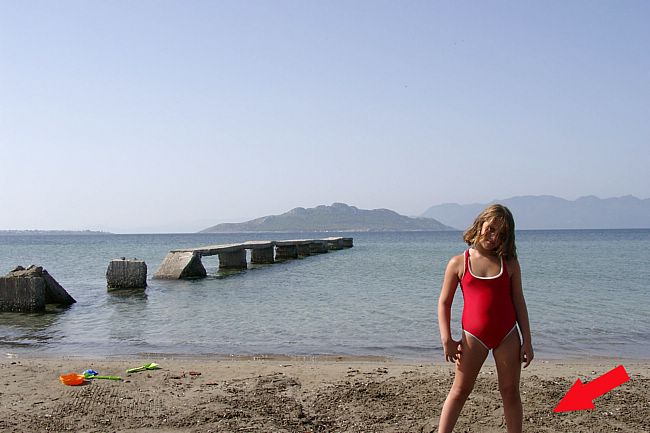
1f. Concerning the format, we suggest some pixels in both areas in order to use the lines and do not cut the feet of the stool like that. It somehow reminds us of photos like the one below!

2. This shot has an even more weak composition. It is also good to use this tip even for general shots where you have a lot of models looking at you. "Every model in your scene must pose nicely for a photograph."
2a. Move the buffet to the left side,10-15cm. Now it looks stuck with the sofa.
2b. Mirror the armchair to the right snd try to show a bit of its blue pillow.
2c. Move the side table close to the sofa.
2d. Move the armchair a bit to the right side.
2e. Put the plant pot on the side table.
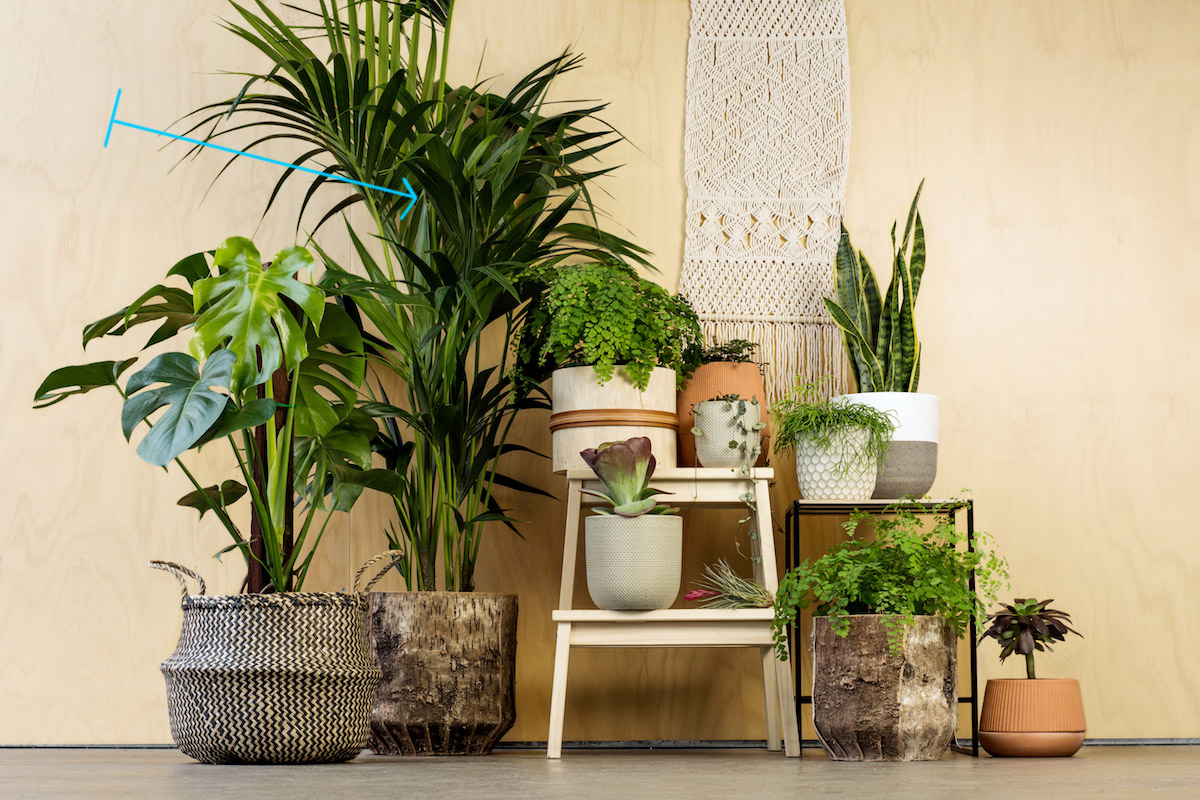
2f. Just a bigger plant there could do the job. We would suggest something like the one below.

3. This shot isn't pleasant at all. We strongly believe that you have another better position of view that you didn't try. By shooting directly to the wooden construction you could take a pretty nice image.
4. This is also a week shot. Even the position of the camera is good the composition looks weird. One object next to another object. Buffet -> Mirror -> Armchair -> Console -> Pouf and so on.
4a. It looks like a clipping plane cut from your camera.
4b. The picture frame placed inside both books and candles.
4c. An overlapped geometry between mirror and carpet as well.
4d. Remove the armchair and let space breathe.
4e. We should normally see a guide for the sliding doors. We consider that as poor modeling effort.
Except for the two shots below the lighting isn't bad at all. Nice intense, temperature, contrast, and shadows. There’s something nice about the cold/warm tones but there are too many lighting sources. It’s hard to distinguish the time of the day. The main lighting source is very cold and bright and the artificial lighting is working as a spot effect most of the time. The wardrobe and the bathroom have too many ceiling elements that are fighting over each other without finding the desired balance.
Generally speaking, we feel that you simply dragged and dropped some models which have enough good materials and that's all. Some shaders are okay but there’s room for improvement. The custom materials you had to create look poor. For example, the floor has a repeated texture, and the pillows too much falloff. Generally, the woods need more work, neither the texture nor the settings can satisfy an advanced 3D Artist. Additionally, we don't see any pleasant color palette. You need to study deeper the color and advanced materials creation. Highly recommended this website. It will offer you a new horizon on how to use the "Colour palettes" in your scenes.
You can do a lot of improvements in your scenes, even if you decide to play with the color palettes. Just one fast Tip using the Auto tools of Photoshop, because we observed that your images have a visible "lighting dust". That usually happens when we have several lighting sources and a strong glow effect, bloom and glare, and so on.
A common commercial interior project with several shots. It could be rated as 8+ but you didn't try something special in your scene. We’d definitely look for design references and try to perfect a particular style. It is very hard to combine many different styles in one apartment and obviously it didn’t work out for us in this one. Even though there are interesting parts when we zoom in. Put more effort next time and we are sure it’s going to be better. Below you can find a very interesting & informative video tutorial.
Kind regards & Keep rendering!