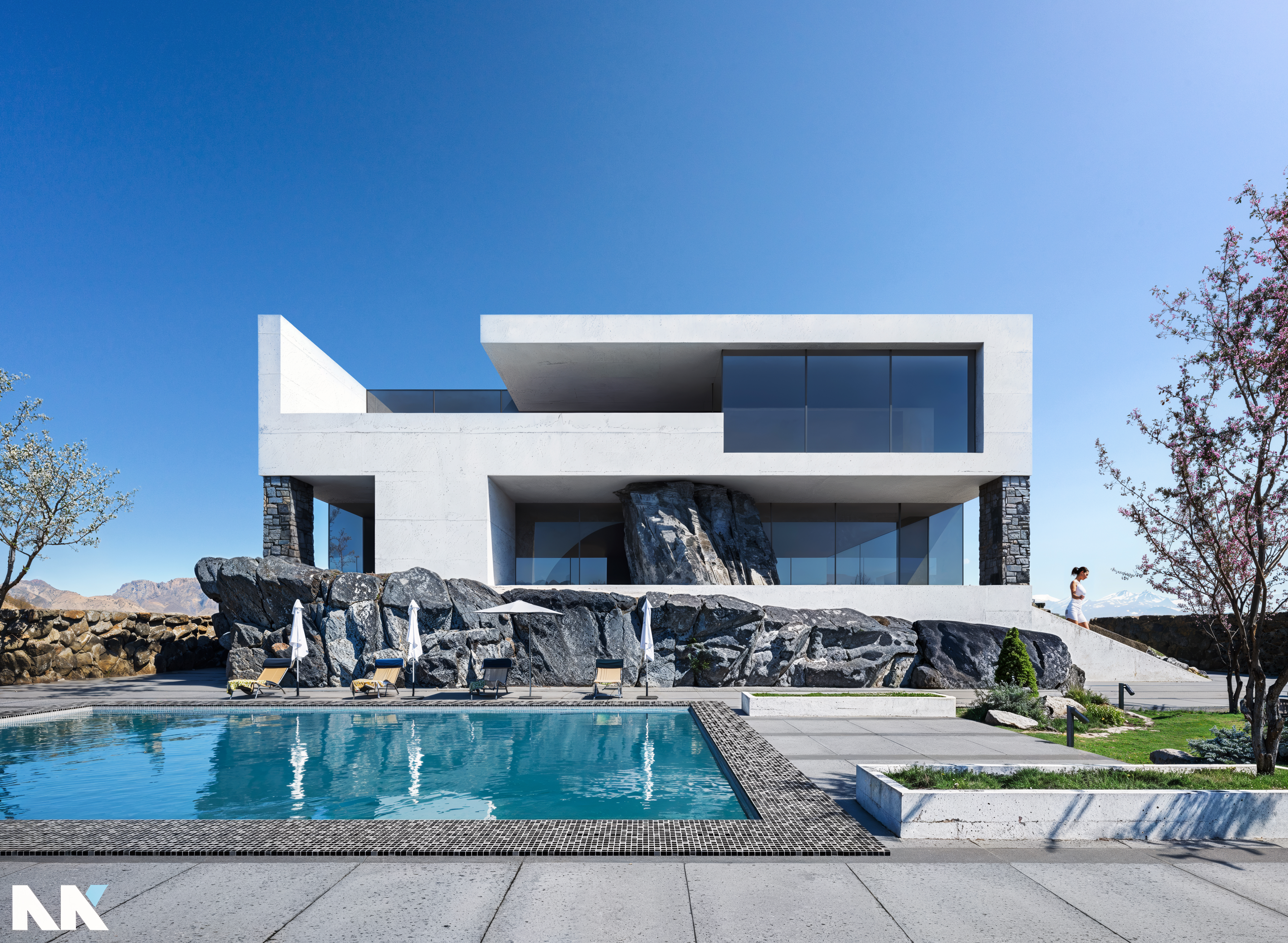
An in-depth evaluation of our member's project, Ahmed Elkhiary's "Modern Villa"
Based on the quality standards we’ve set over the years and an average of what is considered a good Archviz image today, in 2024, this project would be characterized as a solid attempt of medium quality, with much room for improvement.
I believe we can all agree that things have changed and continue to change at an incredible pace, day by day. The quality of architectural photorealism has been drastically influenced by technological advancements and all these new AI tools that artists can use to enhance the quality of an image or even an entire project.
In this article, I will try to analyze and improve the areas of the image that could benefit from enhancement, and there are quite a few. I’ll explain, step by step, a workflow that’s relatively easy to follow, even for beginners. Of course, some familiarity with the tools is needed, as well as enough experience to decide what’s worth keeping and what should be changed.
In the past, we would have needed thousands of words to describe how a project could be improved during 3D design, modeling, composition, lighting, materials, details, and post-production.
Today, this is much easier, and we can communicate it with a single image that represents thousands of words by using artificial intelligence and some of the best tools available.
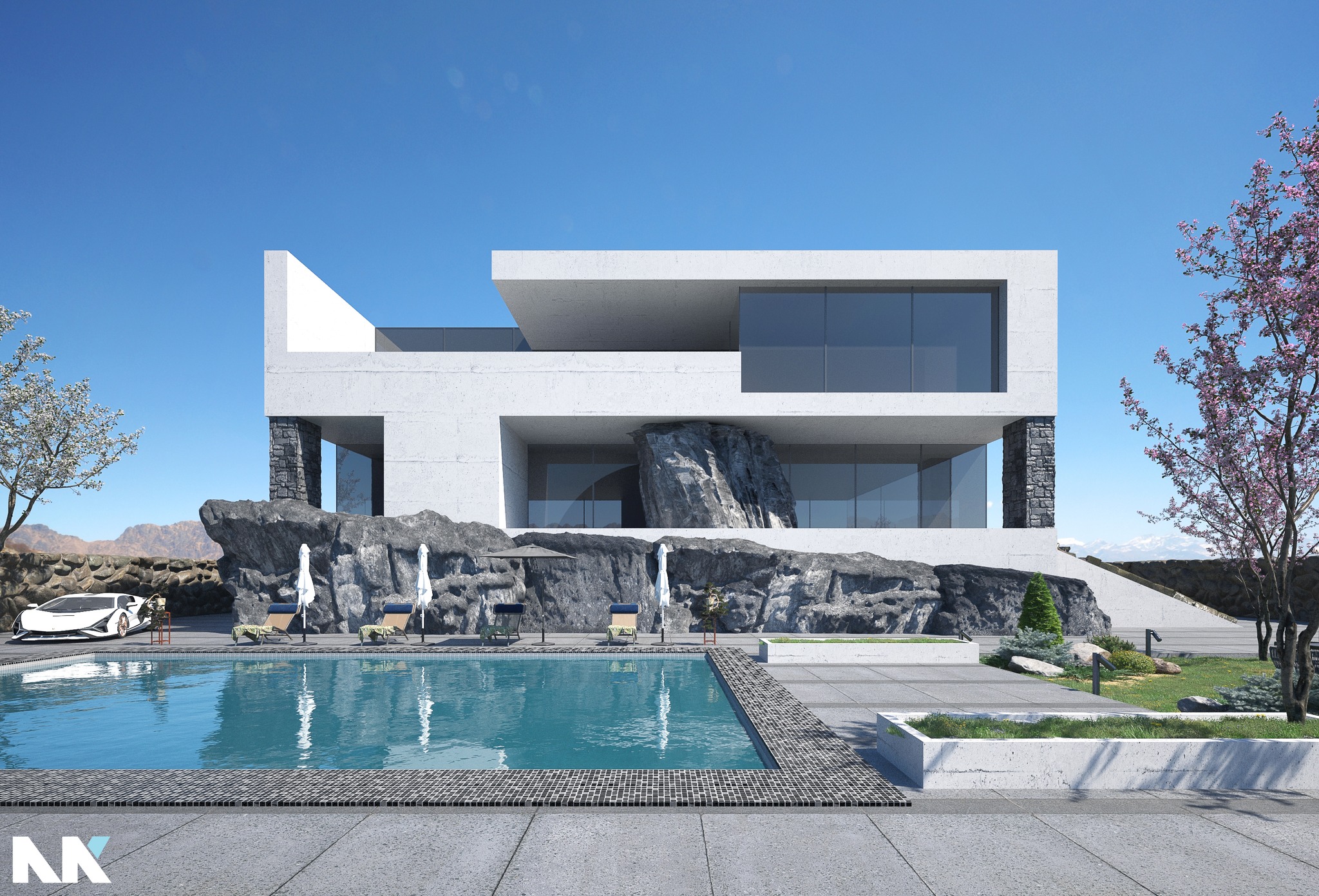
CHECK THE 6k HR IMAGE AFTER ENHANCING.
CHECK THE 2K ORIGINAL IMAGE BEFORE ENHANCING.
The tools I used to elevate the level of photorealism in this image are as follows:
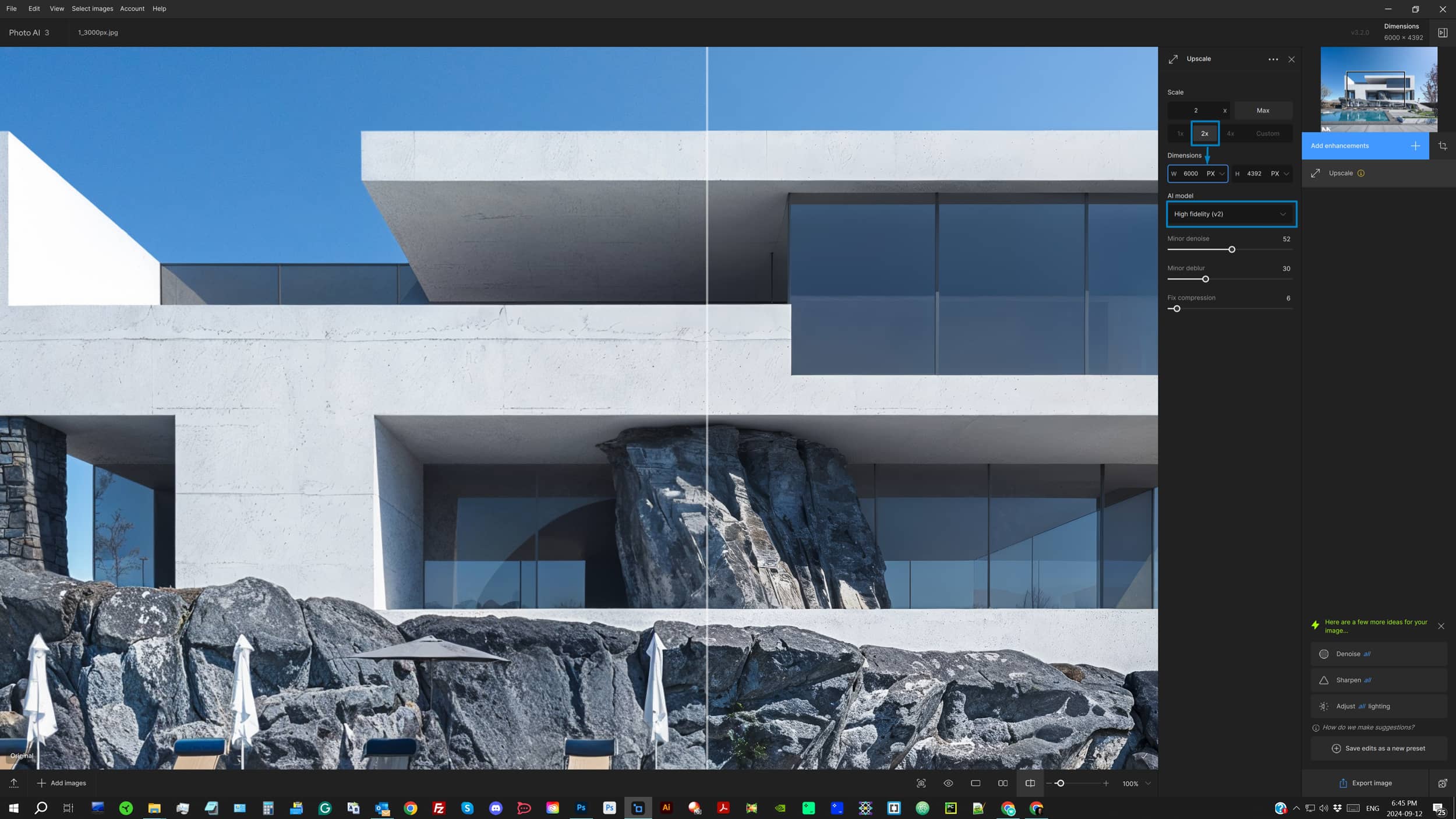
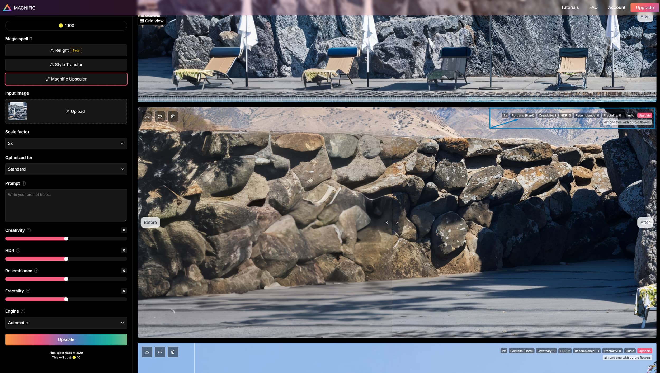
I’ll keep this simple and to the point while explaining the settings of the Magnific Upscaler. You’ll notice there’s a “?” next to each setting that explains its purpose. Just remember, if you decide to use this tool daily in your workflow, there’s no magical button or perfect combination of settings that will instantly give you the ideal result in every image.
Creativity: This controls how creative the AI tool gets. Positive values allow the tool to do some wild things, but in Archviz, this often isn’t desirable as it significantly alters the original image. Even 0 creativity is still creativity. To minimize its effect, you’ll need values around -5 or -6.
Tip: You can achieve fantastic details in specific parts of an image with creativity settings as high as +6 or +8.
HDR: This adjusts the sharpness of the image, improving what we call definition or what we simply refer to as how crisp and clear the pixels are. Positive values increase sharpness, but remember, HDR is also somewhat creative, so don’t overdo it!
Tip: When working with images with a strong depth of field, use negative values (-2 to -3); otherwise, the depth of field might get ruined in an unappealing and unrealistic way.
Resemblance: A very straightforward setting. Positive values keep the image closer to the original, while negative values give Creativity more room to play.
Tip: If you want to stay relatively close to the original while allowing creativity to have some controlled influence, use values around +2 to +4.
Fractality: Usually, this stays at 0. Positive values make the prompt more powerful but can produce strange results, which are often unnecessary in Archviz. Negative values (-4 to -6) help correct vertical seams that sometimes appear in your image. Be cautious, though, as it can also create inconsistent blurry areas.
Tip: Vertical seams are usually quite visible in bright blue skies. Try upscaling with Creativity: -6 | HDR: 0 | Resemblance: +2 | Fractality: -5 | Engine: Illusio. Then, mask the sky in Photoshop.
Engine: The only one I trust when improving archviz images or even real photographs is Illusio. The other ones are pretty sharp, and they usually ruin the generated image.
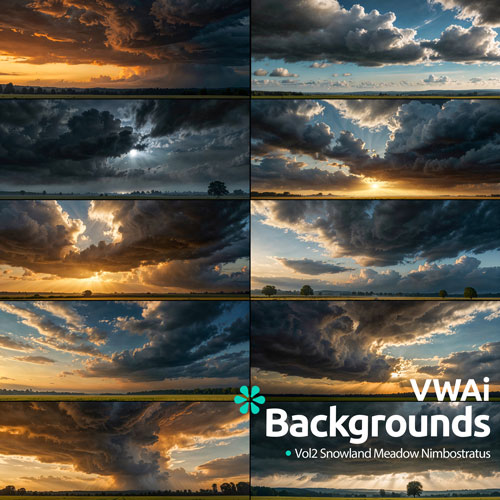
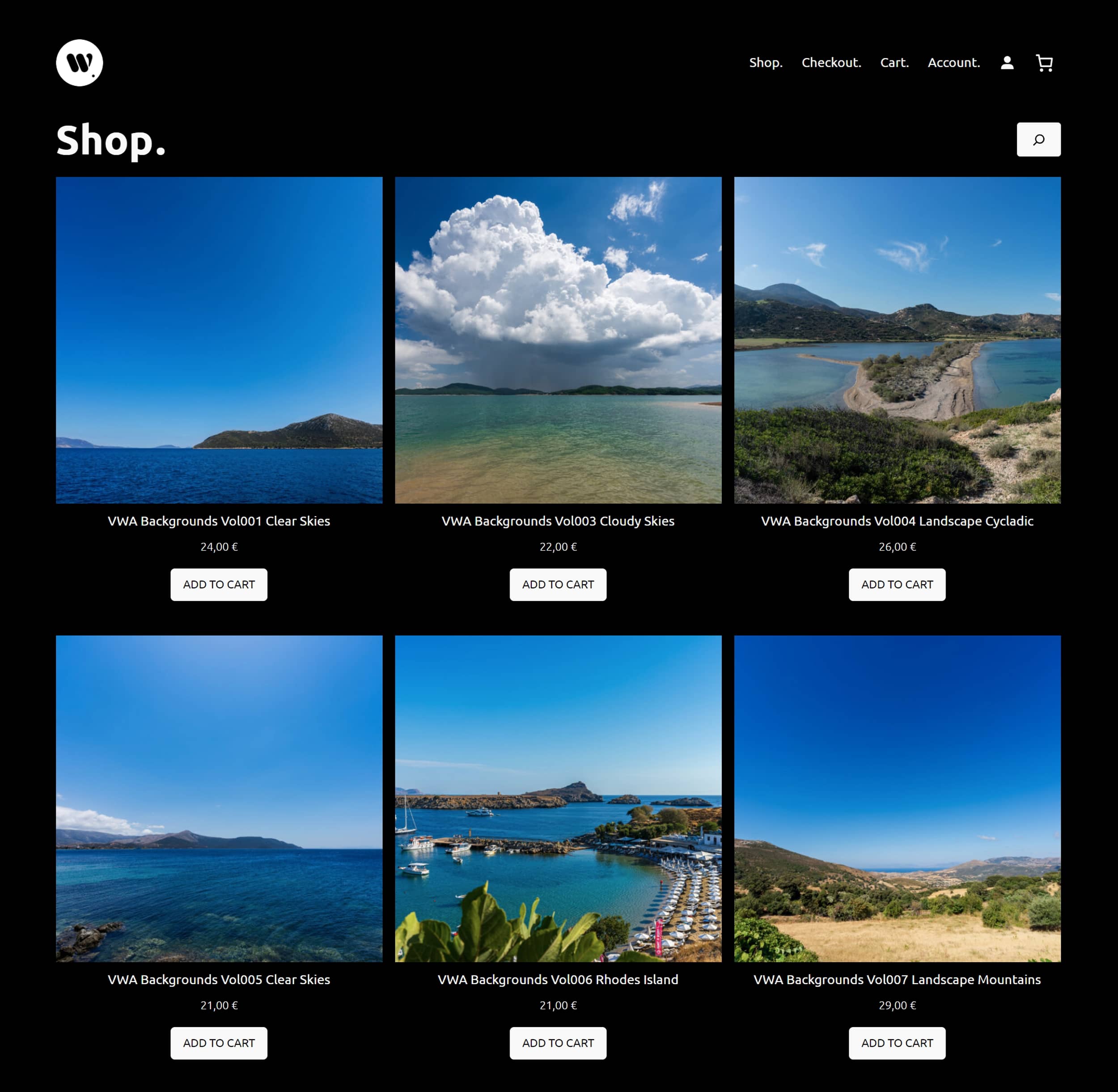
I also have a better solution with high-quality background skies: check out the VWA Shop. There, you’ll find both real high-resolution sky photos and AI-generated skies. VWA Backgrounds are real photos, and VWAI Backgrounds are AI skies. There are also some AI collections that combine AI land with real captured skies.
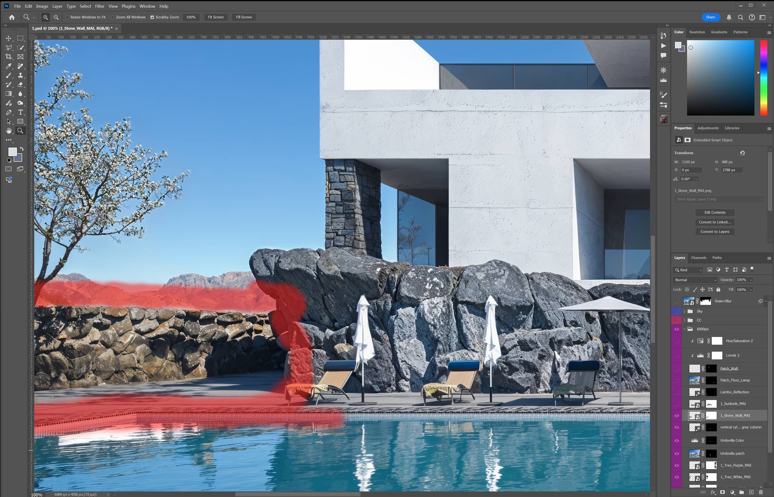
I’ll walk you through the process I used while working inside the Photoshop .psd file, which you can find in this FOLDER for further exploration. Building your file with proper layer organization is crucial so you don’t get lost during post-production. This also ensures that when you revisit the file after some time, you can easily remember the steps you took.
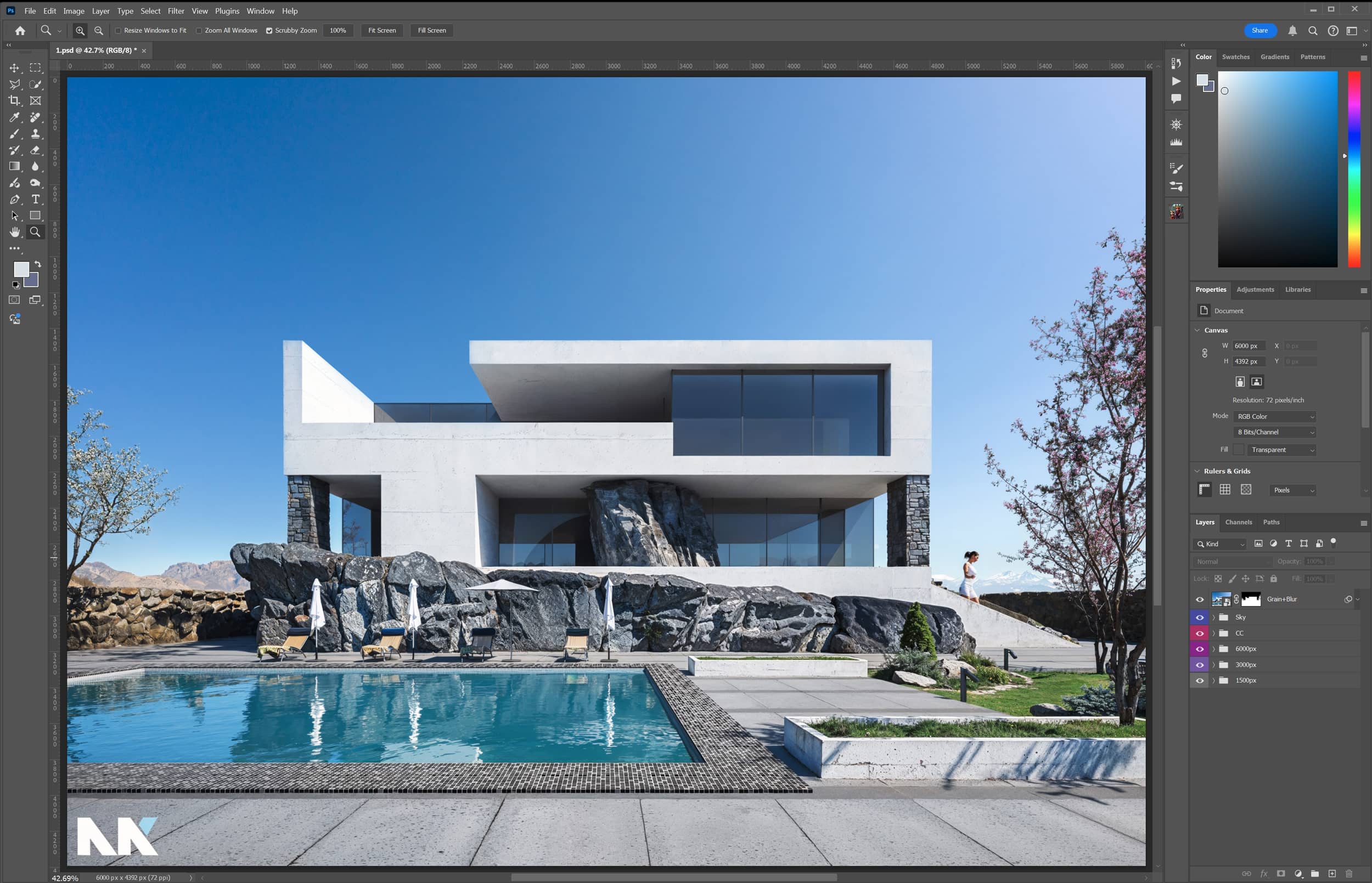
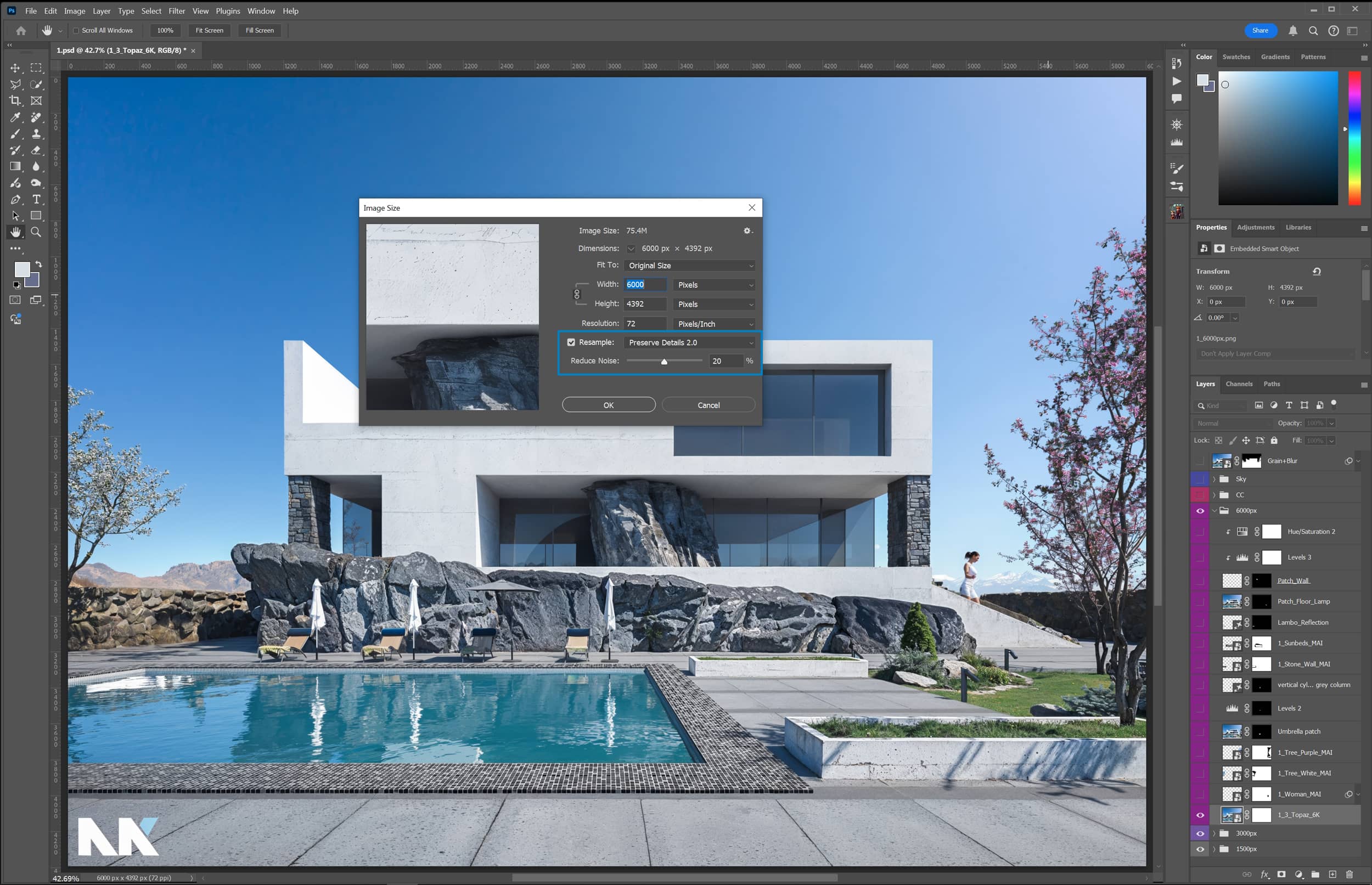
On the 1500px layer, you’ll find the original image, downscaled from 2048px to 1500px. This makes it easier to scale up by 2X (to 3000px) and 4X (to 6000px) while keeping the numbers rounded. Additionally, it helps save resources when using Magnific by minimizing credit (€) consumption.
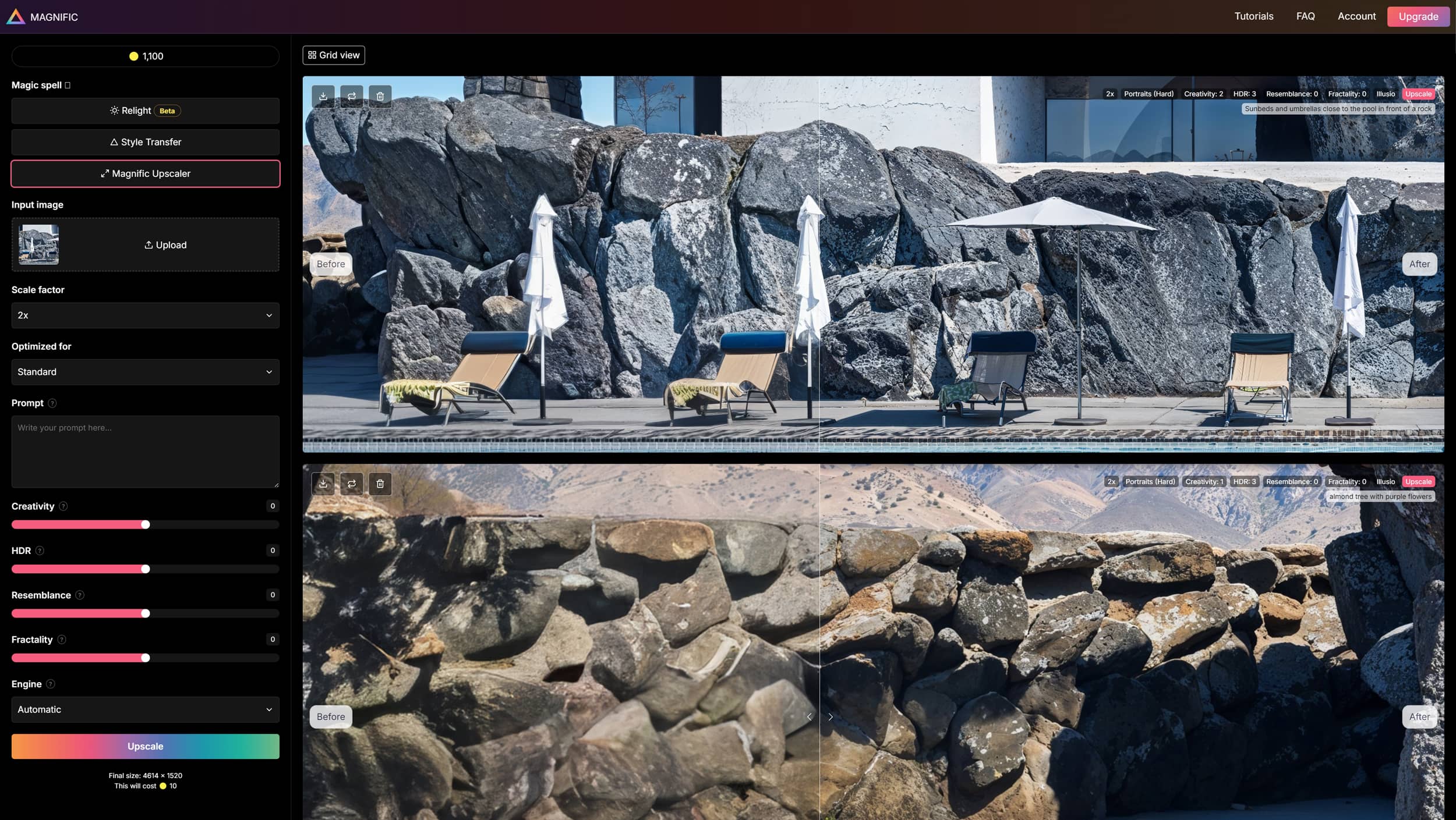
Initially, I made 5 upscales in Magnific, but I kept only the following 2. Don’t focus too much on the settings, though they are essential. What I mean is to experiment with different settings and in each generated image, identify the good elements—the improved sections of your image that you can later use in Photoshop. In the following steps, more images will be produced with Magnific, focusing on cropped areas for both cost reasons and to optimize specific aspects.
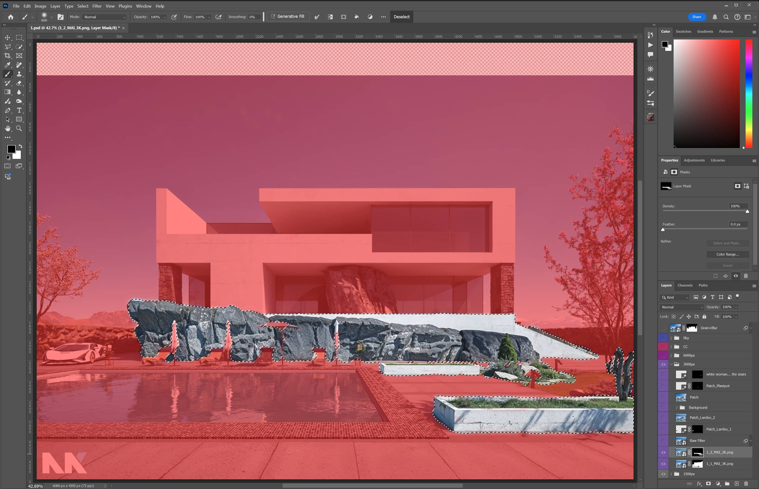
Here are 2 out of the 5 images I chose to keep. At the top right corner of each image, you can see the Magnific settings used, followed by the generated image, and finally, the mask applied to ensure only the desired sections were used.
Image 1_1_MAI_3K.png (Magnific Settings).
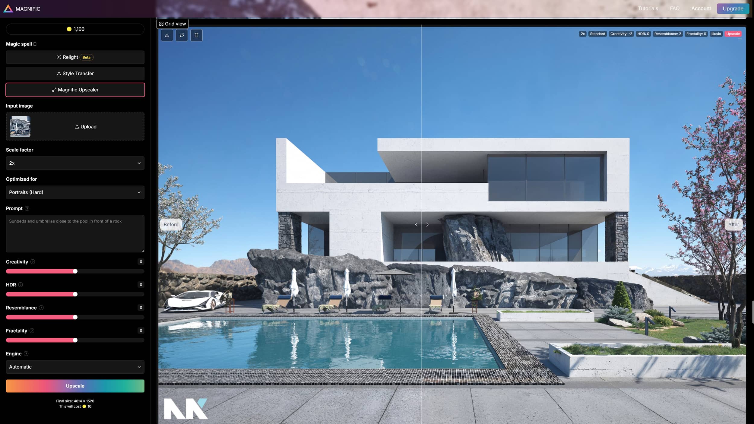
Image 1_1_MAI_3K.png (Exported Image).
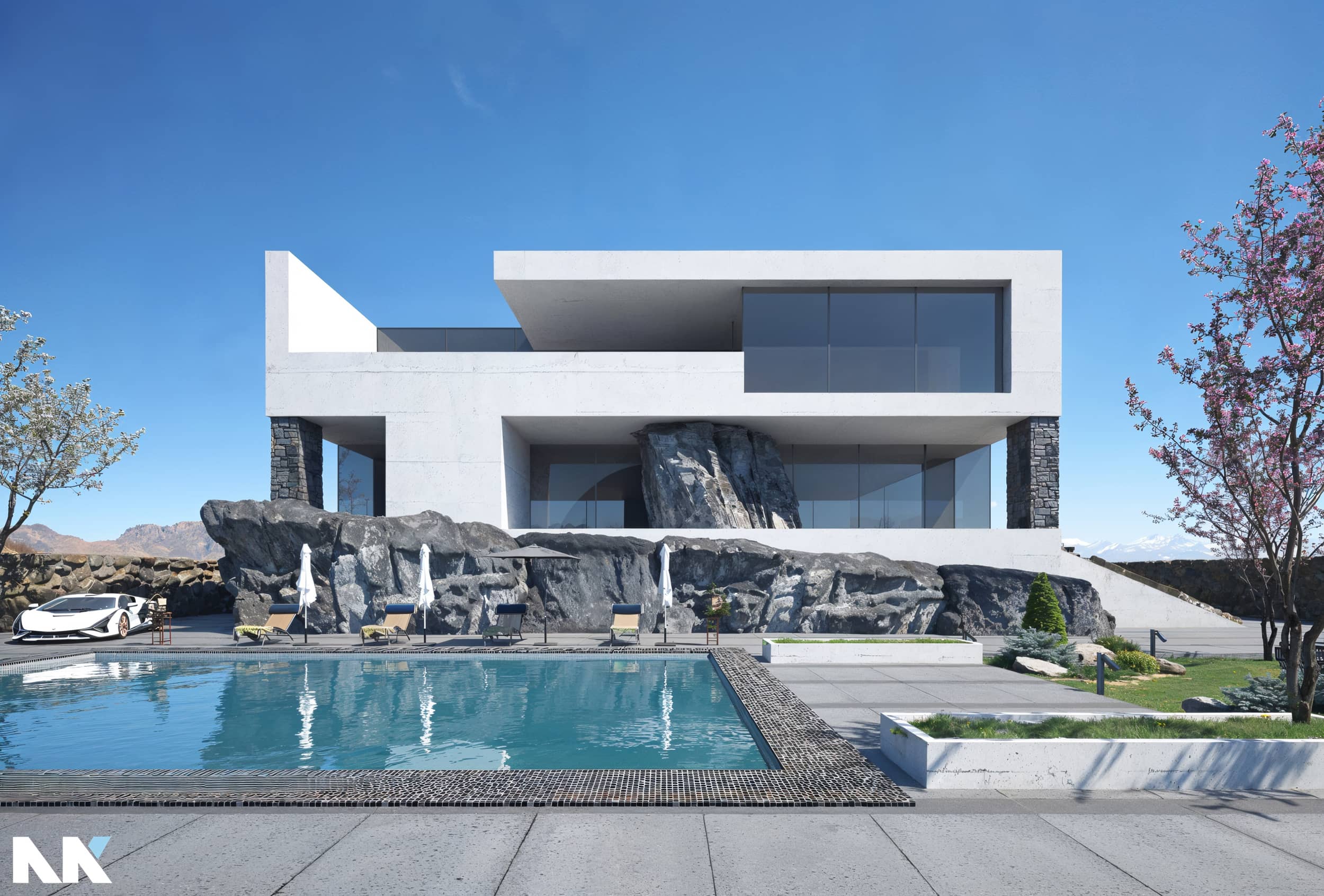
Image 1_1_MAI_3K.png (Photoshop Layer + Mask).
The new image wasn't applied to the sky, the tree on the left, the perimeter tiles of the pool, or the floor lights, as they were changing shape in a way that wasn't appealing.
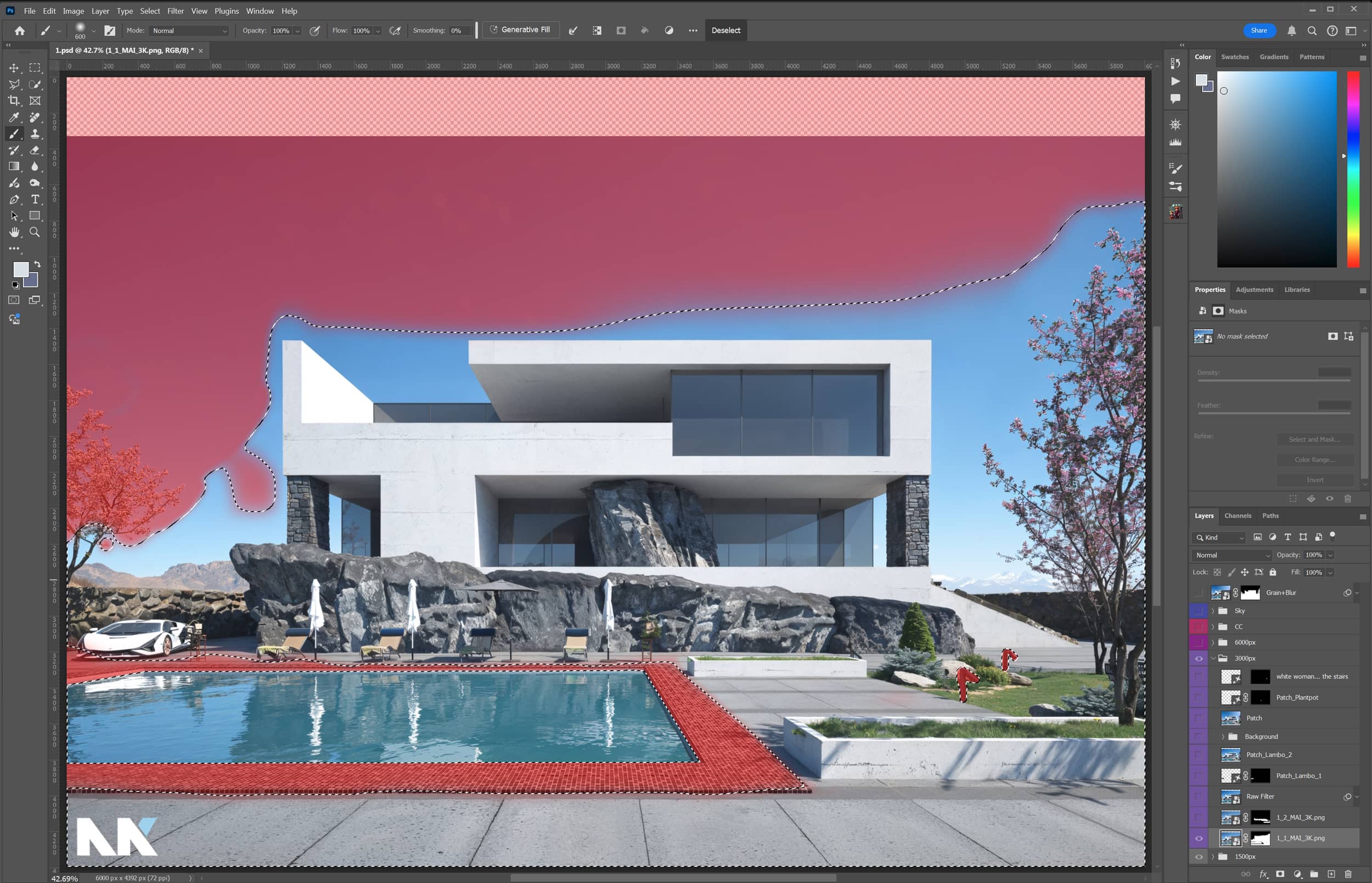
Image 1_2_MAI_3K.png (Magnific Settings).
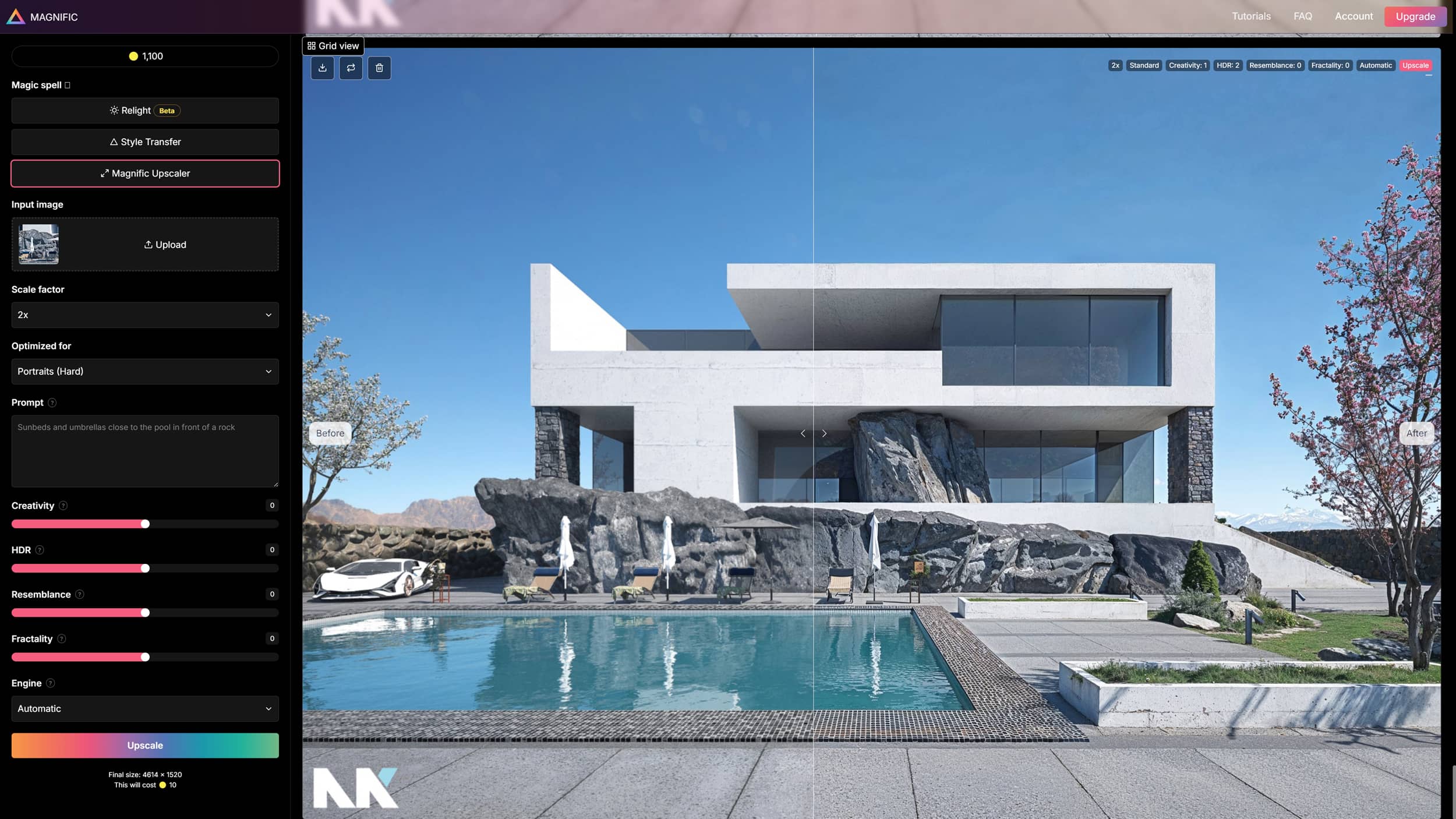
Image 1_2_MAI_3K.png (Exported Image).
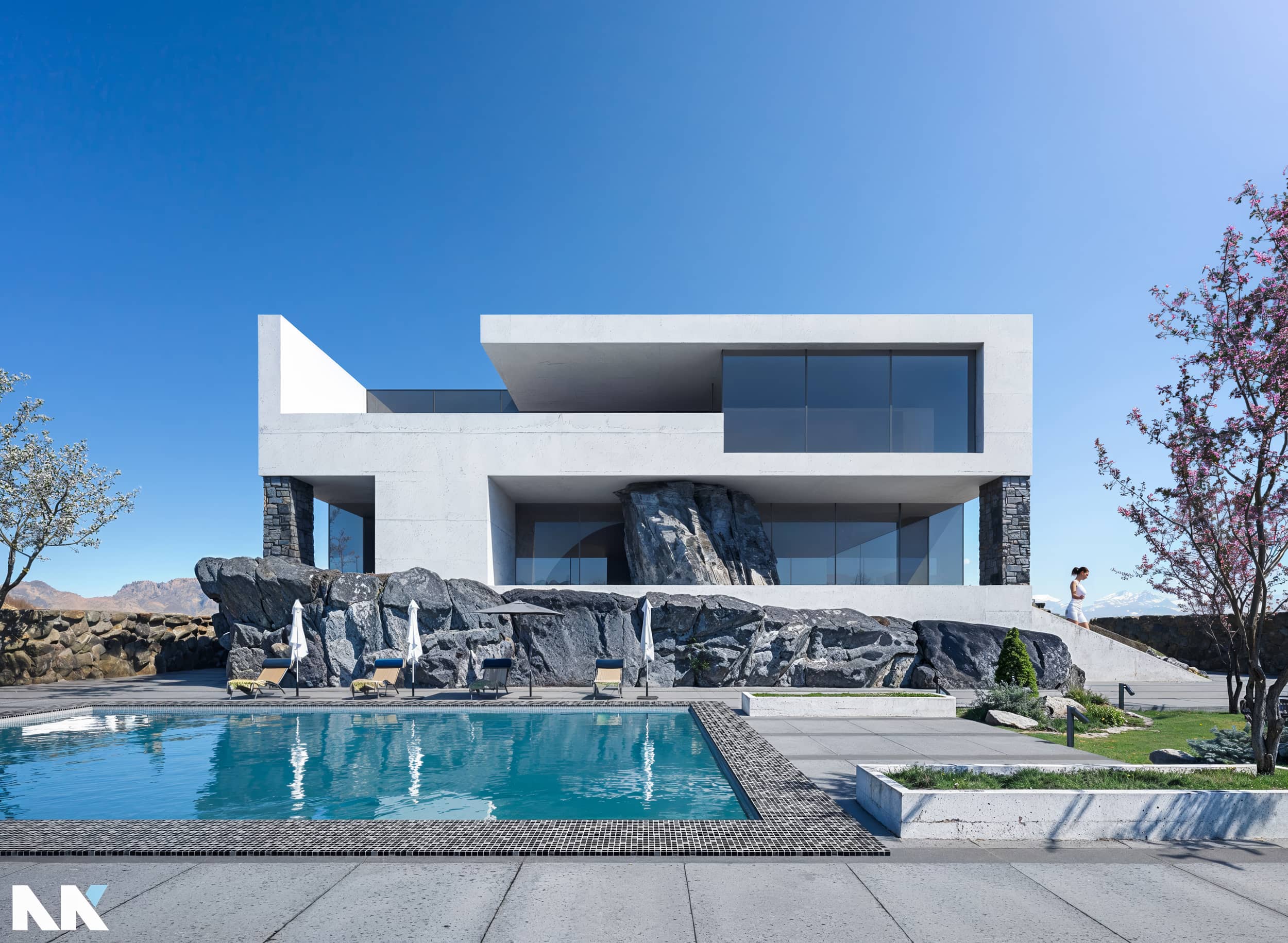
Image 1_2_MAI_3K.png (Photoshop Layer + Mask).
The second image was used only on the rocks, in the flower beds, and in a part of the garden.
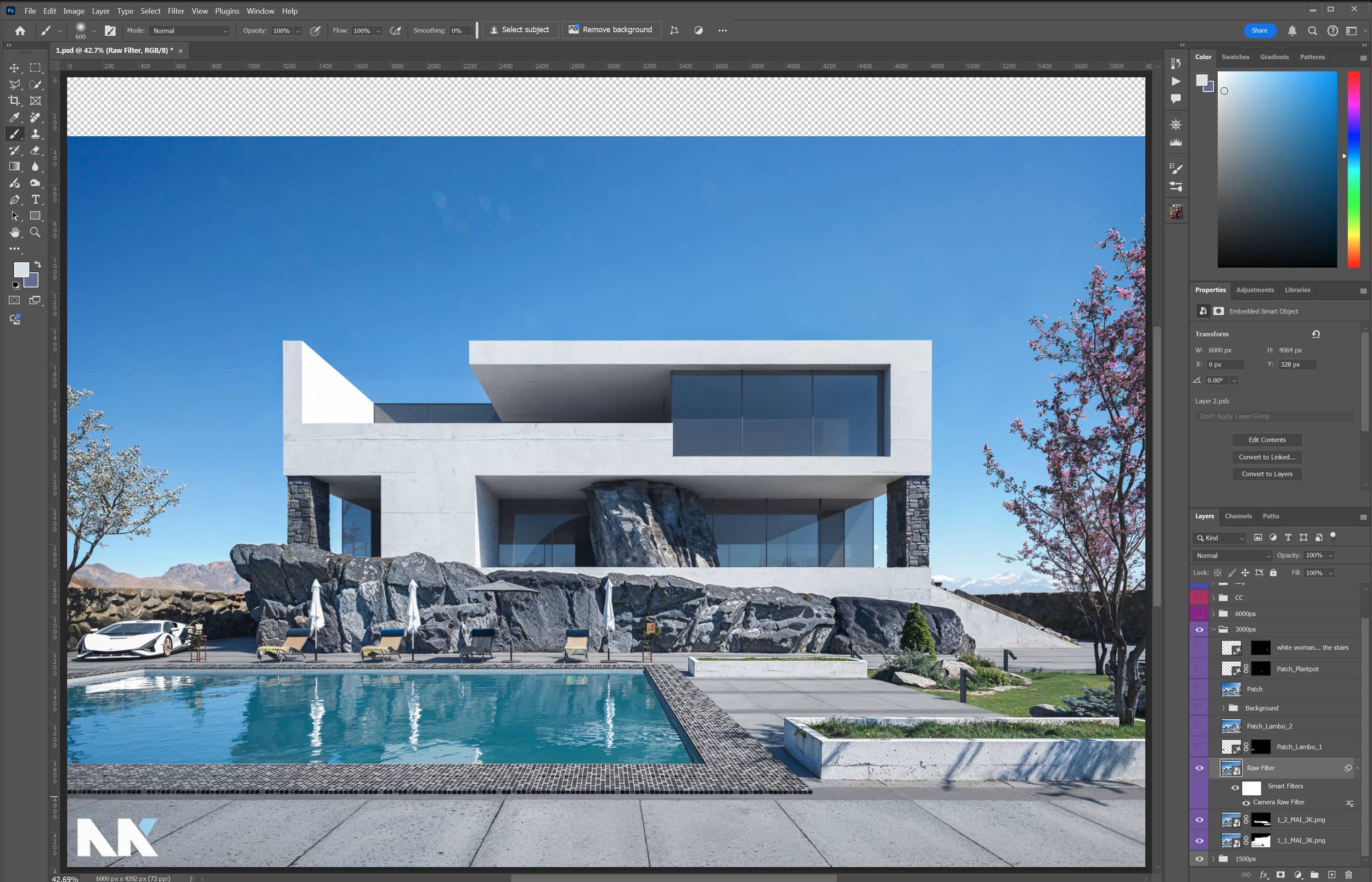
Apply the Camera Raw Filter. Simple steps for an initial color correction, contrast adjustment, and proper light exposure. Open the .psd file in Photoshop to review the settings applied using the Raw Filter.
In this section, I'll touch upon the composition of the photograph, as well as the mindset a photographer, 3D artist, or digital creator, in general, should develop over the years through practice and experience.
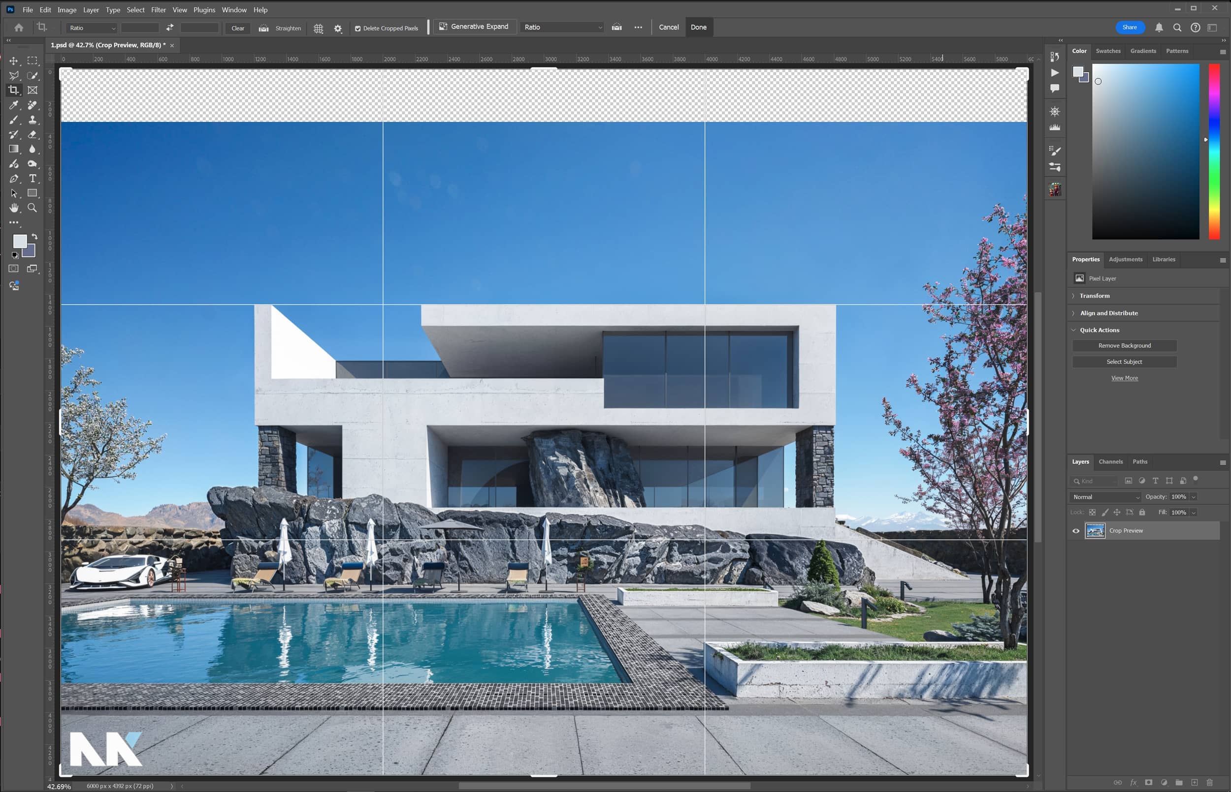
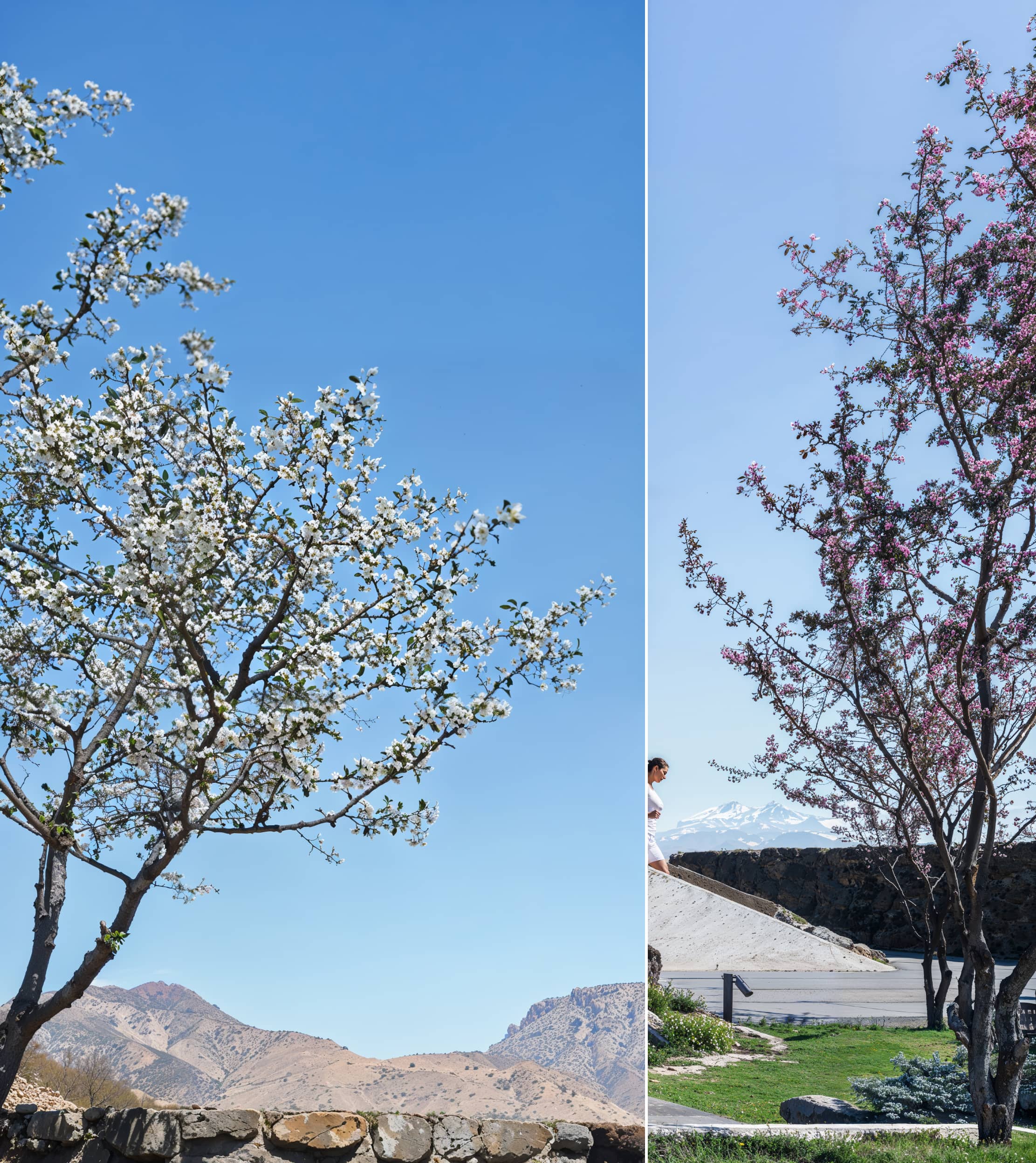
In my opinion, the car on the left side of the yard shouldn't be used. First, because its scale is too small, and the 3D model isn't that great. Overall, the shot is fairly balanced, and the camera is positioned in a "safe way," which typically provides appealing results in terms of framing a photo by "shooting straight towards the building." Finally, I added a bit more sky, applying the rule of thirds and allowing the viewer to see one-third of the clear sky. This helps the image breathe and allows the landscape to convey the sunny day better.
The following two elements I removed were the car and the flowerpot, using the Generative Fill feature. Quick and easy, as Photoshop’s recently implemented AI tools work fast and effectively.
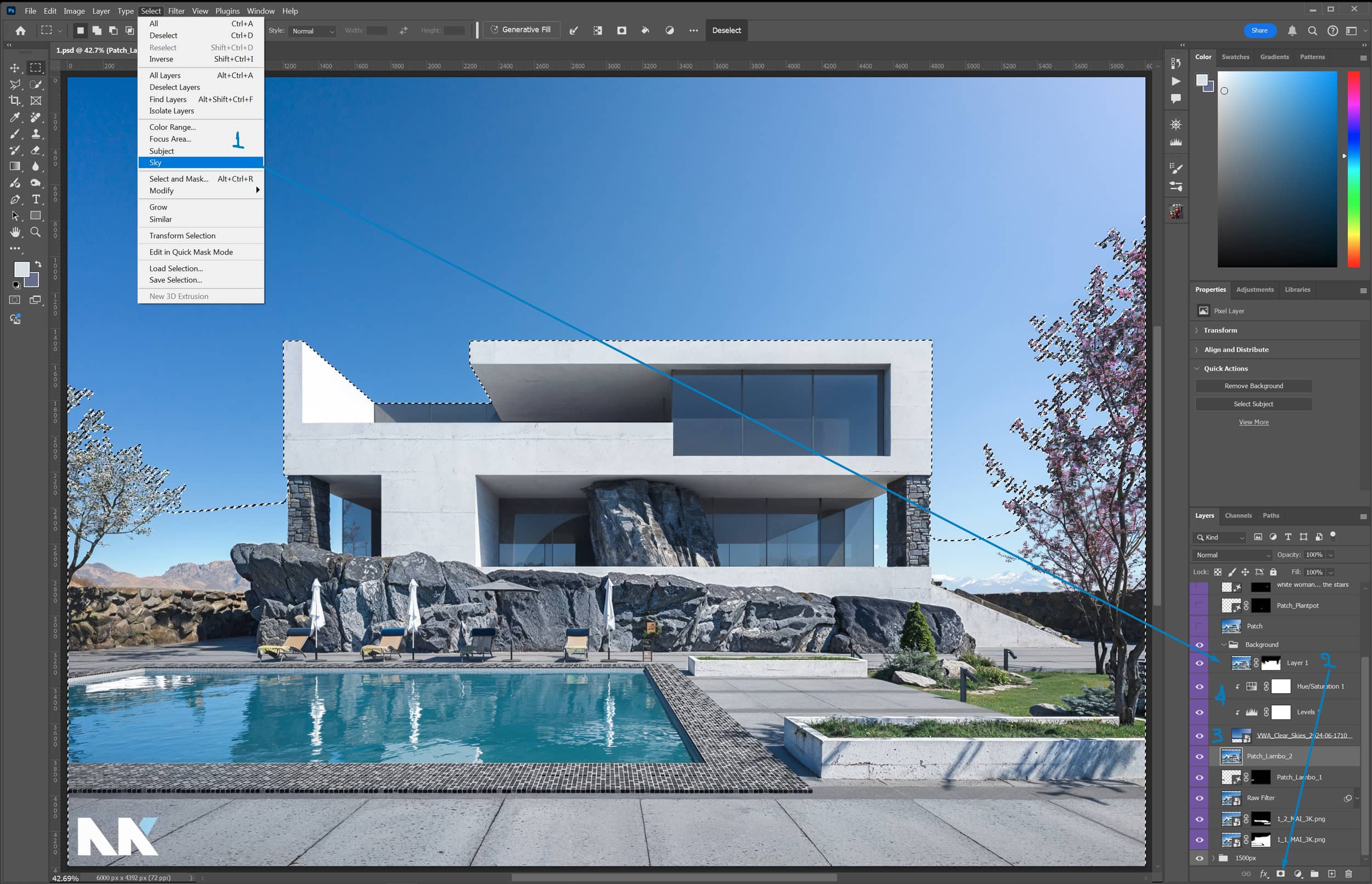
I used a sky from the VWA Backgrounds Vol1 to replace the existing one. The process is quick and simple, especially with Photoshop's new AI tools.
Here's how you do it:
Here are the final minor adjustments made to the 3000px version:

It's time for Topaz to handle a simple 2X upscale. I used the AI model High Fidelity (v2), which cleans up the noise from the image and pushes its sharpness to the limit. While you could do this in Photoshop as well, Topaz is slightly better for the job.
Did you know that Photoshop has a built-in AI upscaler? It actually does, and it's pretty good, up to 2X. But as I mentioned before, I still prefer Topaz.
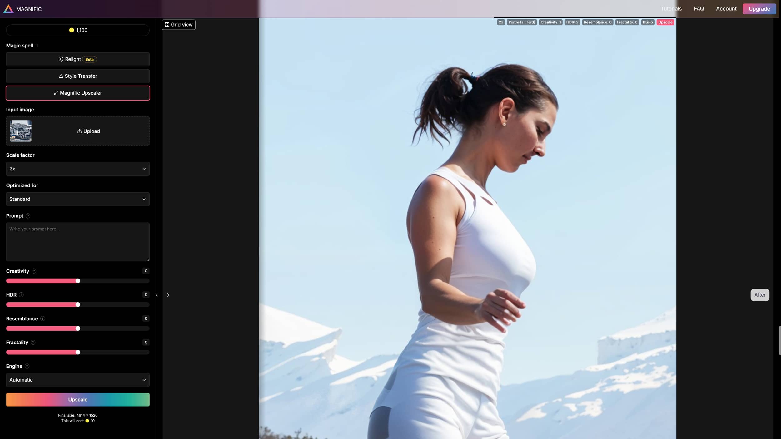
And now, the magic of Magnific begins!
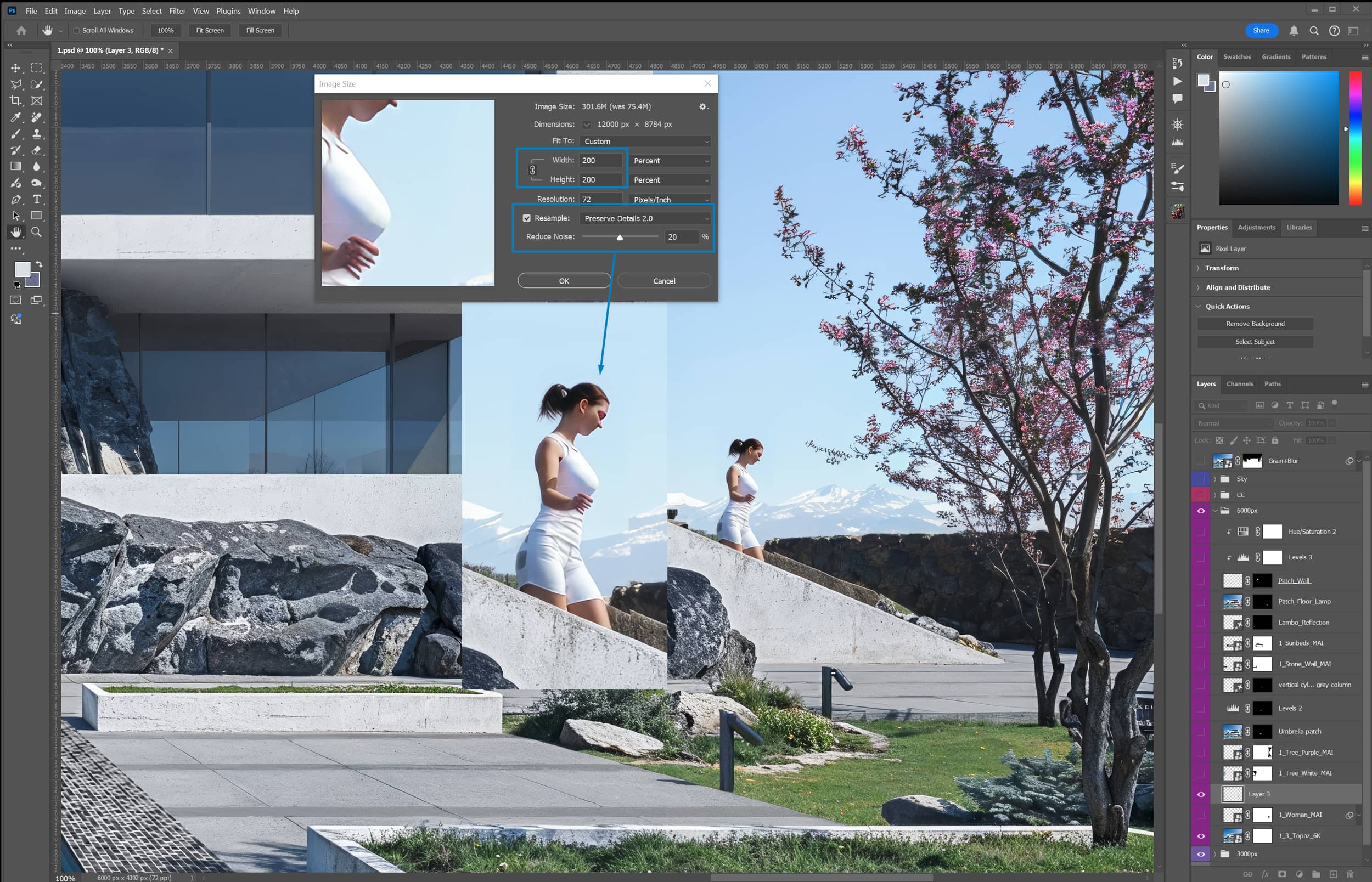
Let's zoom in 100% on the woman. She really looks like a 3D model; Photoshop and Topaz upscaling haven’t done a great job here. The two trees also look pretty poor, and there are some additional elements that I’ll analyze further.
So, first, I'll crop the woman and then use Photoshop’s upscaler (Preserve Details 2.0) because if I don't, the result in Magnific won’t be satisfactory due to the low resolution of the original image.
Woman Improvement.
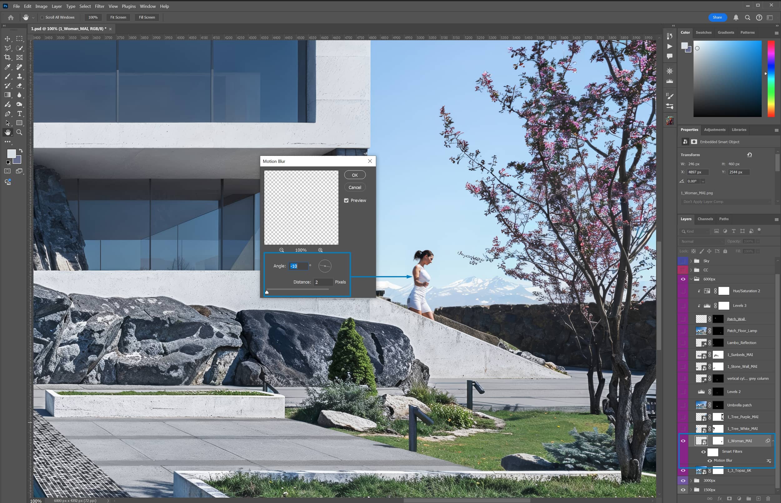
Almond Trees.
I repeat the process without the 2X upscale for the almond trees since the trees are close to the camera and the resolution is satisfactory. Playing around with the Magnific settings improved the results quite a bit, leaving just a few minor blurs in some areas that aren't very noticeable.
Umbrella.
Continuing with the fine details and the Remove Tool since I noticed an artifact on the umbrella. Next, I'll change its color using the levels adjustment, and finally, I'll add a vertical column using Generative Fill.
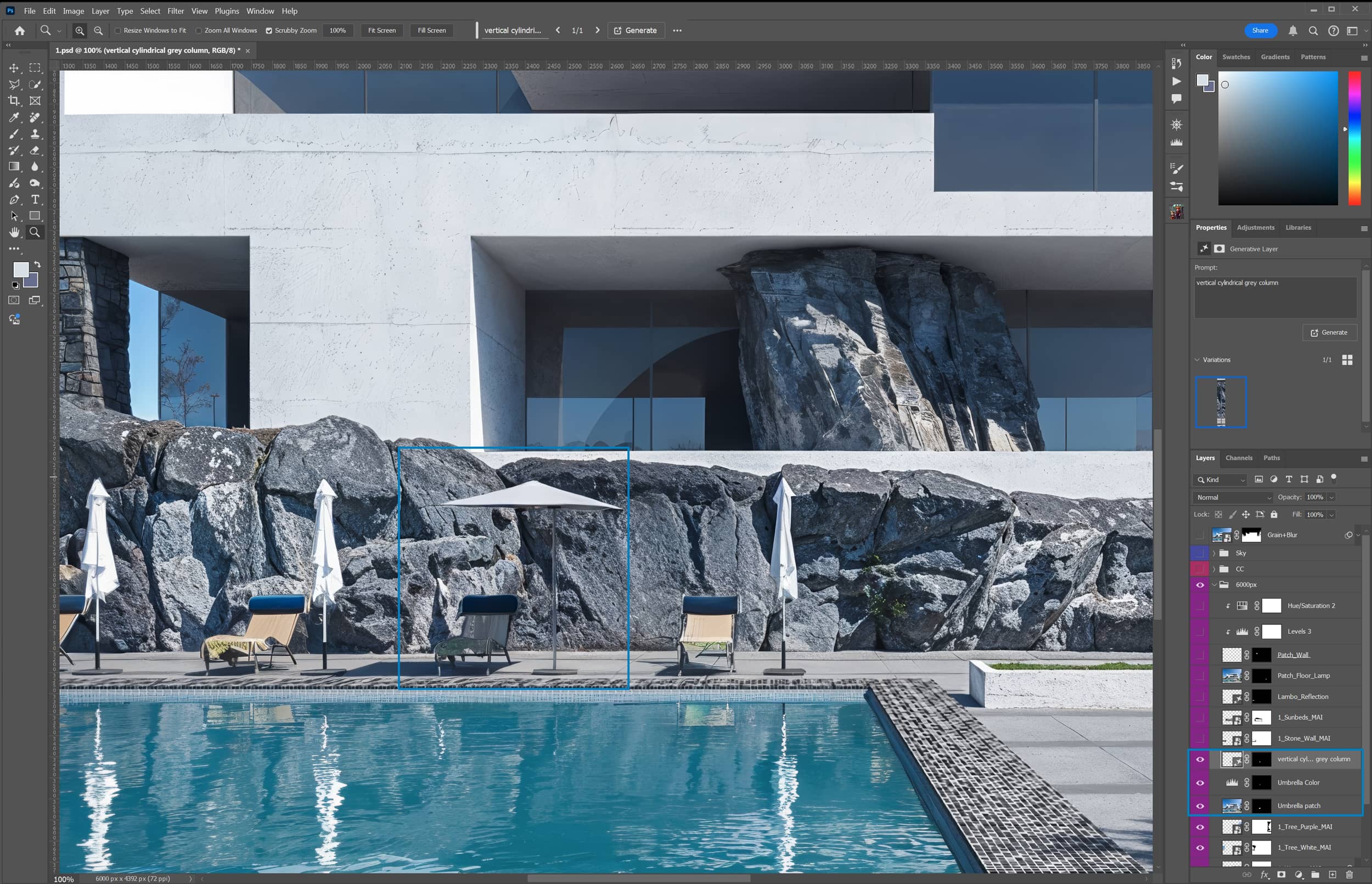
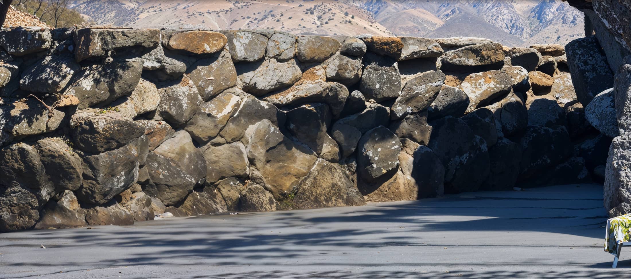
Stone Wall.
At this point, I'll crop the stone coffee wall on the left side and process it in Magnific to enhance its texture. I forgot to switch the filter to standard, leaving the Portrait (Hard) filter active, and the prompt is clearly incorrect. But as you can see, it doesn’t matter at all. The job was done, and with fantastic quality!
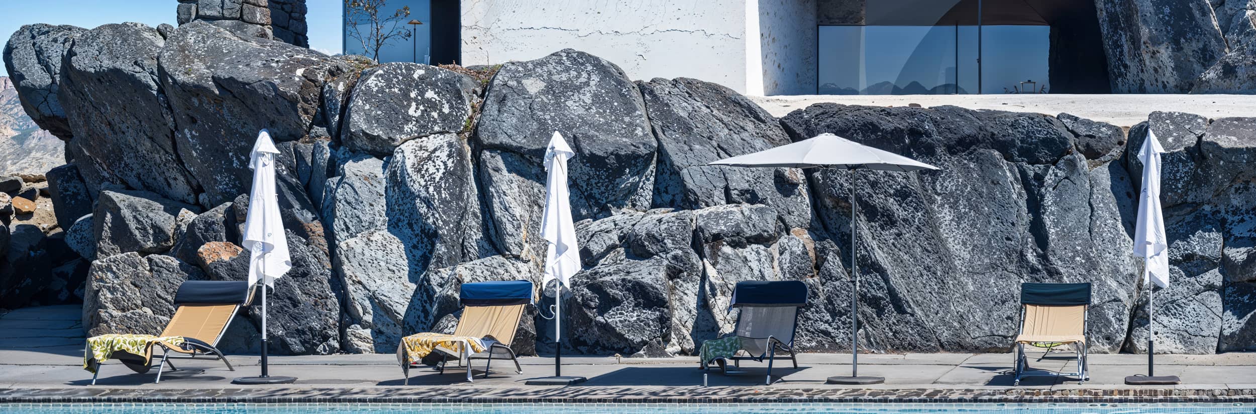
Sunbeds & Rocks.
Again, the same process applies to the pool loungers, the umbrellas, and the rocks at the back of the house near its base.

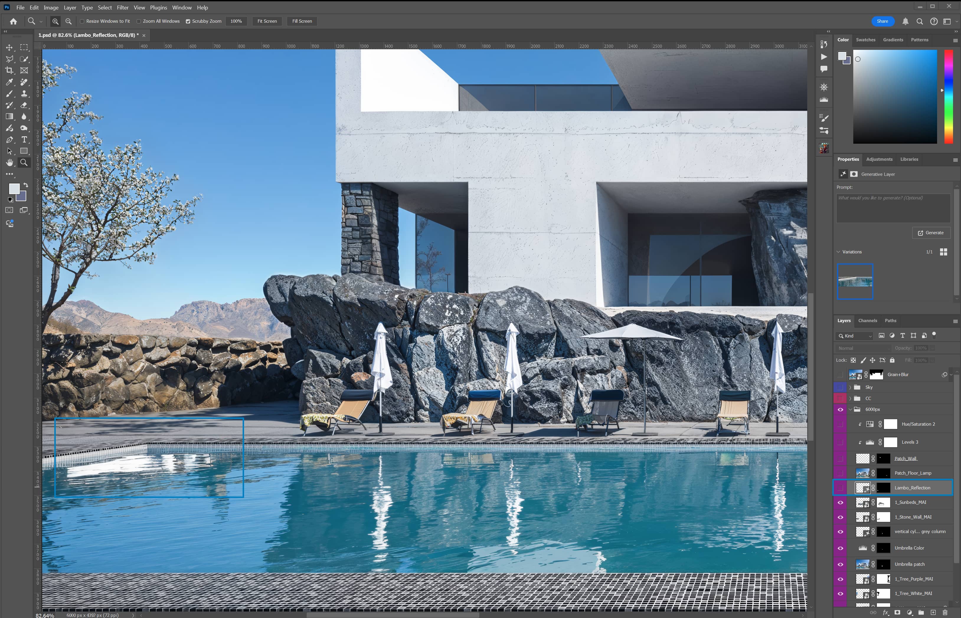
Pool Reflection.
As usual, I’ve accidentally overlooked the reflection of the car in the pool. So, once again, I’m using Photoshop's annoyingly fast AI tool called Generative Fill to fix it with a single click. By the way, this could be done with the Clone Stamp Tool, which isn’t AI-based, but I'd have to brush here and there until the sun sets..!
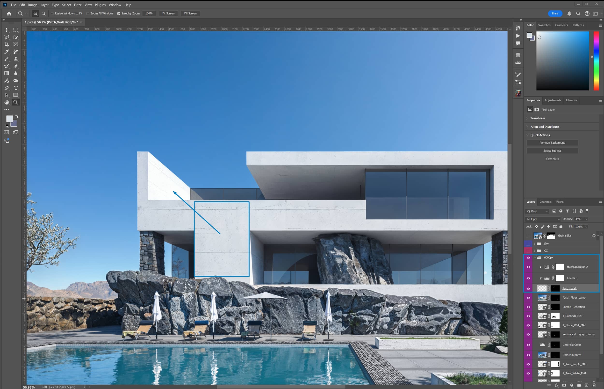
Burned Wall.
The final touch is applied to the white, charred wall, slightly restoring its texture. I first captured it from the building's facade and then adjusted it to fit the desired surface, playing with its perspective.
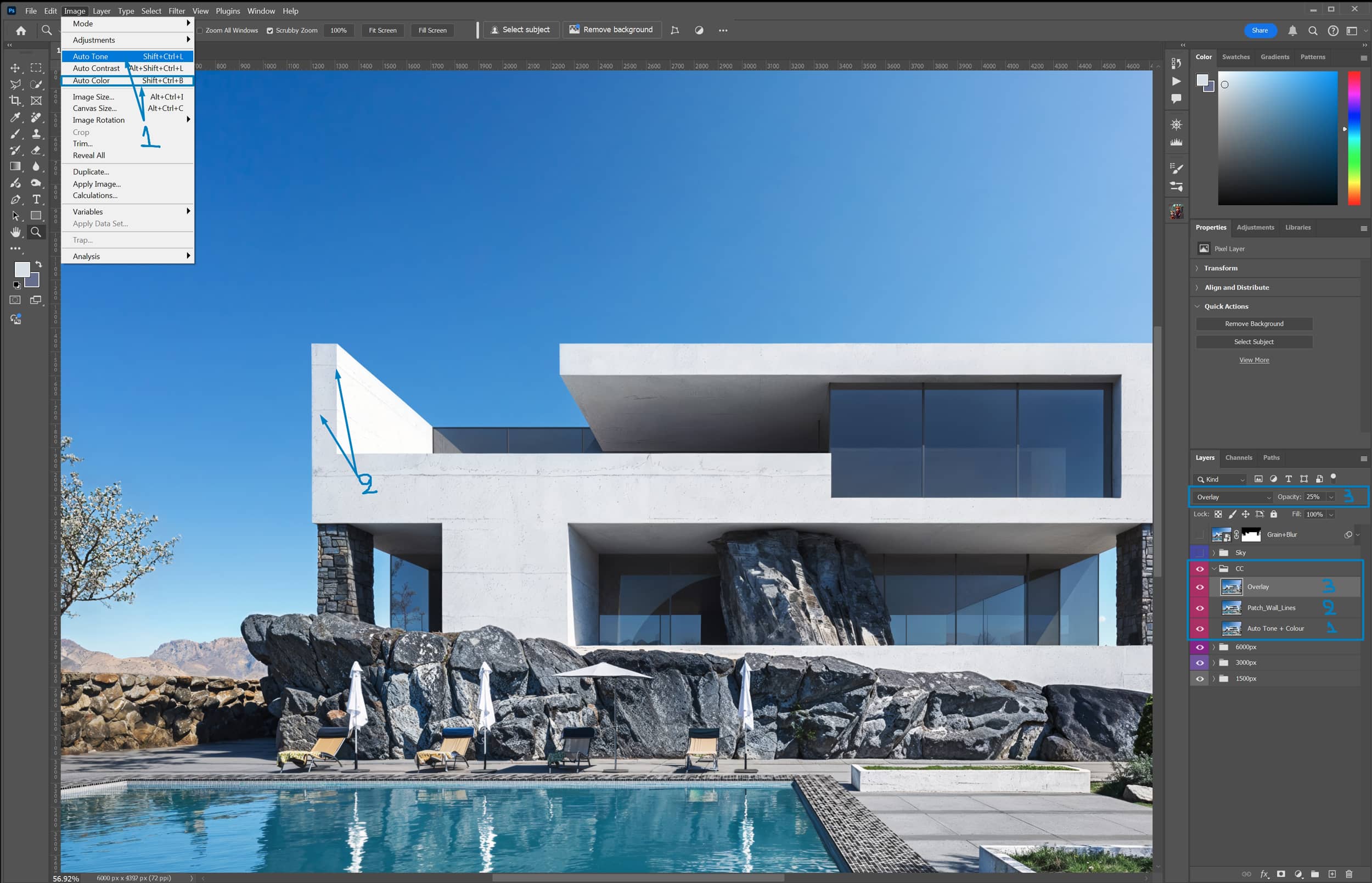
Color Correction Folder (CC).
Quick and Simple Enhancements: Just 2-3 minor tweaks to further improve the color grading and contrast of the image.
1. Auto Tone + Auto Color from the Image Menu in Photoshop. Just a heads-up, this is an AI tool within Photoshop. Alternatively, you can use Levels, Color Balance, Selective Color, etc., and test until you’re satisfied.
2. Patch Wall Lines. A few minor fixes with my old favorite tool, the Clone Stamp. I rarely use it anymore, as I've replaced it with various AI one-click ones!
3. Overlay. This is a simple yet effective contrast technique that a graphic designer friend showed me 10 years ago—thanks, Richard! I still use it and always think of him when I do. Copy and paste the layer and apply the overlay blending mode with 25% opacity. It almost always works effectively especially on the reflections of a scene.
Sky Folder.
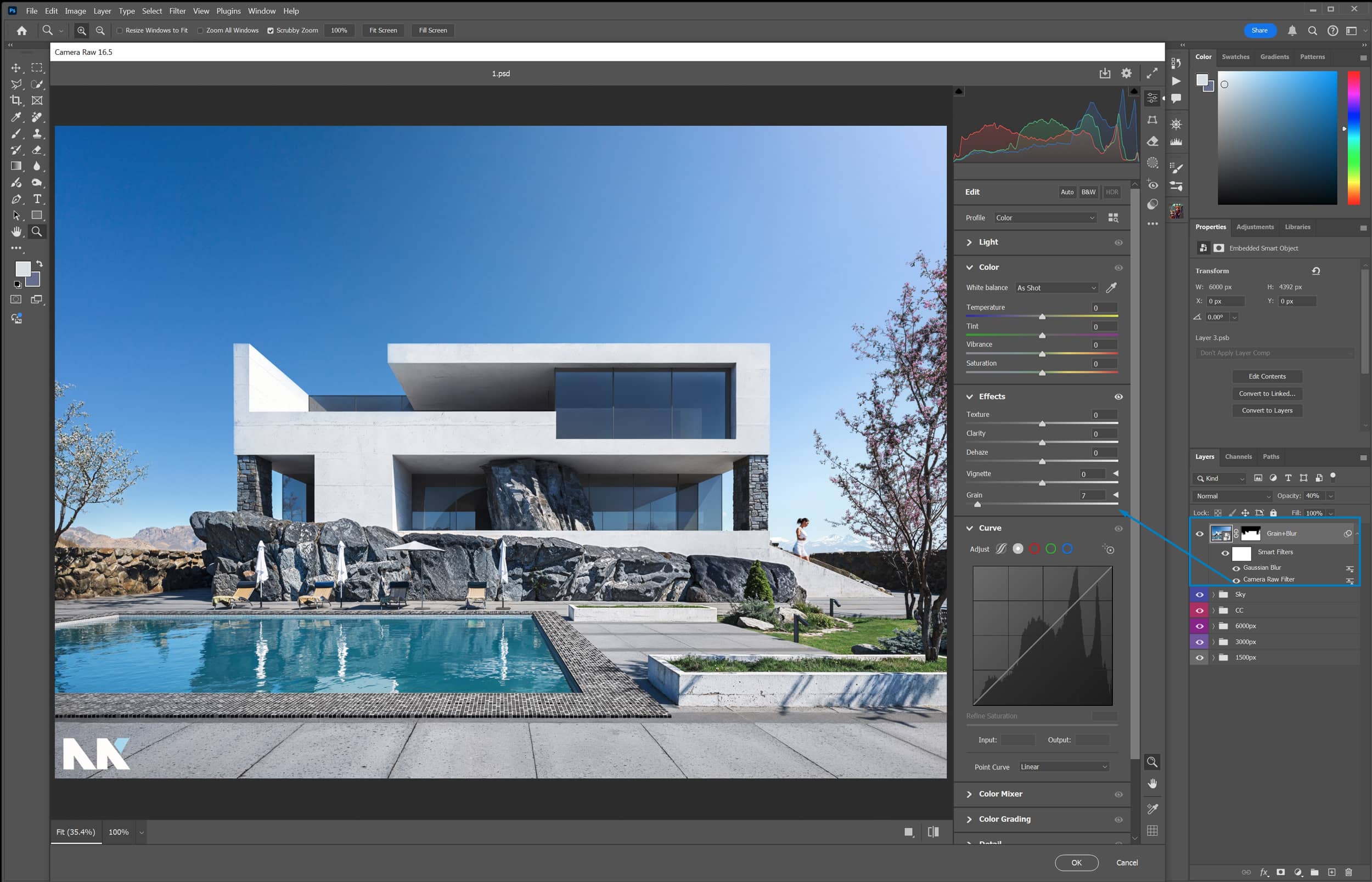
I just decided to reposition the sky because I noticed that I lost some of its quality due to the many upscaling steps, or something like that. It’s not a big deal, though—I was too bored to dig into it further.
Additionally, for some reason that I can’t quite explain, maybe a desire and nostalgia for the old grainy look of my Canon EOS due to high ISO, I chose not to remove the noise from the sky. Instead, I added noise to the rest of the image and a slight blur, which I did using the Raw Filter—probably the best tool Photoshop has ever released. This way, the excessive sharpness and clarity I had given the image up to that point were toned down, and the image gained a subtle sense of a real photograph.
1. Why invest in professional tools and workflows if I can make all the improvements in my 3D modeling and rendering software?
You can dedicate as much time as you like to traditional production, but remember this: “There is always room for improvement.” High-quality professional tools and well-curated libraries are key to mastering your craft. Even with top-tier images, you can often enhance them using the techniques outlined in this article.
And if a client requests a higher resolution, such as upgrading from 3K to 6K, it’s not always necessary to re-render the entire image. Instead, you can often manage this upgrade efficiently. Pro tip: Charge your standard rate for this service; the client will be willing to pay.
2. Have you ever tried to upscale and enhance high-quality images without success because they were already so great?
Yes, I’ve attempted that twice, and in both cases, the images were already outstanding. I ended up congratulating the artists because they had truly delivered some of their best work.
3. Topaz Photo AI is reasonably priced on average, but Magnific is quite expensive. There are other enhancers on the market that are more budget-friendly. Do you have any suggestions for those?
I’ve tried out several online tools, and in my opinion, nothing matches Magnific, even with its flaws. To me, it’s actually quite affordable, especially considering the many tricky ways to reduce credit usage, as I’ve mentioned in this article.
4. Can this upscaling/enhancing technique significantly improve any low-quality image?
Not really. You need a decent base to start with. A good image isn't just about resolution; it's about having enough quality in the original to work with; for example, framing or lighting is also very important.
5. Is there a free alternative way to apply a similar post-production workflow without paid tools such as Topaz & Magnific?
Yes, you can achieve a similar workflow using free tools like Stable Diffusion and upscalers such as ESRGAN or Supir. Supir is often recommended to maintain the original look of your image. However, when it comes to image enhancement, I have to say that, based on my experience, Magnific is still the best I’ve tried—it delivers results that really align with my personal taste.
Thank you for your time.
Kind regards & Keep rendering!