Menu
VWArtclub
Search
VWArtclub
VWArtclub is a community of thought, a shared 3d art gallery, a thirst to know how 3d design will evolve worldwide, a respect for this way of art and a decision to record this fact visually.
Projects. Club. Studios. Learning. News. Inspiration. Xfree3D. Contests. Forum. Profile & Contact. Login.
learning
Be A *Member.
Be A *Supporter.
Be A *Wanderer.
Be A *Studio.
Share it.
Share it on Facebook
Share it on Twitter
Share it on Pinterest
Share it on LinkedIn
Share it via e-mail
Technicolour Spaces

The Elements Of Design

Vamvakas Anastassis

Creating a complete and aesthetically pleasing 3d scene relies primarily on good knowledge and use of the elements and principles of design. The elements provide the visual tools to create a design from scratch, whereas design principles can be thought of as the visual grammar applied to the elements, a way to manipulate and arrange them, in order to build around the subject matter of our intended image.

It’s generally accepted that there are eight elements most commonly used in design of any type. These are line, space, form, shape, texture, colour, light and time. Of those we will focus on line, shape & form, space, colour, light and texture.

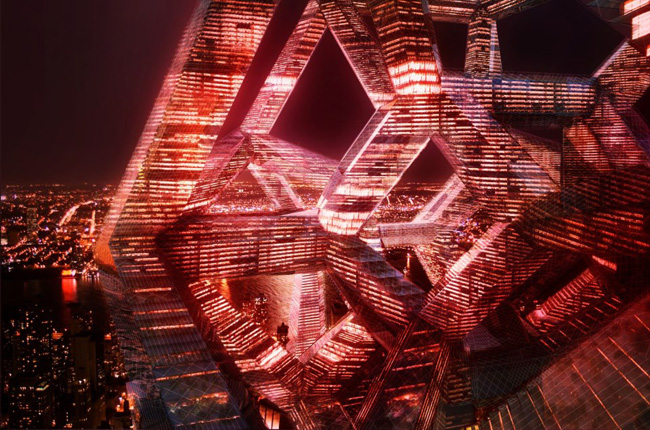
"The element of line is of fundamental importance to architecture. In this building rendered by Juan Carlos Ramos, diagonal lines spreading to every direction create an energetic and pulsating composition which challenges the stability and logic of the horizontal and vertical axes."

Line is a fundamental concept, and although it may seem quite abstract in its definition, it becomes very real visually when one starts creating a 3d scene.

Lines can be actual or implied, the latter being formed by the arrangement of the various objects put together in a 3d scene. Their intended-or sometimes unintended- directions lead the eyes through the scene. Lines are pretty capable of evoking different psychological feelings and we need to be well aware of the impact the lines we designed have on the viewer of an image. For example, horizontal lines convey a more relaxed feeling, can elongate a space, and may tend to be more reassuring. Vertical lines, on the other hand, may evoke a feeling of more formality, height, and grandeur. Angled lines can represent energy, while curved lines may illustrate more natural or freer spaces.

Practical tips.

  • Horizontal lines suggest a feeling of stability and rest. Objects parallel to the earth are at rest in relation to gravity. Therefore compositions in which horizontal lines dominate tend to be quiet and restful in feeling. This is very well shown in Frank Lloyd Wright"s architectural style, where the use of strong horizontal line stresses the relationship of the structure to the land.
  • Vertical lines communicate a feeling of loftiness and spirituality. Erect lines seem to extend upwards beyond human reach, toward the sky. They often dominate public architecture, from cathedrals to corporate headquarters. Extended perpendicular lines suggest an overpowering grandeur, beyond ordinary human measure.
  • Diagonal lines suggest a feeling of movement or direction. Since objects in a diagonal position are unstable in relation to gravity, being neither vertical nor horizontal, they are either about to fall, or are already in motion. In a two dimensional composition diagonal lines are also used to indicate depth, or an illusion of a space. Thus if a feeling of movement or speed is desired, or a feeling of activity, diagonal lines can be used. Diagonal lines, real or intended, also lead the eye to primary or secondary focal points in an image.
  • Horizontal and vertical lines in combination communicate stability and solidity. Rectilinear forms are very stable in relation to gravity. This stability suggests permanence, reliability and safety. Deep, acute curves, on the other hand, suggest confusion, turbulence, even frenzy, as in the violence of waves in a storm, the chaos of a tangled thread, or the turmoil of lines suggested by the forms of a crowd.
  • Curved lines do vary in meaning, however. Soft, shallow curves suggest comfort, safety, familiarity, relaxation. They recall the curves of the human body, and therefore have a pleasing, sensual quality

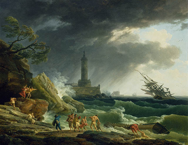
1. A Storm on the Mediterranean Coast, Claude-Joseph Vernet, 1767. The angled lines of the sky, the ship and the rocks on the shore convey a feeling of movement, agitation and speed in this stormy harbour scene.
Image Source: The J. Paul Getty Museum  

Shape and form are often thought of as interchangeable, but this is not the case. They’re two distinct elements with individual characteristics. Shape is a two-dimensional element that has only length and width and occurs on one plane. It is a closed contour, defined by its perimeter. Shapes can be abstract, natural or geometrical. Form, on the other hand, is a threedimensional element that has length, width and depth. Probably the most common form 3d designers work with is the rectangular box, especially in architectural visualisation. Obviously 3d design is all about form, but we must never forget that 3 dimensional objects emerge from 2d shapes and can be deconstructed into those flat shapes again. In fine art for example, Picasso, in cubism, disassembled forms and made them into shapes. He took orthographic views of a subject and put them together to make a composition. His pictures don’t have depth in them initially, but the human eye is capable of putting all those combined shapes into perspective. In architectural visualisation, working the other way round from Picasso, when we design a wall, we must always treat it as an elevation and what is on it as 2d shapes which must be combined in an effective and pleasing way. This is very important when, for example, we are called to create a wall of paintings, or shelves, or when we need to accessorize a surface with different decorative objects. The same holds when designing floor plans and deciding on furniture arrangements. It is always important to remember that creating more original forms for our enclosed rooms can help to convey different psychological messages to the clients and the users of the spaces we design.

Practical tips - Form.

  • Form can be defined by line, either explicit or implied, which can provide the contour of forms.
  • Value (the relative lightness or darkness of a colour) can also define form. Strong contrasts in value within a composition may define the boundaries of forms. Gradations of value, or shading, can also create the illusion of contour and volume. .
  • In the same way, hue (colour) contrasts and gradations can also define forms. Form may also be defined by change in texture, even when hue and value remain essentially consistent. However, most typically, form is defined by a combination of these factors.

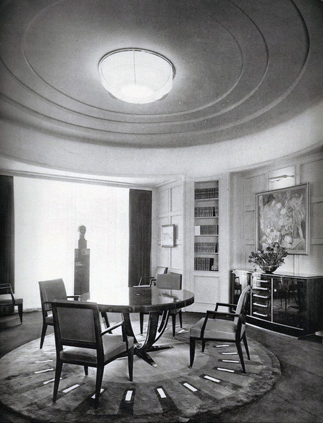
2. In this Art Deco Interior, circular shapes and forms lend the room a distinct character
Image Source: Art Deco Interiors Gallery

Space is probably the most important element to discuss in architectural visualisation, since it is actually what we are manipulating to form our designs. Space is three-dimensional, and is defined by either physical or visual boundaries. In 3d design the illusion of the 3 dimensional space is of extreme importance. Major considerations in achieving a successful illusion of 3d space are

  • shading, ie modelling with light and dark,
  • linear perspective, ie the relationship between apparent size and space and
  • atmospheric or aerial perspective, ie the way an object should be shown when viewed through a layer of air, moisture, dust etc.

Practical tips - Space.

  • Always keep in mind visual and spatial boundaries in your scene. How do they interact? What do they reveal/mask? 
  • Negative space, in other words what is left “undesigned” is also a crucial part of your design. The relationship between positive and negative space in your image can make or break your intended vision.

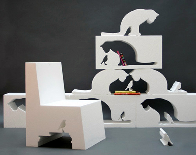
3. Positive and Negative space are addressed here in a playful and bold, contemporary manner.
Image Source: FILL IN THE CAT Oscar Nunez

Colour and Light are interdependent, and of course vast topics to be covered in an introductory article. Changes in one will create changes in the other. Colours viewed under different light sources will change, so all colours must be chosen under the light sources with which they will be displayed in the scene. Colour is a very conscious choice made by a designer and can dictate feelings, trends and underlying messages. Light, on the other hand, is a very important component of material aesthetics, able to transform and manipulate space, colour and texture. Lighting is an often neglected aspect of interior design, yet it is one of the most important considerations. It enhances colour, accentuates the architecture, and highlights art and accessories. Proper lighting takes an interior beyond the ordinary to create the exceptional.

Practical tips - Light.

  • Always keep in mind the function of the room and design appropriate lighting solutions for it. 
  • Mood lighting tells a story, or describes a feeling for the space. 
  • The lighting fixtures themselves express a mood very strongly. As with the furniture you select, the style of the lighting fixtures should be suitable in mood to the rest of the decor. 
  • Accents of light in specific parts of a room usually have no functional reason, but add a dramatic touch. Always take care in deciding what to accentuate by lighting. 
  • Vary the lighting scheme by using different types of fixtures for different tasks, by having illumination flow in different directions, by having fixtures at different heights, and by providing different levels of intensity of light. However, all the different types of lighting you use in a room must work together in harmony.

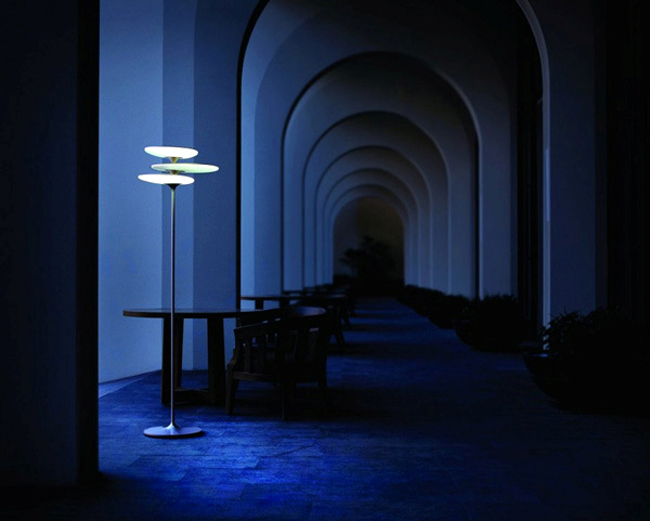
4. Accent Lighting helps redefine space 
Image Source: Coral Reef Lamp Qis Design 

Colour-Interior Design colour tips.

  • Use the 60-30-10 Rule: 60% of a dominant colour 30% of a secondary colour 10% of an accent colour
  • Study Colour Scheme theory: Using a colour wheel you can come up with various colour schemes. Each type has its own significance and function. For example, rooms decorated with a complementary colour scheme tend to provide a clear separation of colours and are often more formal and more visually challenging. Complementary colour schemes should be used in the more formal areas of the home, for example, the living room or dining room. Rooms using an analogous colour scheme are typically more casual, restful and muted. This colour scheme is best used in the more informal areas of the home. Family rooms, dens and bedrooms, places where you’re searching for rest and recovery from the day, and so on.
  • Don"t Forget a little bit of Black: Black colour always adds depth, grounds a colour scheme and pulls together all patterns and colours in a space.
  • Go Natural with your Values: Follow Nature’s example. Darker values of colour for the floor (ground), medium values of colour for the walls (trees and mountains) and light values of colour for the ceiling (sky).
  • Pull From the Pattern Pick your colour scheme from the largest pattern featured in the room.
  • Flow the Colour: In order to create a flow of colours from one room to another, simply choose a colour you"re using in one room and restate it in a different way in an adjoining space.
  • Consider Contrast: A high-contrast space appears clearer and more highly defined than a space that incorporates low contrasts. Think about using high contrast to enhance the formality of a room and low contrast to introduce soothing qualities.
  • Get Emotional With Colour: Use emotional associations of colour to their greatest effect in a space by deciding on what emotional impact you want the room to have.

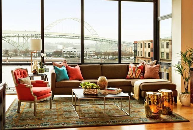
5. Accent Colours add character and identity and provide a visual balance with the dominant view
Image Source: Garrison Hullinger Interiors

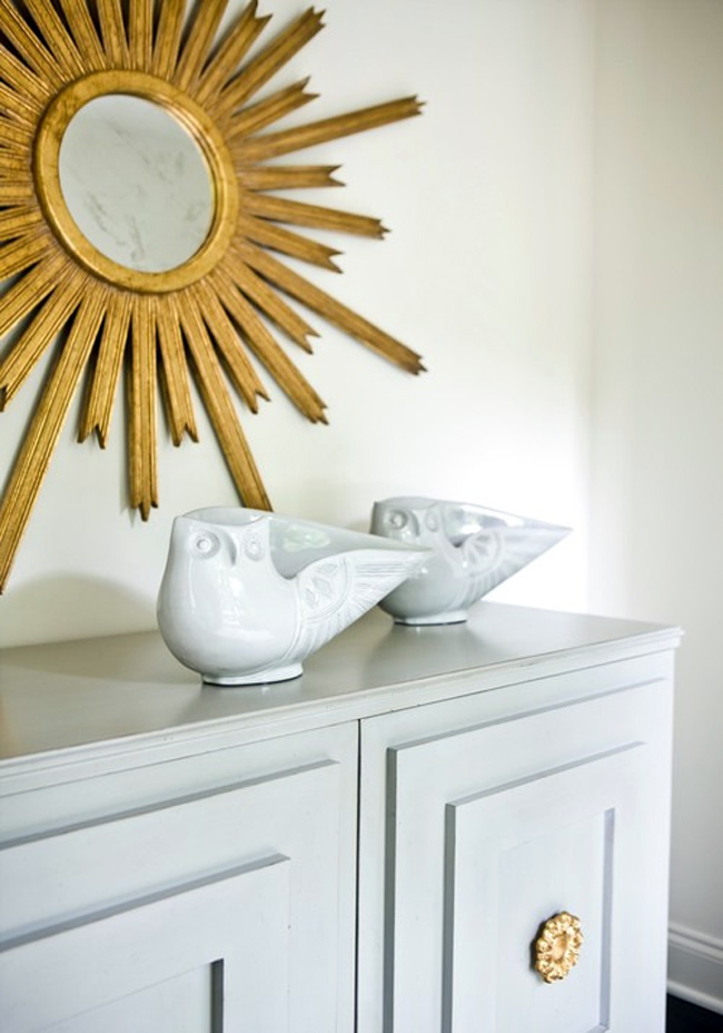
Texture can only be visual/perceived in a 3d image. In other words, viewers cannot touch it. Nonetheless, it must create the intended feeling for the viewers, as if they were capable of touching and feeling the materials presented in the image. Sometimes the visual message of a texture is actually different from the tactile message, and it’s important that we, as designers, try to maintain a strong relationship between the two to reinforce the integrity of the materials and the design. Using texture allows us to add another whole dimension to a space. No longer confined to visual elements such as line and colour, now we can actually determine the way the space will feel to the viewers, thus making our artistic design much richer and more meaningful. One common function of texture is to add interest to a space which has “boring”, monochrome colours. As a rule, all interior design styles come with their accompanying textures, which identify and characterise them.

Practical tips.

  • One of the basic principles of using texture has to do with weight. Rough, coarse textures tend to make an object feel heavier, while smoother textures will make it feel lighter. In this way a polished white marble floor will feel lighter than hardwood flooring, even though it is actually much heavier.
  • When determining how much weight a certain texture adds to an item, the rule of thumb is that generally, those objects which reflect more light will tend to feel less heavy. Using this understanding, it is possible to create balance between large and small items, using heavier or lighter textures.
  • Designers keep textures from multiplying out of control by repeating them. Like colour, flow the textures around the space by restating them in different objects. However, good layering avoids repetition of the same textures on top of each other. A glass coffee table with glass candle holders and a glass table lamp is often dull, unless specifically intended this way.
  • Like colours, interior design styles traditionally come with a set of adherent textures. The 60-30-10 rule is also applicable to texture for a balanced and varied result.

Finally, don’t forget that in design, rules are made to be broken!

6. Layering different textures lends a space vitality and interest.
Image Source: Melanie Turner Interiors  

Bibliography.

Comments.

 
go back
 
300x250 Donate
 
300x430 RebusFarm 2024
 
300x300 VWAI Backgrounds Vol5
 
300x430 Creative Lighting
 
300x430 Horoma
 
300x250 Renderpeople
 
300x250 Extreme Textures 4
 
300x250 Chaos
 
300X250 Legrenzi Studio
 
300x430 LeonardoAI
 
300X250 Evermotion
 
Be A *Member.
Be A *Supporter.
Be A *Wanderer.
Be A *Studio.