The principles of design act as guidelines to help us create physical spaces, as well as presentations, graphic designs, fabric designs, etc. As stated in the previous article, design principles can be thought of as the visual grammar applied to the elements, a way to manipulate and arrange them in order to create a substantial and aesthetically complete design.
Six principles of design are generally recognised: balance, rhythm, emphasis, proportion, scale, unity (harmony and variety). Clearly there’s a relationship between all of the principles as we use them in our designs, and we’ll briefly discuss each principle in the following paragraphs, along with practical tips that illustrate their use.
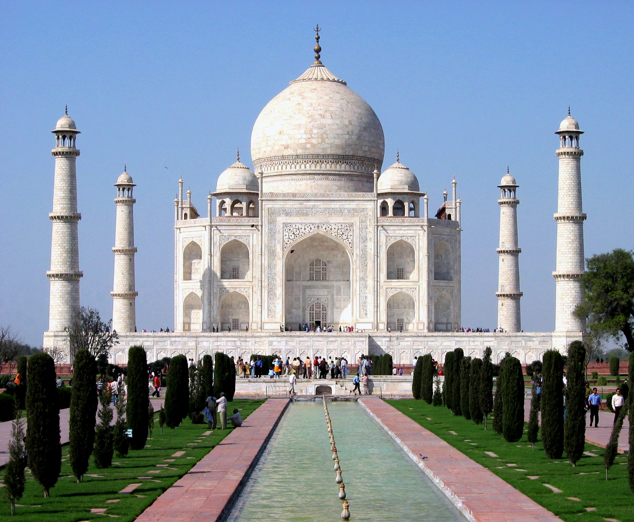
1. The Taj Mahal is one of the most illustrious examples of symmetrical balance.
Balance is the visual and physical sense of equilibrium we create in a room. It provides a sense of stability or constancy, and inspires a sense of comfort while viewers take time to observe a space. The most common type of balance used in design is symmetrical balance, which involves the existence of an axis of symmetry, or a central point with items identical on either side of it. While this type of balance is quite dignified, formal and restrained, it can become somewhat austere or feel oppressive. Asymmetrical balance is the use of different objects on either side of a central point. This type of balance is perceived as less formal and often more comfortable, but takes more skill and thought to create. Radial balance is based on the circular shape, as suggested by its name. On a small scale it can be identified on the round dial of a clock, an old telephone, or the spikes of a bicycle wheel. On a larger scale it can be observed in chairs surrounding a circular table, or even a spiral staircase. Radial balance, much like the circle it creates, evokes a feeling of inclusion and invitation, a sense of quiet and effortless achievement and completion.
Symmetrical balance (or otherwise known as bisymmetrical, formal or passive balance) relies very much on restraint and discipline. It requires or allows no judgment, being therefore ideal for historical interiors, or spaces that must remain timeless. Combined with vertical lines it creates a sense of unparalleled power and grandeur. However, it has been well known to designers that a really good symmetrical composition always contains elements of asymmetry. An elevation of a bed with two matching nightstands, for example, can be “broken” by the asymmetric placement of objects on them, or by using dissimilar picture frames on the wall portions above them.
Asymmetrical balance (or otherwise known as informal, active, optical or occult balance) can be achieved in two ways:
Asymmetrical balance is the most difficult to accomplish and requires constant practice and a trial-and-error approach. Always try to find objects that are compatible yet varied enough to create interest. Then proceed to arrange and re-arrange them until the overall composition is meaningful and “feels right”. It always helps if your composition is able to support a scenario, in other words tell a story about the interior you are designing. Asymmetrical compositions are nowadays favoured everywhere, from bedrooms to living and dining areas, to assembly spaces and commercial interiors. The Western world has learned a lot about asymmetrical balance from oriental philosophies and especially the strong Japanese influence in architecture and design.
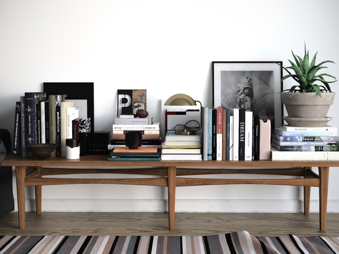
2. Assymetrical Balance in accessorising a table surface. Image by Petukhov Sergey
Rhythm is a concept familiar in music, as a fundamental element supporting melody. In design, rhythm aims at moving the eye around a space and keeping interest flowing. It can be identified in the repetitive use of the elements of design, be it colour, line, pattern, texture, shape and form. Architectural details such as stairs, window panes and mouldings suggest rhythm.
Rhythm can be achieved through five techniques:
Repetition of a colour, texture or other design element throughout an interior can ensure that the eye moves around connecting elements smoothly, rather than jumping or leaping abruptly from object to object. Colour plays an important role here, and so does texture (see relevant tips in the Elements article).
Alternation is the sequence of two or more components which invite the eye to follow them throughout, thus creating a rhythmic pattern. Coffered ceilings and egg-and-dart shaped cornices are two very famous design entities consisting of rhythmical patterns.
Progression or Gradation is seen in shapes progressing from large to small or vice versa. Nesting tables or a collection of boxes varying in size, or the famous Russian dolls are celebrated examples. Gradation can also be identified in the distribution of colour values in an interior. A usual distribution is: light values on the ceiling, medium values on the walls and dark values on the floor.
Transition is a technique that leads the eye without interruption from one point to another. The element of line plays a very important role here. Crown mouldings, arched doorways, stencilled or wallpaper borders, graffiti and runner carpets are all methods of creating uninterrupted, flowing “lines” or routes within a space.
Opposition or Contrast are everywhere around us. Window frames oppose glass panes, built-in cabinetry contrasts with its enclosure; cove lighting and luminous ceilings create boundaries with darkness. Shapes can also create rhythm by opposition: open and closed, busy and minimal, light and dark. Angular forms placed next to rounded shapes, harsh textures layered on top of shiny ones give relief and energy and reinforce asymmetrical balance.
Radiation clearly relates to radial balance, often featuring in large, custom floor coverings in spaces like hotel lobbies and ballrooms, or in grand ceilings where carvings or plasterwork create a radial effect. It is dramatic and impressive, lending a sweeping, rhythmic movement to a space. Circular compositions generally require about double the space compared to rectilinear ones.
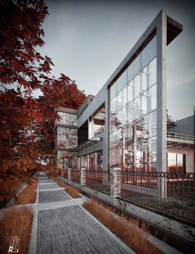
3. Rhythm by repetition can be observed in the architectural glass panes and pavement. Image by Mohseni Mohammadreza.
Emphasis is the creation of a focal point that attracts attention, indicates importance or shows that something holds a place of distinction. It is a natural tendency of the human eye to seek to identify a point of reference in a space, and the principle of rhythm expresses exactly the route to a dominant feature, a focal point. A many-doored hallway ending in a vista, such as a fine piece of furniture or artwork in a hotel is an image that could very well illustrate the notion of emphasis in design.
Focal points may vary from one to multiple, according to the space. Logically, smaller areas can handle fewer focal points, whereas larger areas may feature multiple focal points, each one with a different level of emphasis, progressing from the most to the least dominant in order to avoid conflict.
Choosing a focal point is a very conscious design decision. Usual candidates are windows framing a remarkable view, a fireplace, a wall of dramatic art, an impressive piece or grouping of furniture, or even an area rug of distinguished craftsmanship. More unusual or even controversial focal points are television sets and technology in general.
Where multiple focal points are planned, the dominant focal point can migrate seasonally. A fireplace in the winter may be replaced by a window or patio doors in warmer seasons. Space planning must be accordingly manipulated in order to comply with the elements emphasised at each specific point in time.
Where no focal point exists, one must be created. Using balance and rhythm, any piece of furniture, cabinetry, artwork (individual or in groupings), tapestries, rugs, mirrors and light fixtures can serve as a successful focal point.
The elements of design play a very decisive role in the creation of a focal point and can be manipulated accordingly to give greater emphasis to the chosen component. Arranging furniture shapes in order to face the focal point, directing lines-real or imaginary- towards it, accessorising with groups of objects to give visual weight, or using dramatic colours and textures are ways to increase emphasis.
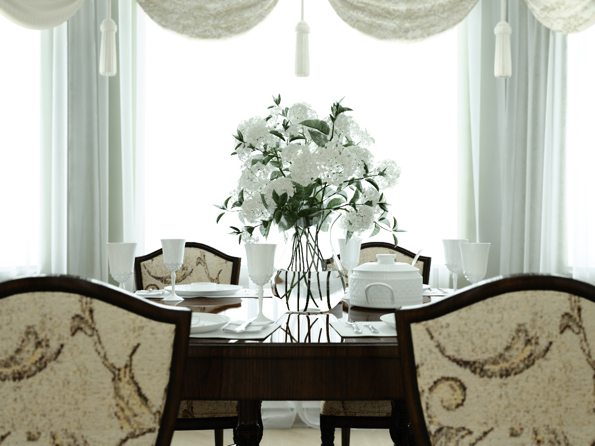
4. A vase of white flowers makes for a striking focal point in this tablescape. Image by Kulagin Vyacheslav.