Hello everyone, and thanks to VWArtclub for giving me the chance to write an article about my latest project. I greatly appreciate the opportunity because this project was special to me for many reasons. It has been with me for a long time. It took at least a year to finish it and was probably the most intense, pleasing, unnerving and annoying production ever for me. I hope that you will enjoy and find it useful!

I set the highest standards for myself. And despite not quite meeting my own expectations, I'm very happy with the final images. I learned a lot and will probably be doing things differently in the next project. So, maybe you can find some useful information in this article. The things I wish I knew before I started working on it basically.
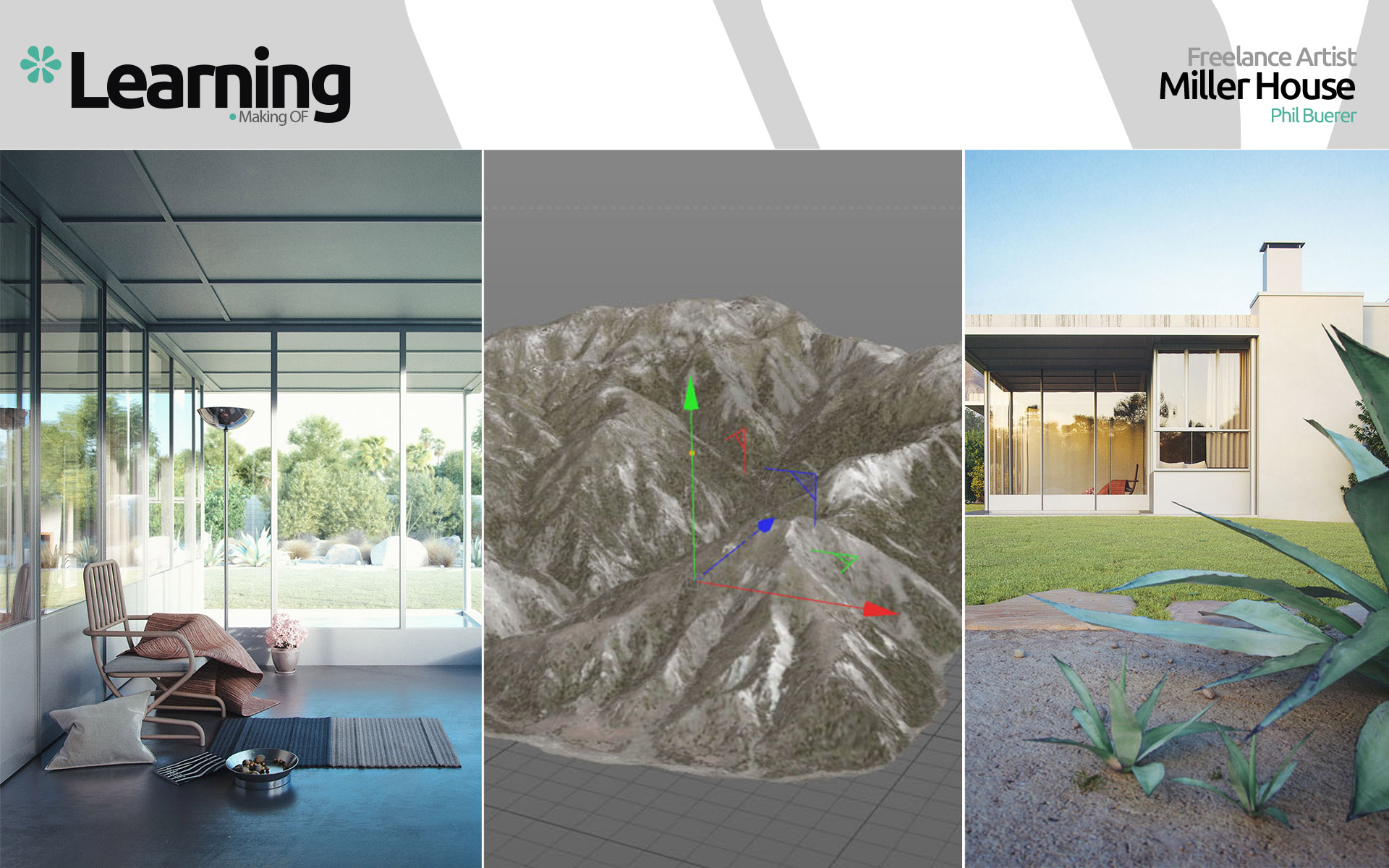
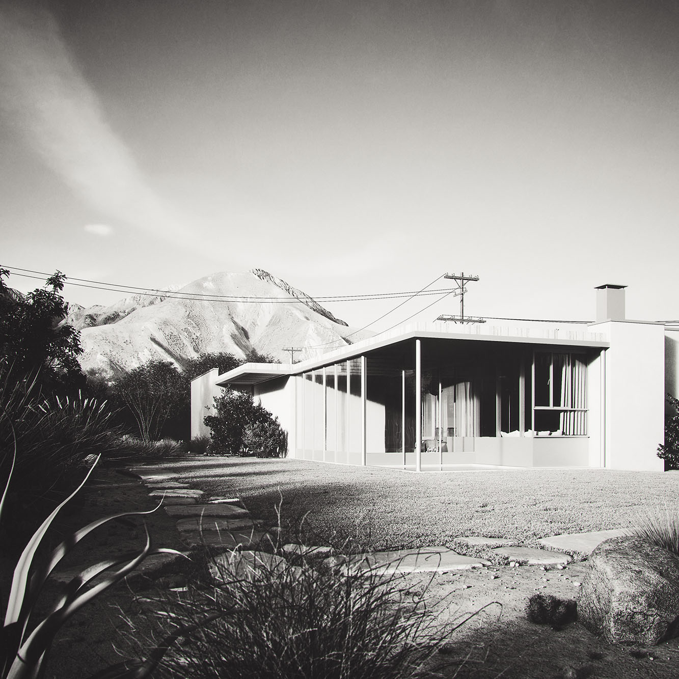
It all began while reading a book about Richard Neutra's designs. Particularly the Miller House, as photographed by Julius Shulman, caught my attention due to several reasons. It was not the most spectacular or expensive house but not less interesting either. Built in the desert in Palm Springs (CA) in the 1930s, the house went through some changes/adaptions over the years. Abandoned by the original owners, it was even used as a crack den by locals at times and the condition deteriorated until new owners commissioned thorough restorations. For more background information, here's a nice article from the current owner.
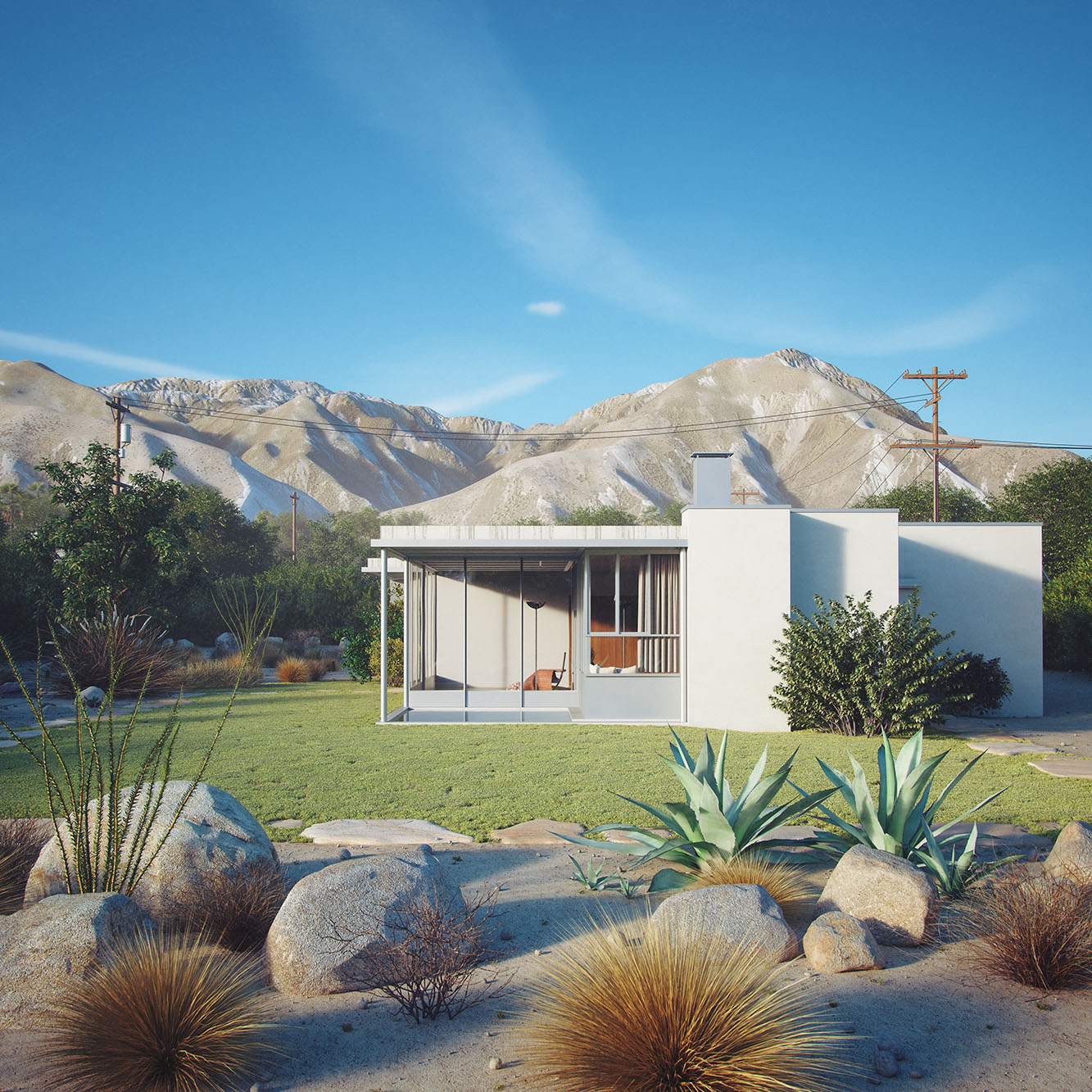
However, I thought this house would be a perfect challenge to recreate in 3d. And use it as a project to refine rendering techniques. I decided to make images from the house as it would look like today, if it were preserved in its original state. And I wanted to be able to take images from different angles, so I knew I had to build the complete environment in 3d.
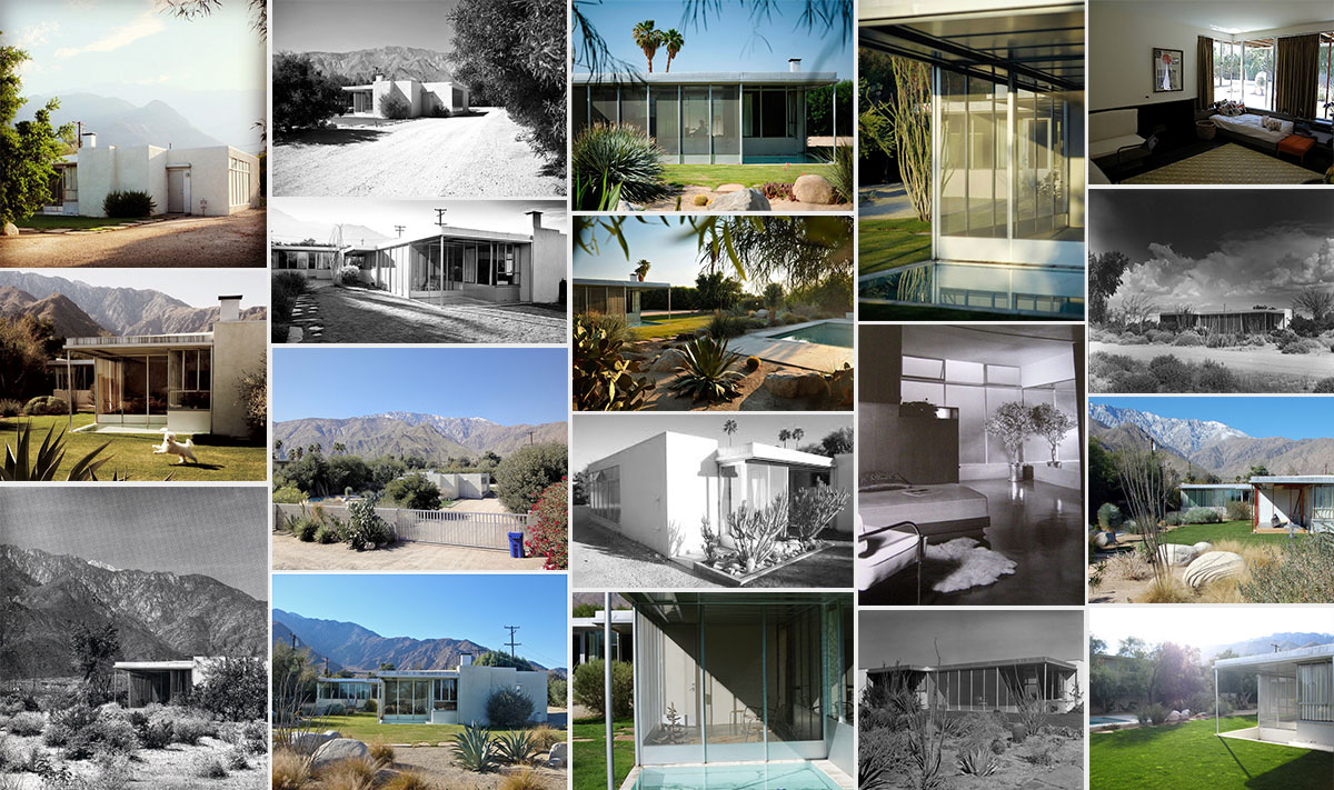
As always, it's crucial to get as many references as possible. It wasn't very easy because there's not as much information about this house as there is for other houses by Neutra. I gave most of my attention to the few original photos taken by Julius Shulman.
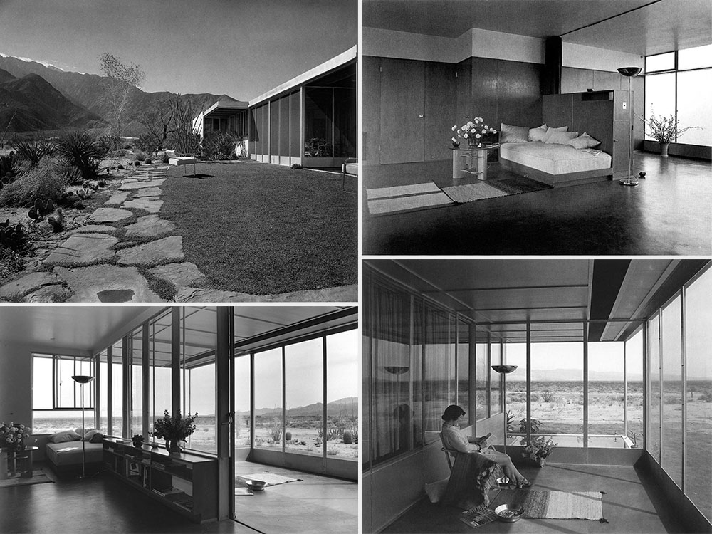
And here is what I found on the internet.
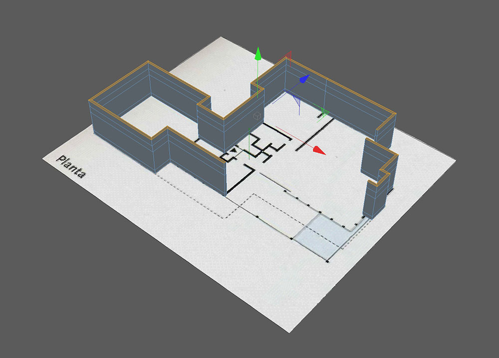
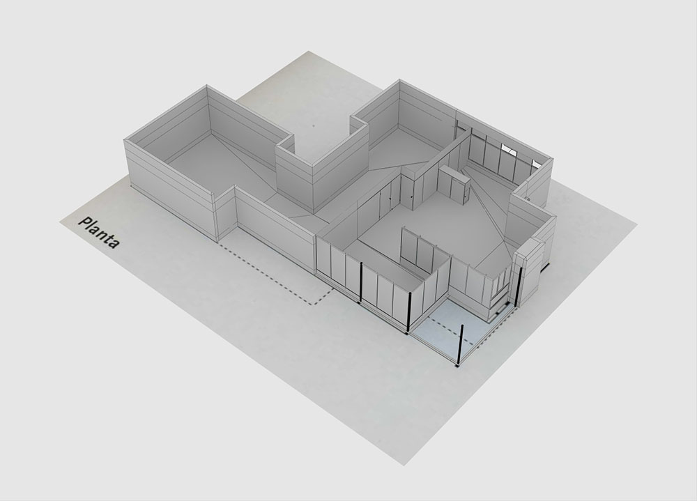
That was the easiest part in this project. As this is not a modeling tutorial, I won't go into every detail. To model the house I used the floor plan that I had found on the internet, put it on a plane and painted polygons with the polygon pen tool for the walls on top of it. Then it was just a matter of extruding.

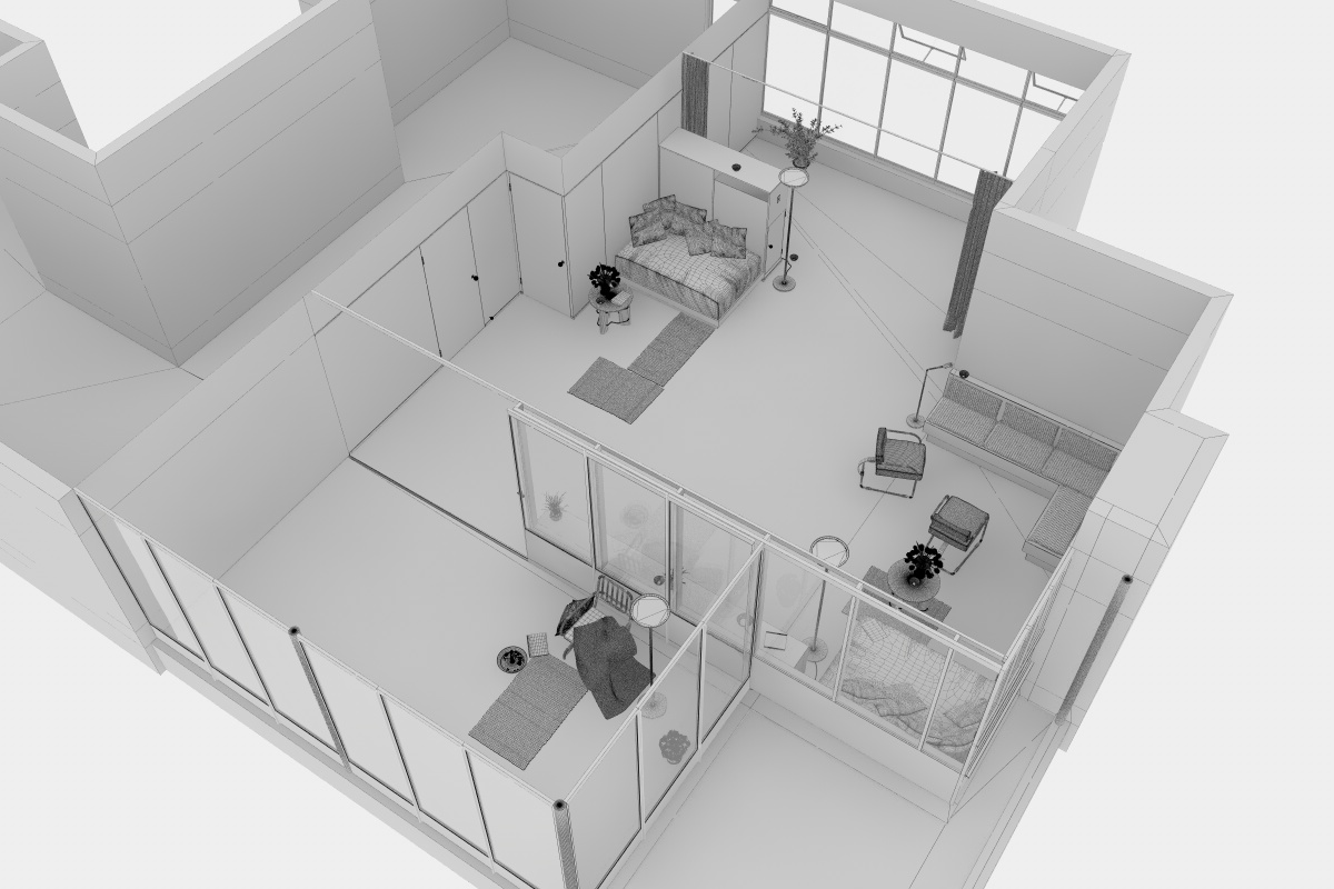
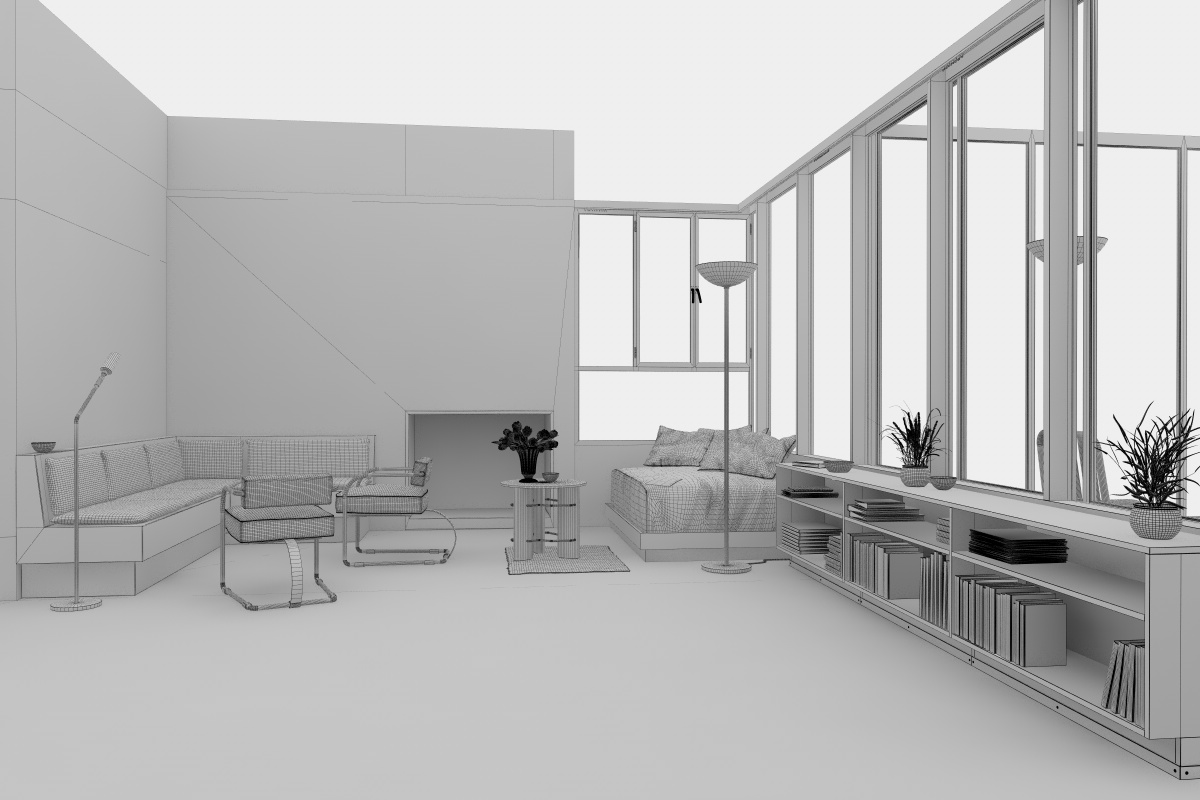
Most of the interior assets I took from my library, although almost every object needed to be adapted. As I was trying to match the original furniture from the 1930s and objects from that era which are difficult to find, I realized I had to model a lot myself. Yet, the modeling was basic so no secrets here. Just good old manual poly modeling.


The terrain, surrounded by a wall, is created with a highly subdivided plane. Adjusted manually to match the original heights.
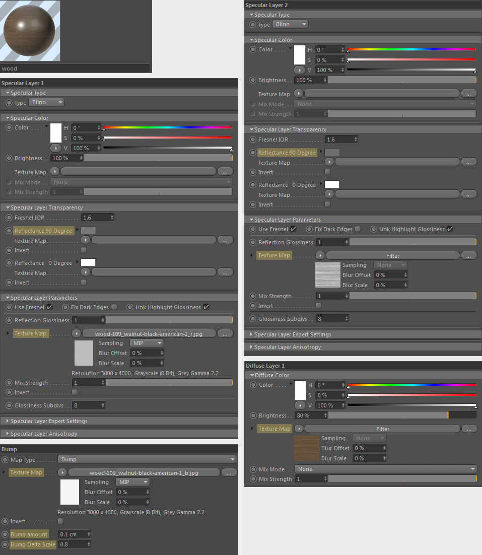
I always try to keep the materials as simple as possible. I'm trying not to over-complicate it with unnecessary layers, filters and other things. I try not to use colour saturation or values at 100%. Extremes are usually not happening in the real world and thus look out of place. But I do try to use high-res bitmaps from photographs whenever possible. After all, what looks more real than a picture of something real?
One of the materials that has a huge impact on the scene and is rather simple to make is the floor.
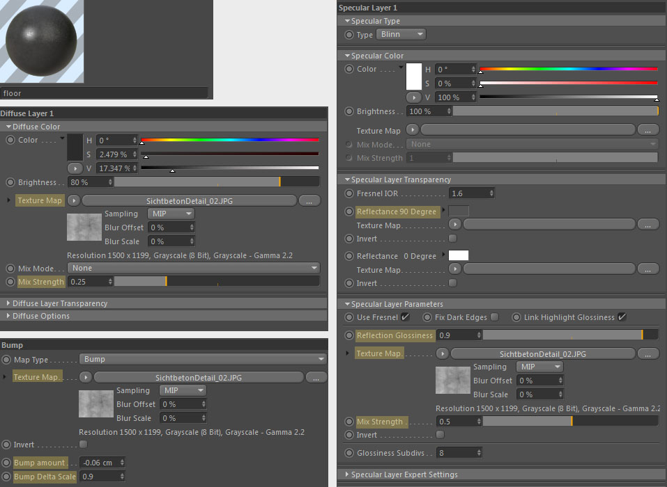
Most of the Materials are built up the same way. As an example, here's a wooden material:
For the windows, I started with a glass material and repeatedly added dirt and/or lessened transparency to create a variety of materials. I applied them to individual windows to make one look dirtier, i.e. less transparent than the other, as would befit reality, where some windows are exposed to elements more than others. This is how the dirtiest was composed:

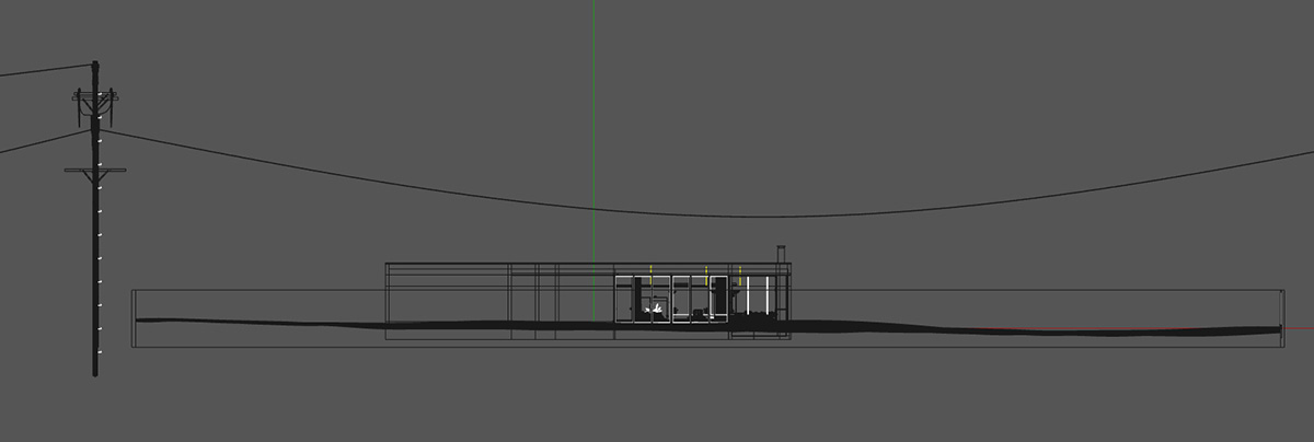
Never neglect to add a slight bump to the glass as no glass in real world is 100% straight.
Trivia: For example, very old windows in churches are significantly thicker at the bottom than on top because the glass tends to constantly flow over the centuries. Small imperfections add a lot to realism. Straight lines behind a window glass should not appear perfectly straight and of course always remember not to overdo it; if you just barely notice the effect in the scene then it's just right.
The terrain consists of 2 different textures, one for the grass and one for the caked desert-ish dirt, their placement defined by a vertex map.
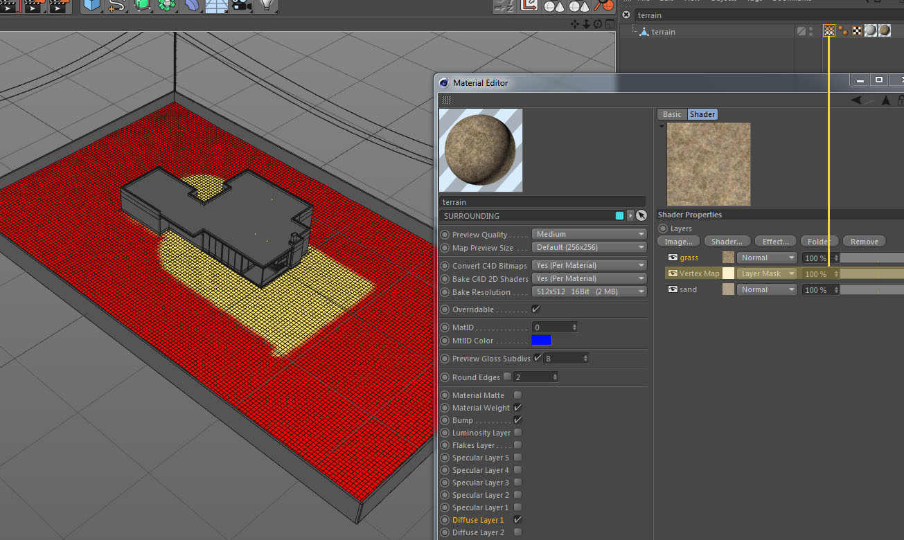
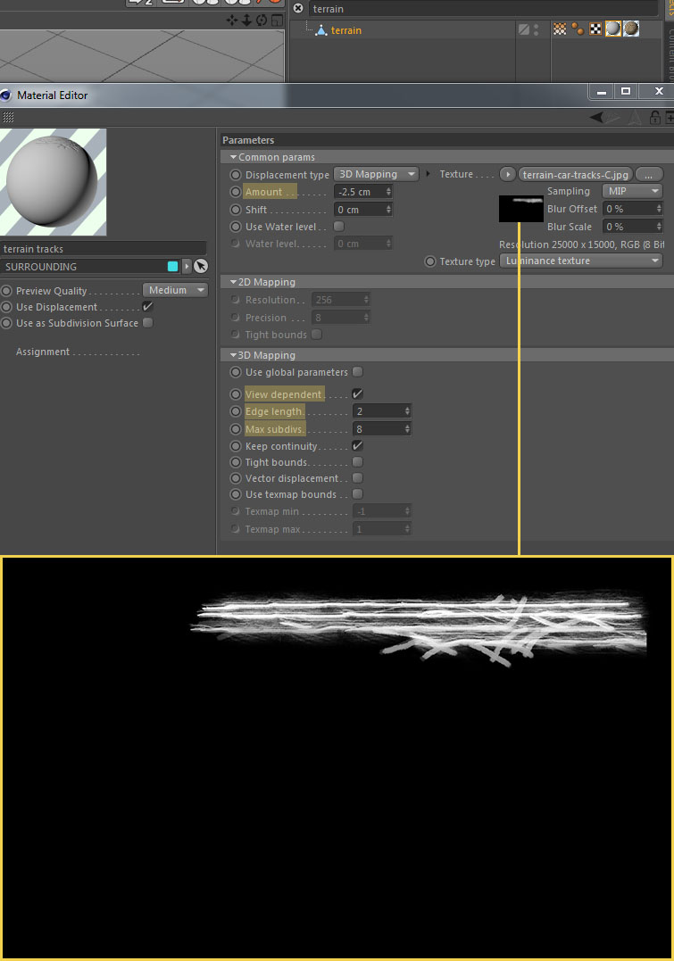
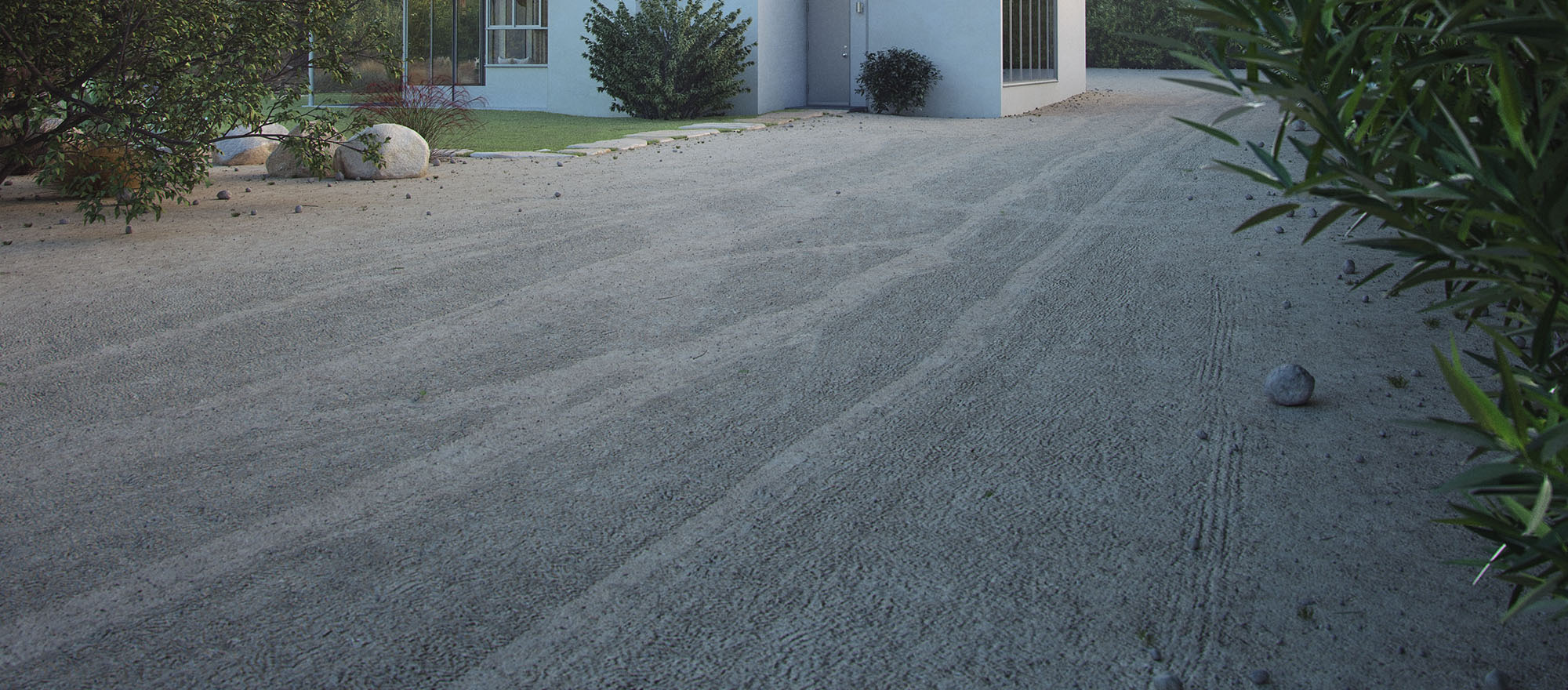
Car tracks were added with a displacement map which I created in photoshop. The displacement material was placed just before the terrain material. Like this, displacement and terrain will bake together and you don't have to activate mix texture.
The lusher parts of the environment were definitely the biggest challenge. I believe vegetation is the first thing to make you understand whether something is a 3d render or a photograph. Therefore, I invested by far the most time into that part of the scene. I was simply never satisfied with the quality. There are still parts that should be better, but one must find an end eventually.
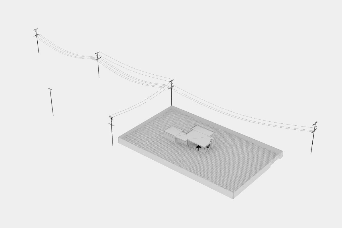
To start this chapter, I will introduce you to the worst part of the project, which in hindsight I decided not to approach the same way again; the scene background. Those mountains were created with a simple plane, about 16km square in size and then displaced using a large-scale texture in a displacer object.
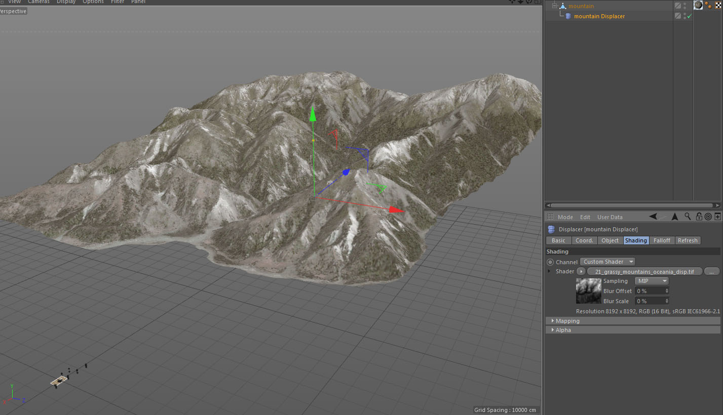
The advantage of this is that I really had a 3d mountain in my scene allowing me to move the camera around and the perspective would always be correct even in the background. Plus of course that I had a real-time preview of where exactly the peaks would be in the picture composition. I could have used backplates, but I would have had to adjust them for every single camera. The cheapest way would have been to fix all that in post naturally, but in terms of “continuity” it would be difficult. The question is if anyone would ever notice, but since this was a personal project and not a for profit project, why go cheap? In fact, next time I would like to actually model the mountain with real 3d trees and boulders and so on.
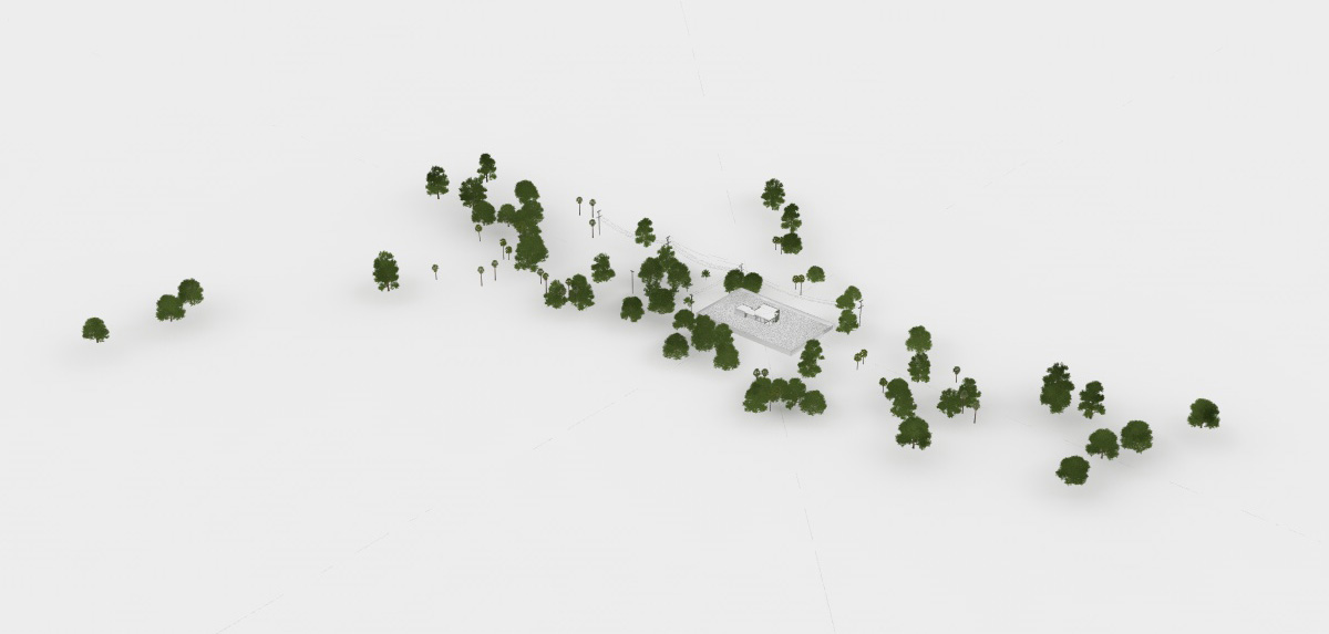
As a result of the detailed vegetation, the environment consists of around 2 million objects and 113 million polygons. Most of them were included as xrefs or proxies so that my computer was able to manage them. Then, they were distributed manually or with the mograph object.
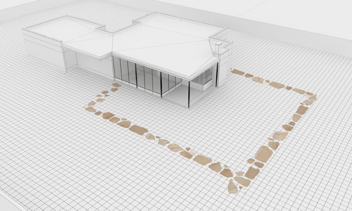
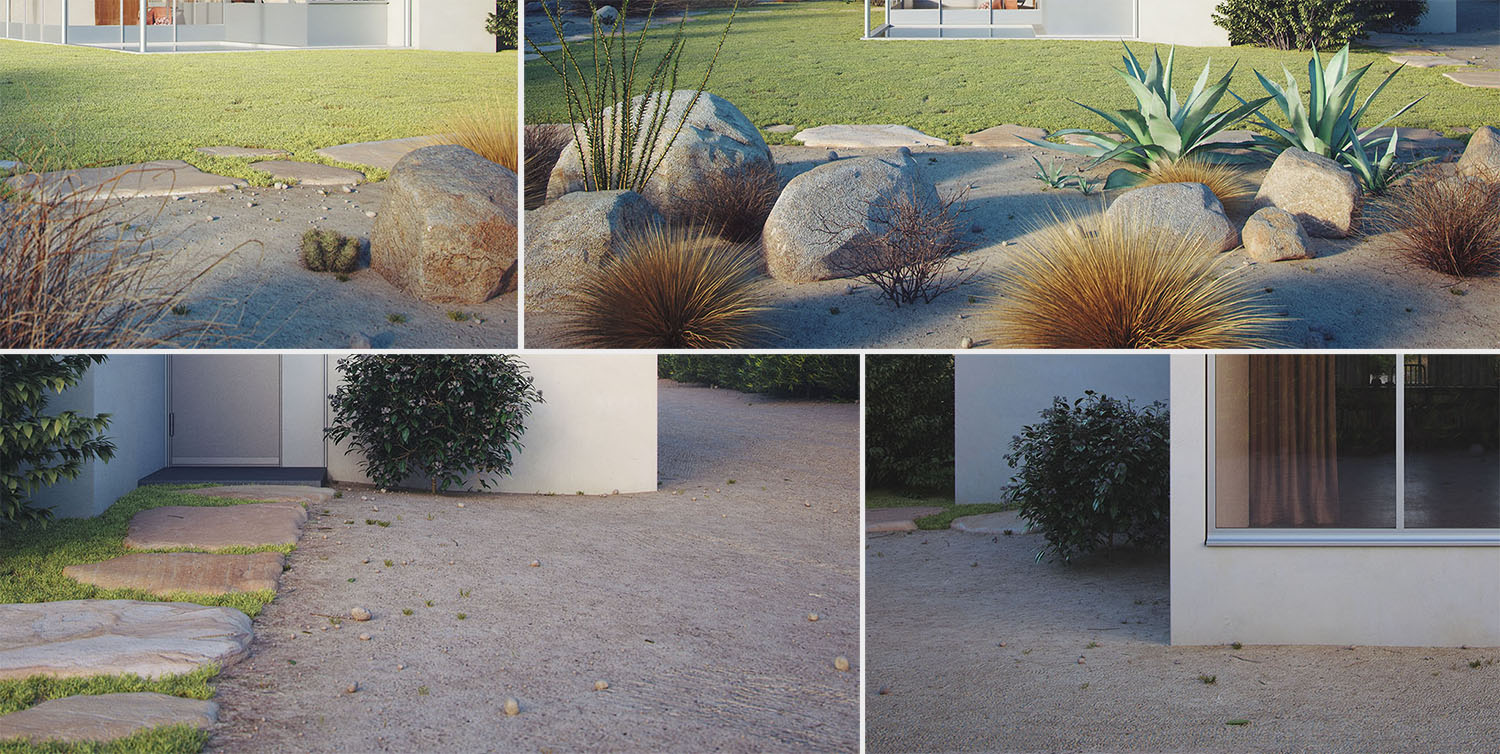
For the stone walkway I've used VIZPARK Real Boulders models and sliced them into individual slabs, much like a mason would. Using that method, I ended up with 13 different slabs of stone which I then duplicated several times while changing scale until I had 55 unique models. Afterwards, I placed them manually into the scene much like a mason's assistant would.

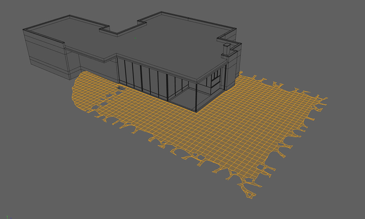
For the grass, I've used models from VIZPARK Real Grass that I tweaked a bit to fit my needs. I duplicated the terrain plane, deleted all polygons where no grass was supposed to grow and cut out the parts where the rocks/sidewalk were.
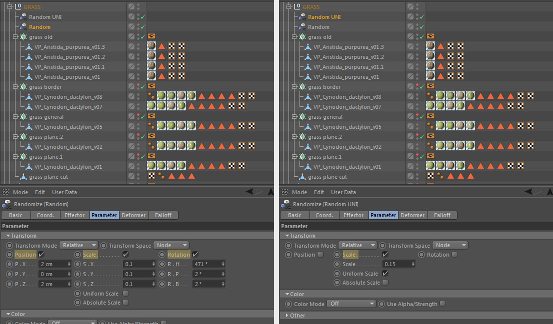
Using this plane, it was a simple task to distribute the grass models. With mograph in the object mode, just drag and drop the grass plane in the object slot. Don't forget to tick Render Instances. I'm not sure how this is possible, but with this option cinema doesn't calculate every object in the editor window even though it still displays them all. Anyway, it makes it possible for cinema to display thousands of objects without suffering performance impacts. I changed the distribution to surface and used selection tags to limit the distribution at some parts. Doing this several times you get a natural looking lawn with various grasses and weeds.
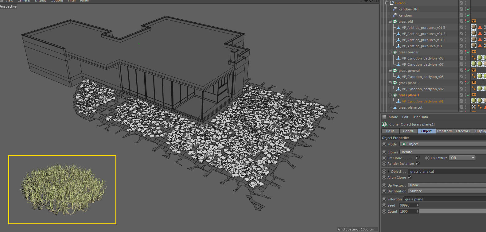
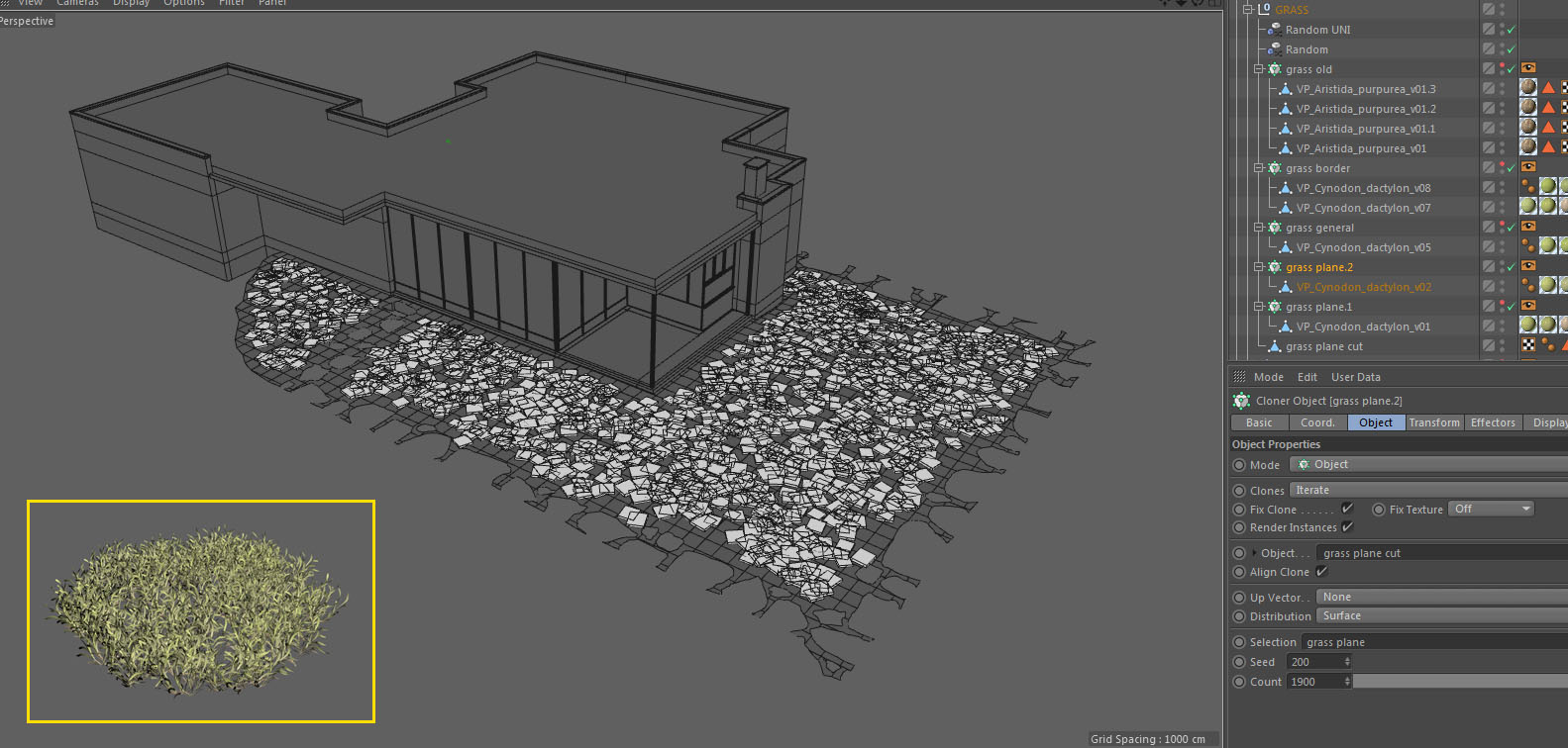

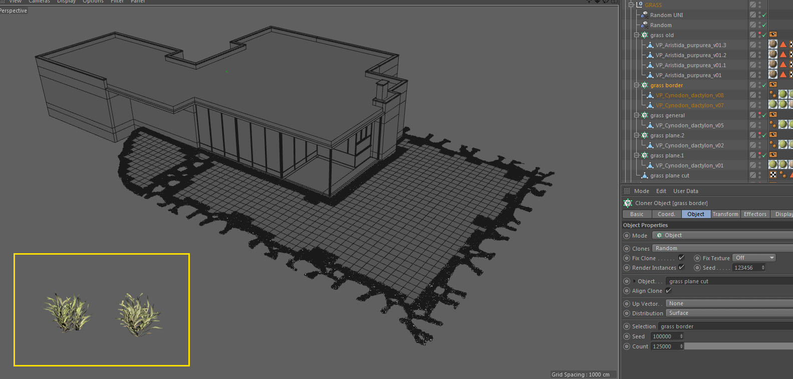
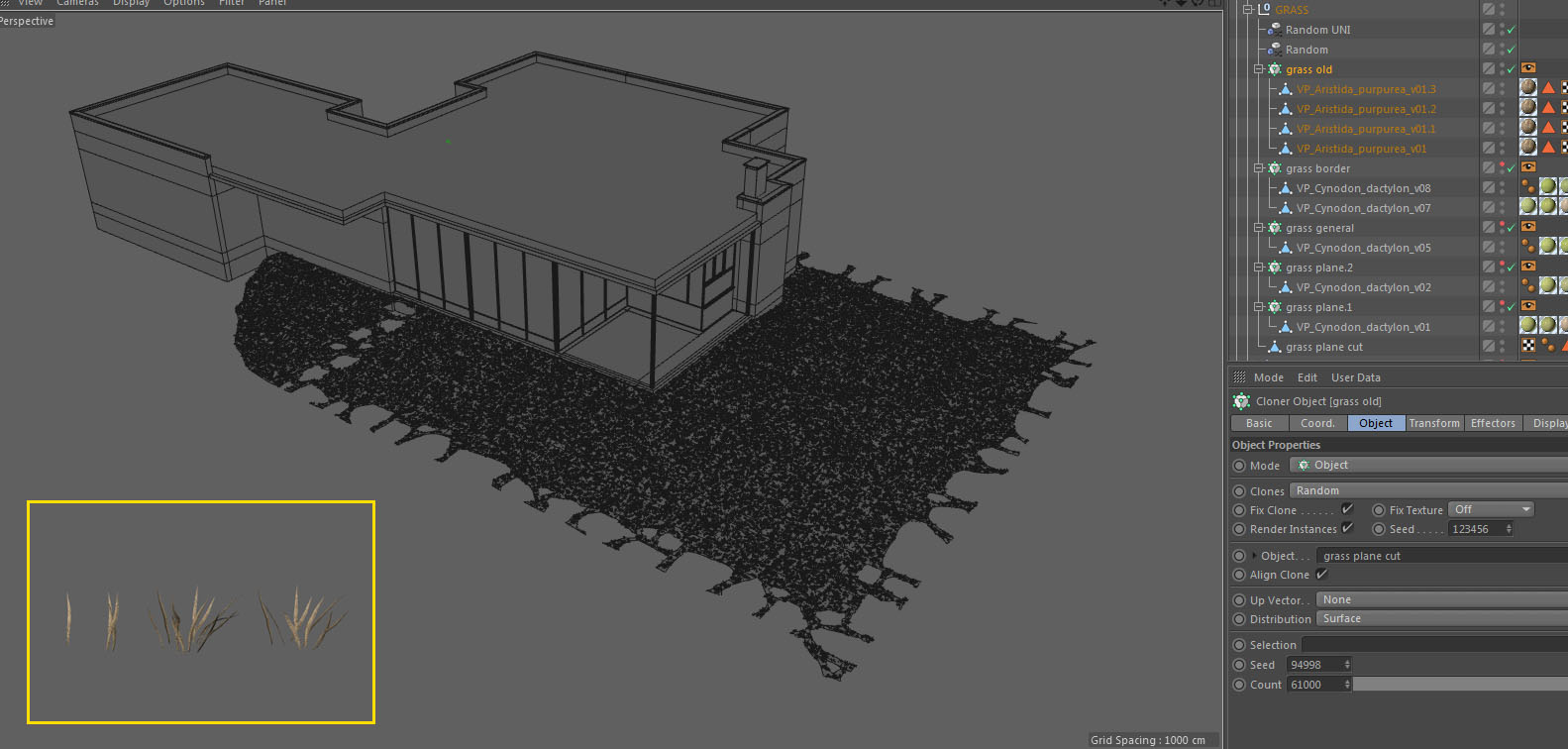
Every mograph object connects to two random objects to achieve variations in scale and rotation for the various instances of the same root grass model.
For the garden, namely cacti, plants, bushes, rocks and small trees, I've used the same principles. Spread the lot with mograph and place some manually to break patterns and add details, large or small, where needed. I've used some VIZPARK, evermotion, hq-plants, cgtrader, turbosquid and other models I've collected over the years. There are so many that it won't make sense to name them all separately.
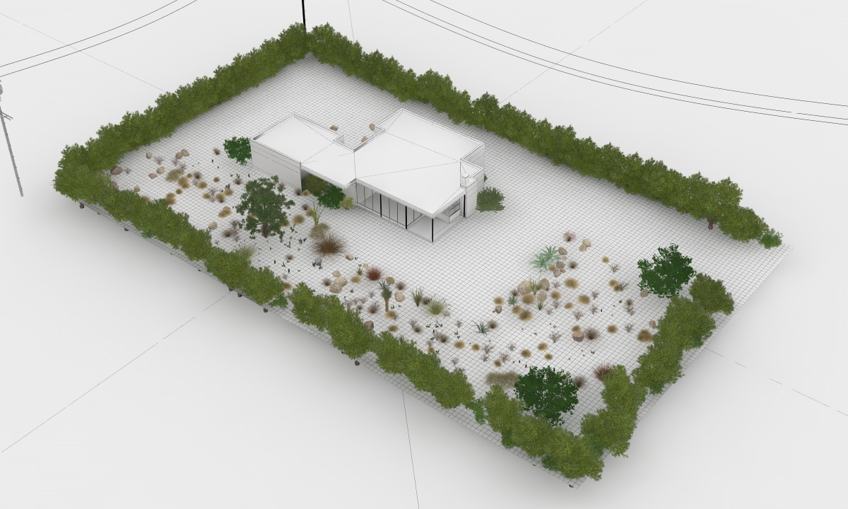
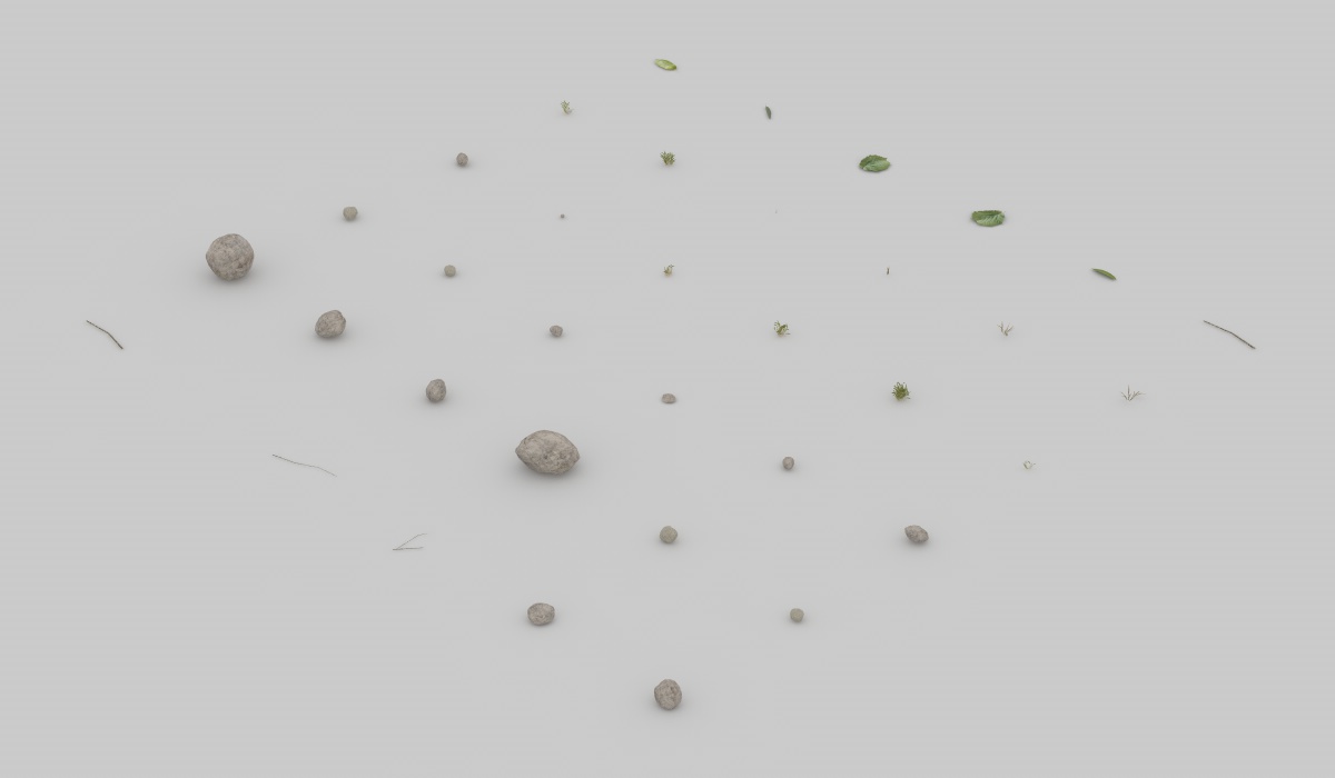
Another very important thing is to add small details and imperfections everywhere. Dirt, pebbles, grass blades and so on. I scattered them all over the place with the same technique.

The background trees were positioned manually.
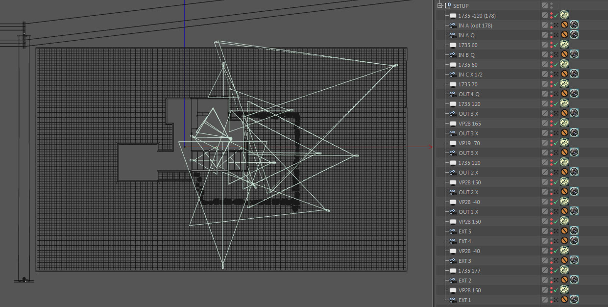
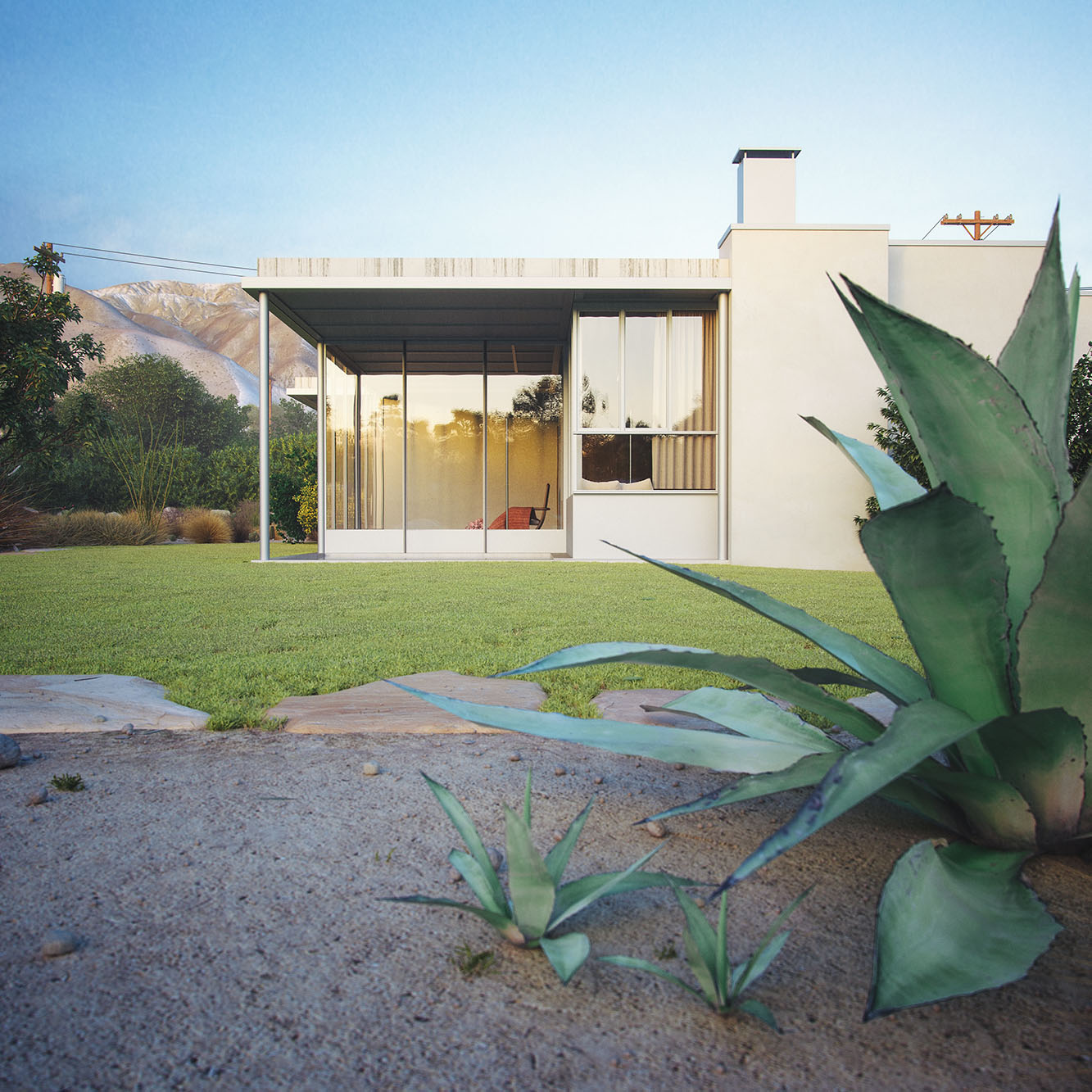
The good thing about all the previous work was that I now had a complete scene with no gaps, allowing me to place cameras wherever I wanted just like a real photographer on site. I was surely influenced by the existing image compositions, but having the entire scene available also encouraged me to look around and find unexpected interesting compositions.
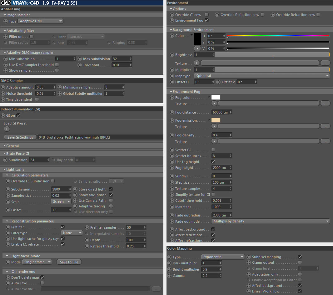
I ended up with 18 different camera setups. For the lighting, I used exclusively HDRIs, since I rendered only daylight scenes and thus there was no need for additional lights. In total, I used 3 different HDRIs, one from Peter Guthrie and two from VIZPARK. The HDRIs were adjusted in rotation and intensity to every specific camera setup.
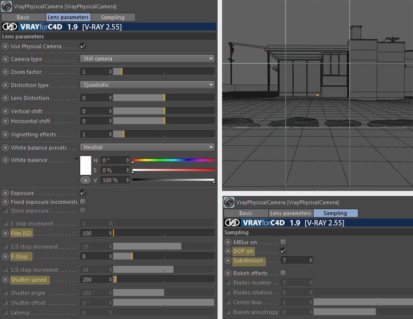
These are the camera settings for this particular shot. They are very similar to the settings for the other cameras with slightly different values for f-stop and shutter speed. I always activate dof even though the effect is subtle and it will render much longer, because I think the quality is far better than doing it in post-production.
And here's the dome light settings for the same shot. Here too, settings are pretty much equal in all setups with slight differences in intensity and gamma.

The render settings were exactly the same for every shot.
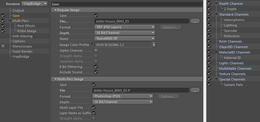
The final renderings were saved as 16 bit tiff files, with a maximum size of 4000 pixels, along with some basic additional passes.
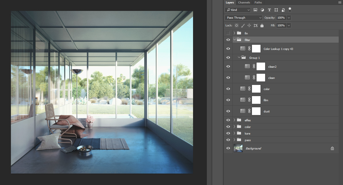
As a matter of fact, because I'm using exponential color mapping, the raw renders tend to be low in contrast. But with almost no over or underexposed areas they are a perfect base to fine tune and pop the image in post-production. The process is quite the same for all images. The focus was colour adjustment. There were many small adjustments, so I won't go through all of them, I will just be breaking down the main steps.
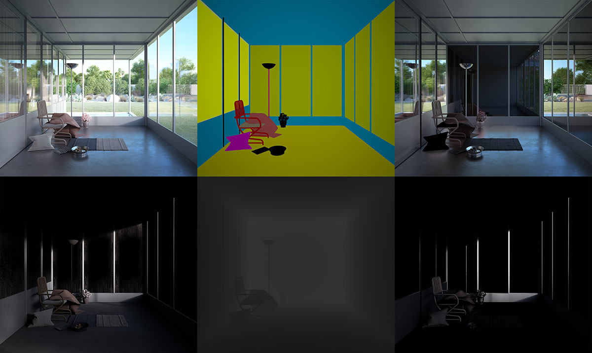
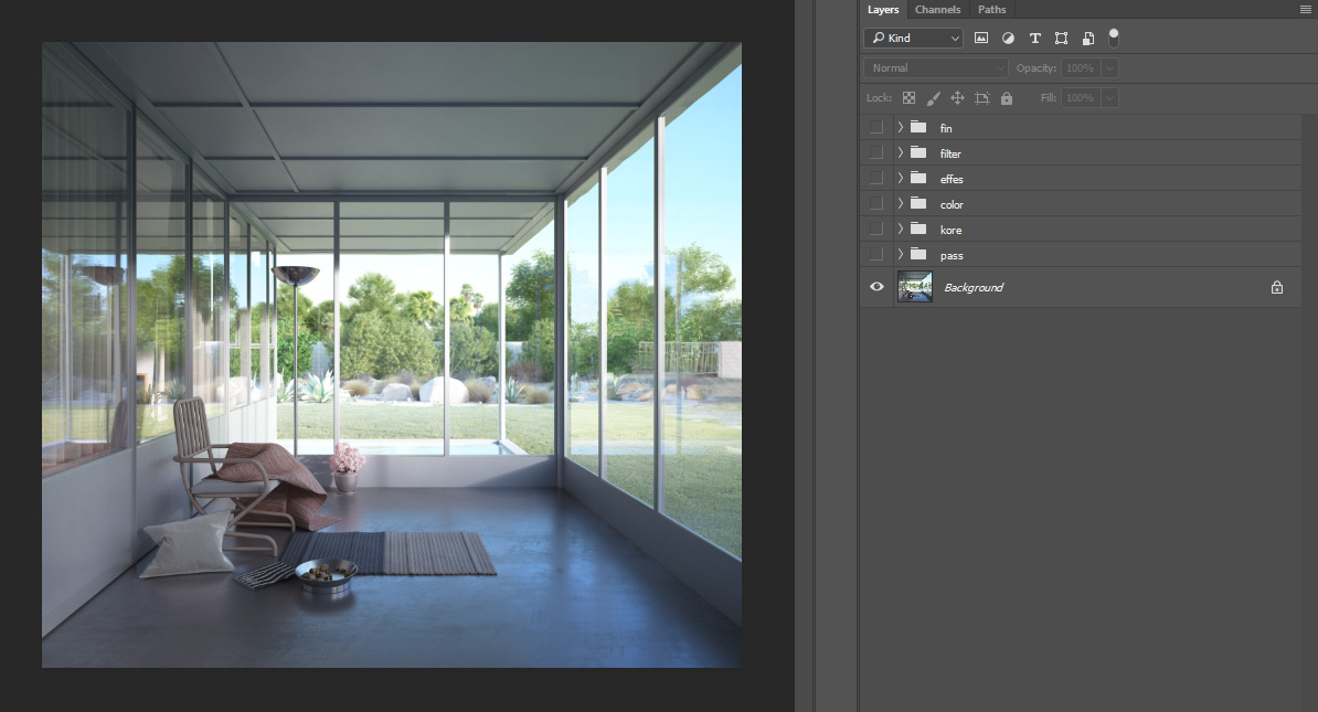
Raw render.
To enhance specular and reflection I've used those passes in linear dodge mode, from 5 to 10 percent opacity.

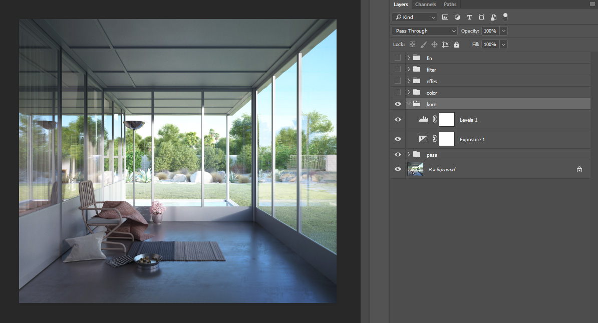
Main exposure and level adjustments.
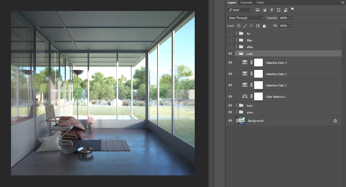
Specific colour correction, mainly the yellows and greens.
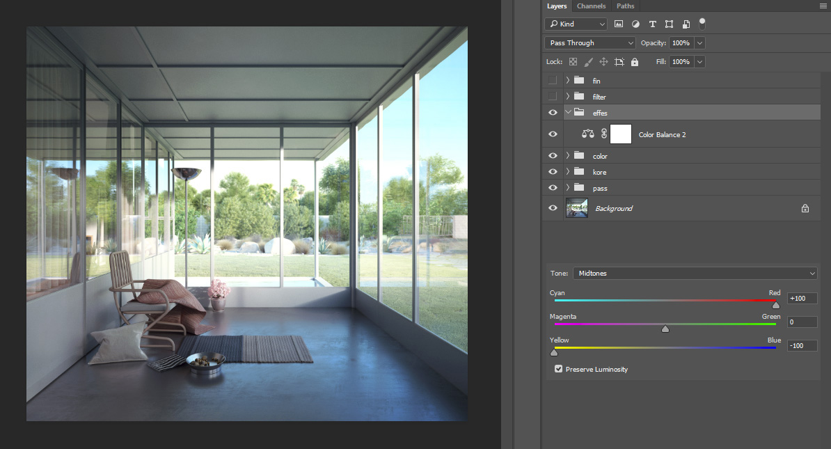
A tiny effect of warming up colours by using a colour balance adjustment layer on colour dodge mode with 3 percent opacity.
I've used a combination of different luts from James Miller.
At the end, I usually add lens distortion, chromatic aberration, noise, glow, vignetting, sharpen and an extra tiny bit of scratchy texture to top it off.
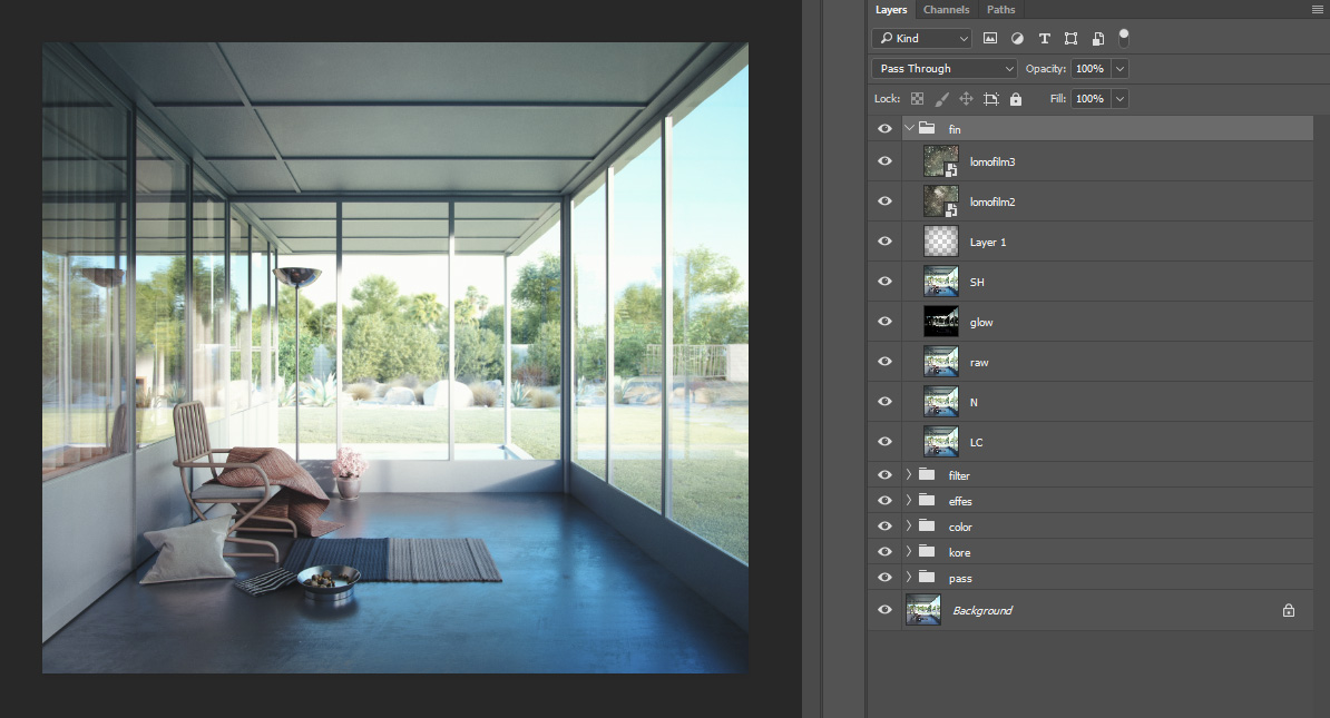
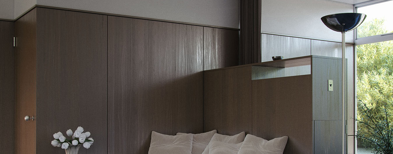
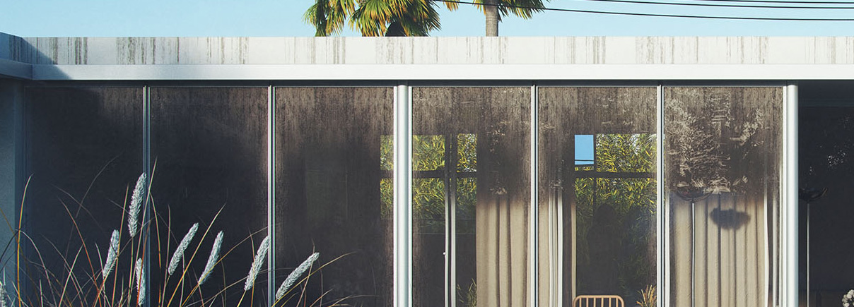
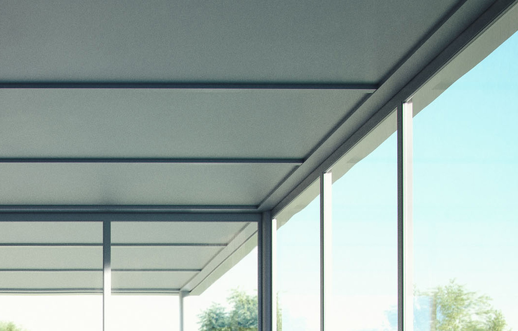
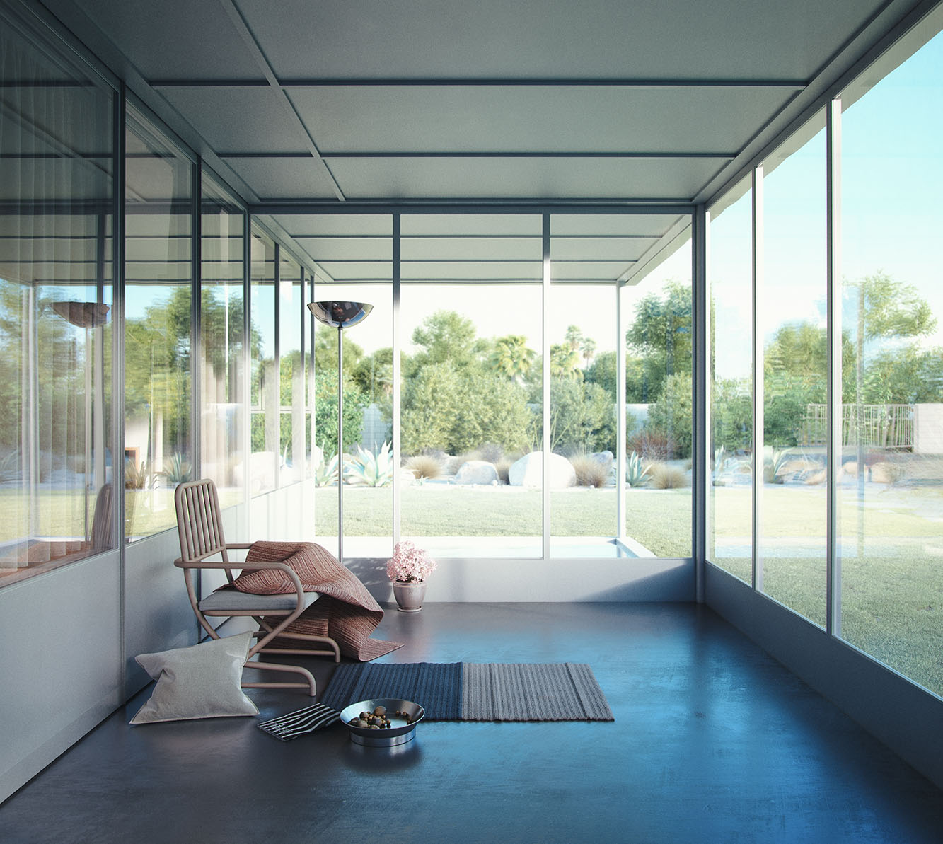
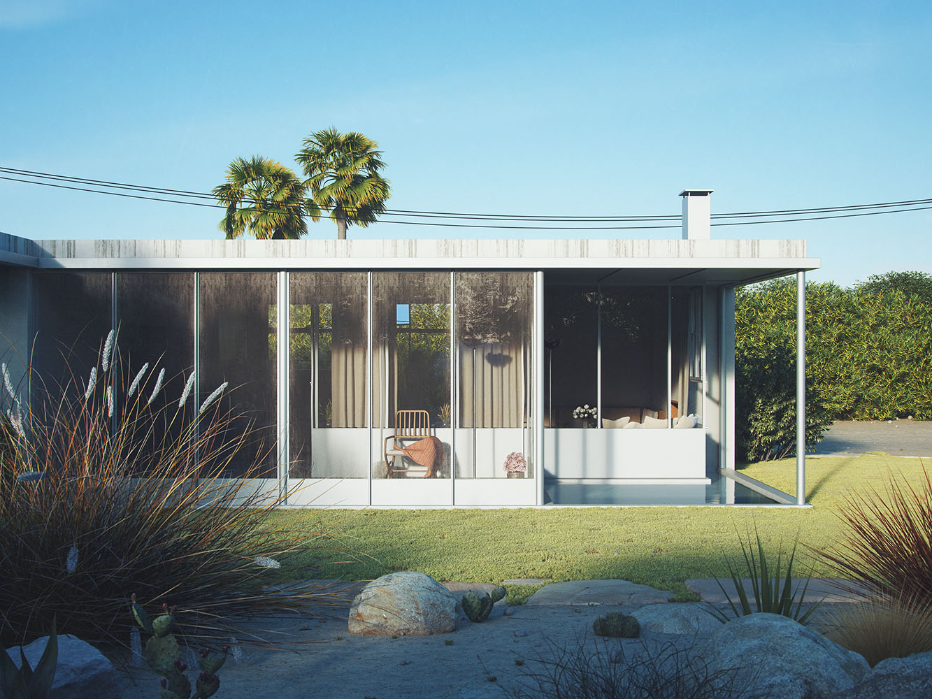
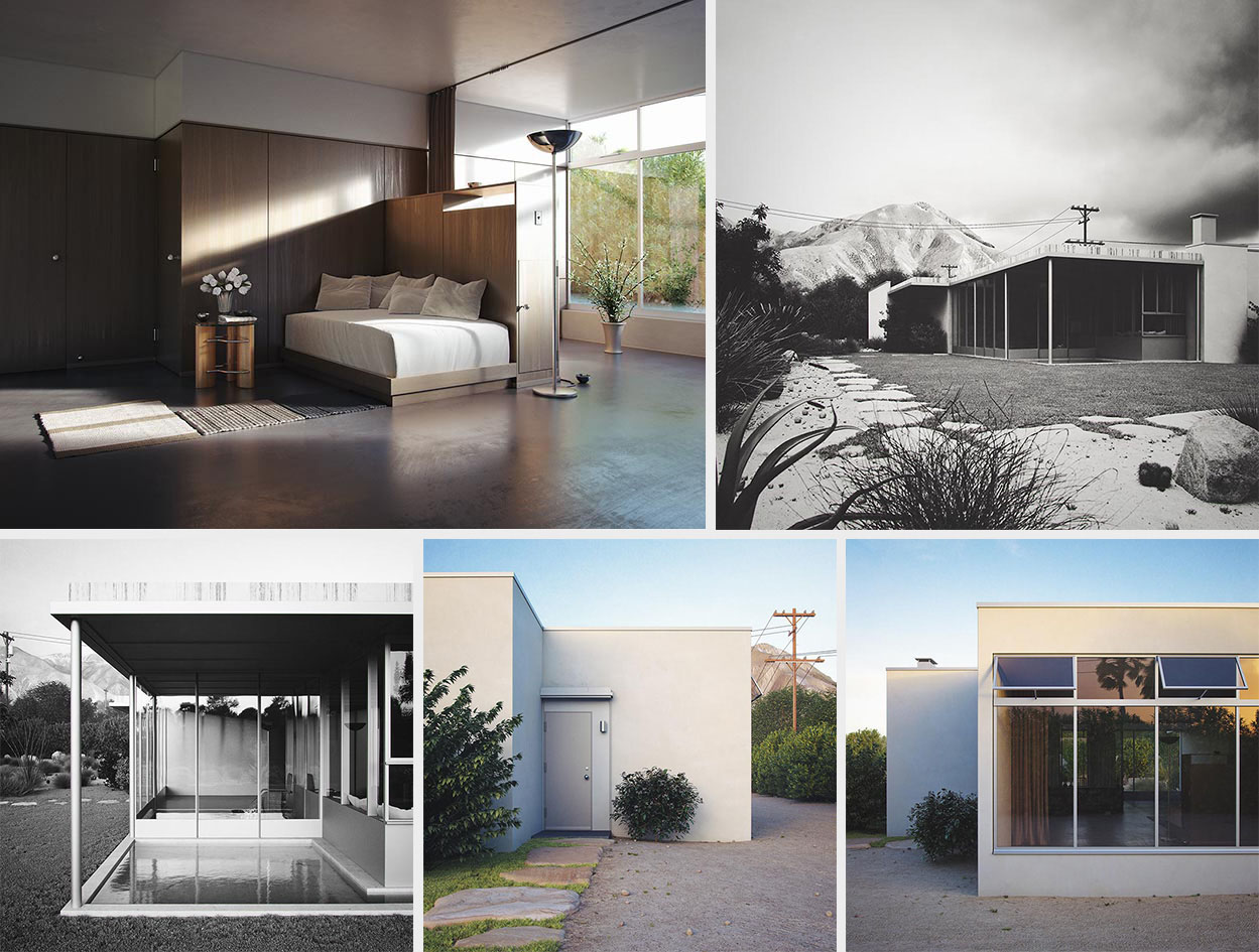
These are the final renders.


And some never published outtakes.
And that's it, thank you for reading to the end :) If I missed something, feel free to ask in the comment section below.
Saludos,
Phil.