We have tried to explain VWA *Quality Standards for many years driving our members to the path of improvement. Sometimes by using small tips while other times an in-depth explanation.
Area 261 By Tsiky Imanoela.
TIPS: When I saw your image, I remembered my recent walk on the mountains for photography. I tried something fast on your image, which I think you may find interesting because the foreground looks very weak as it is now!
An illusion that you stand higher than the subject, and you frame it using the rocks.
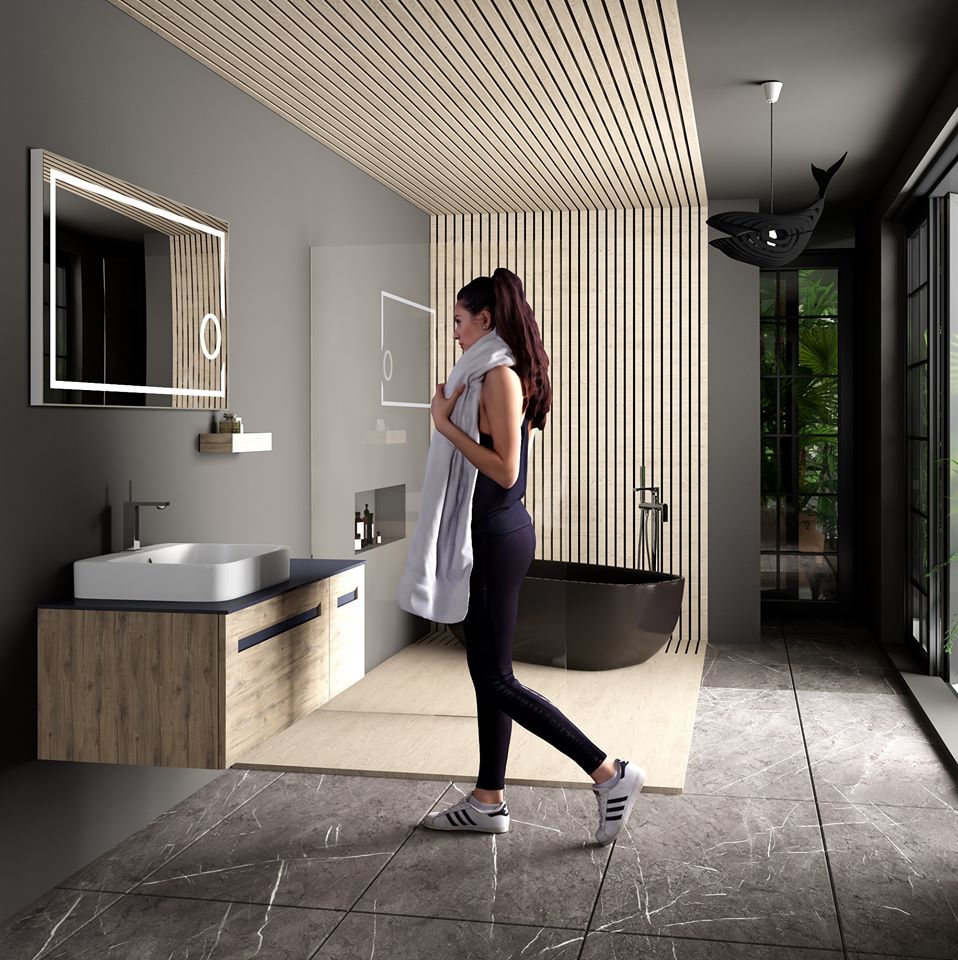
Bathroom By Suleyman Ozkan.
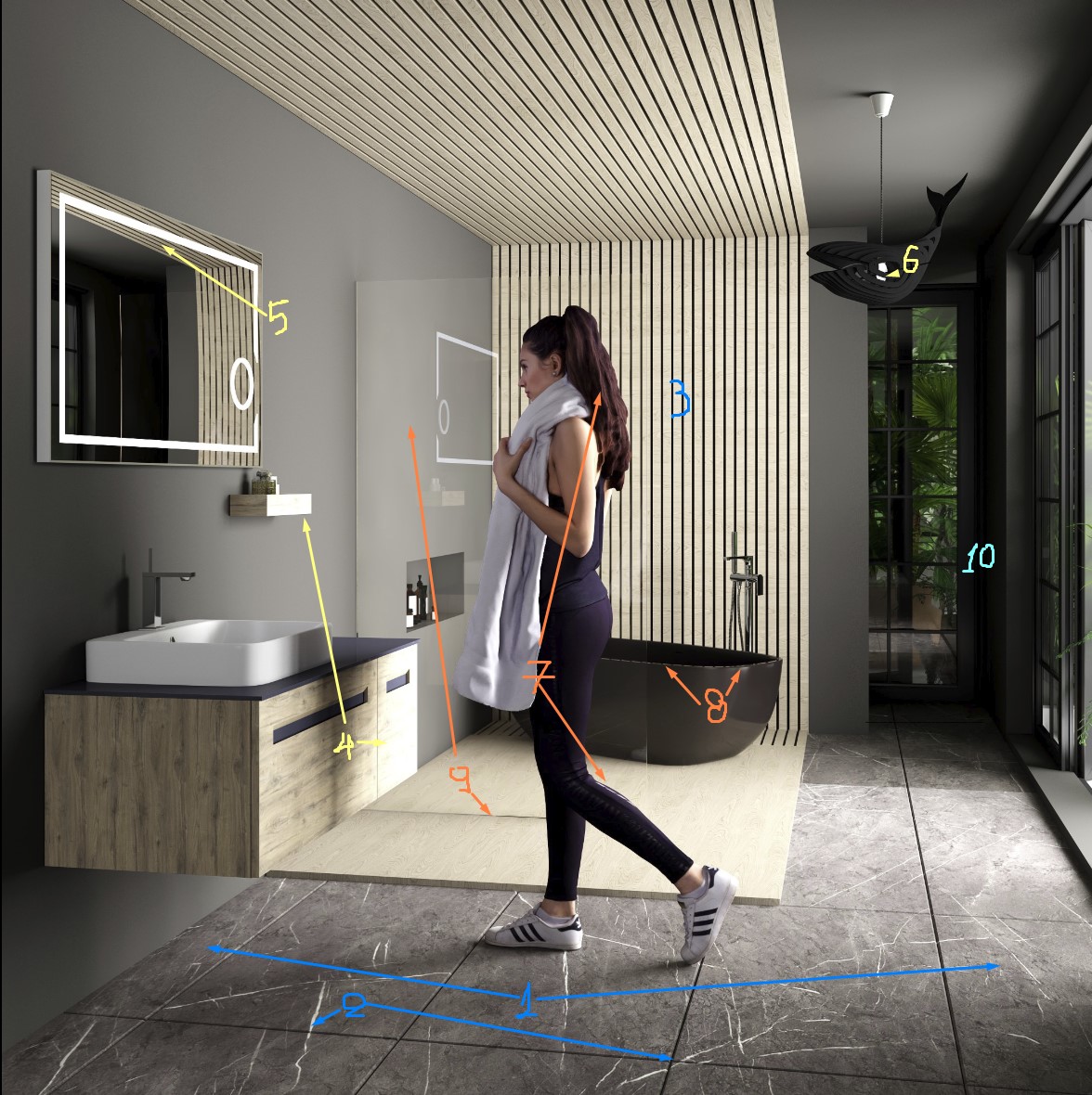
TIPS: The lighting & contrast is good enough, as well as the position of view.
Possible Improvements.
1. You could have four complete tiles for better construction and design.
2. A continuously mapping for tiles is quite difficult in real life. You could randomize it a bit.
3. It's not that visible, but you have applied a box mapping for this wooden structure. You can rotate mapping 90 degrees and randomize it on each slate.
4. Strong light burned some parts of the wooden furniture. Usually, medium to dark grey reflection maps can save that.
5. Soft bloom & glare effect could give a realistic result without bad antialiasing.
6. Turned on bulb without generating light. Add a spherical light inside the bulb and exclude only the bulb from this light.
7. Woman's scaling looks big comparing to the furniture and bathtub. Maybe 10-15% smaller. I usually try to patch some better hairs when I use a 3d model close to my camera. Finally, there is a powerful reflection on her foot while the rest of her clothes look perfect!
8. Bad antialiasing, you can save it with better sampling or just a handmade blurry brass in Photoshop!
9. Glass material looks poor; you could enhance a bit the reflection.
10. Only in this part, the contrast is quite strong and almost black. Soft selection with brightness and contrast in Photoshop could make it softer.
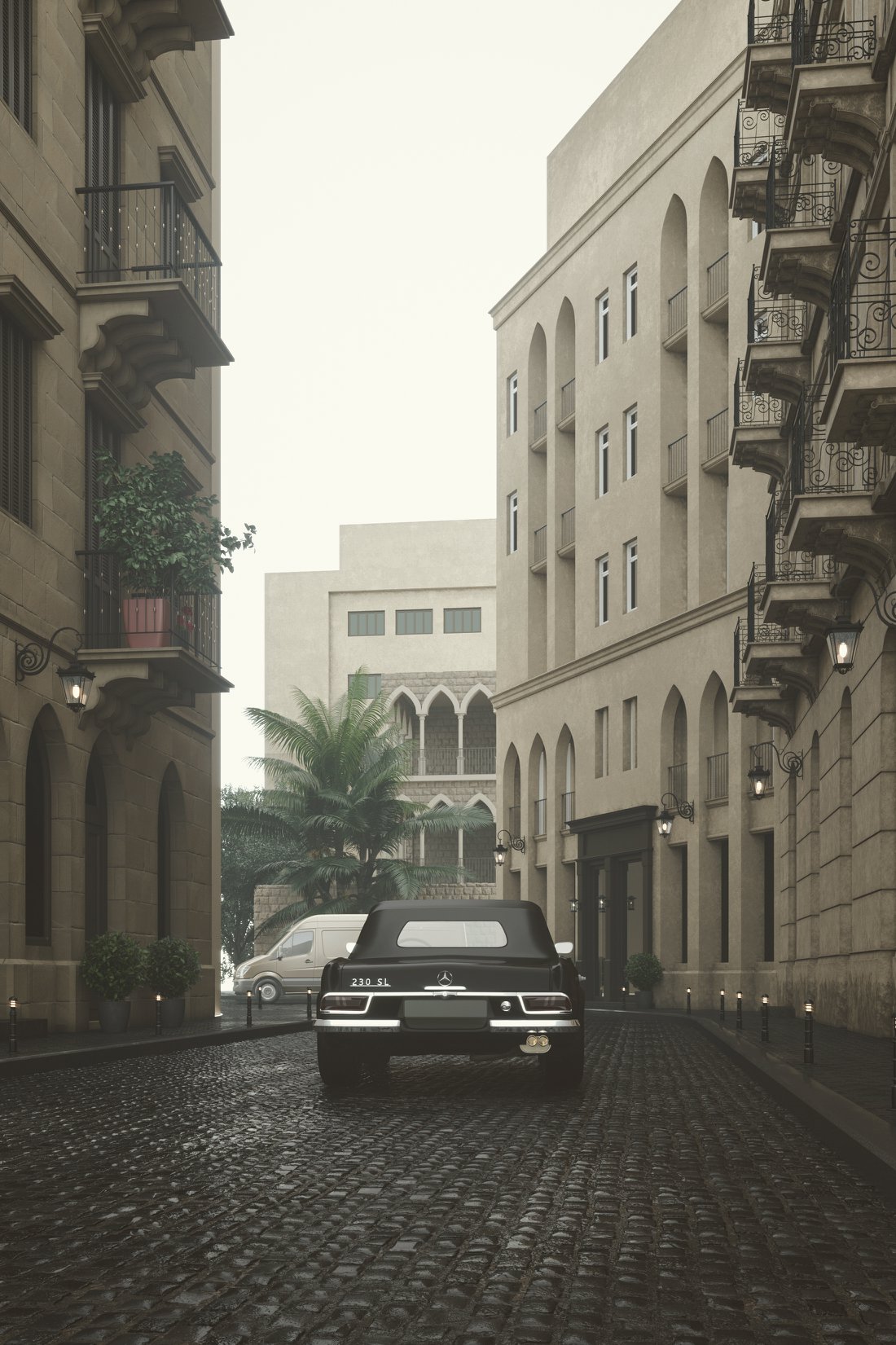
Beirut By Ahmed M. Gbr.
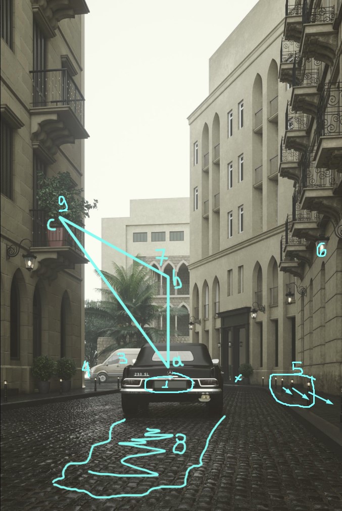
TIPS:
1. You can do something there; I mean a plate number.
2. One plant pot fills all the balcony. I prefer something like this outdoor chair with attractive color, desaturated yellow or even orange, to create the famous "triangle of interest."
3. No suitable materials, but in any case, I wouldn't use the van at all because it has already "broken" the only point of interest, which is the black car. Imagine if you finally choose to follow the triangular composition.
4. Some short vegetation behind the tree to fill the gap.
5. Even the distances between the street lamps are correct; I would cheat it to get a balance between the left and the right side of the image. I think you don't need the one inf front of the black entrance.
You can also improve the reflections on the black entrance with some reflected vegetation instead of a pure wall
6. Try to spread a soft light generated by the wall lamps.
7. It is the triangle. We already have pointed a=car and c=colorful furniture, so we need to create the point b (a human being maybe)
8. I'm not sure about this, but I can guess that a small puddle-water would generate some beautiful reflections, the line which directs the viewer to your "triangle" points of interest.
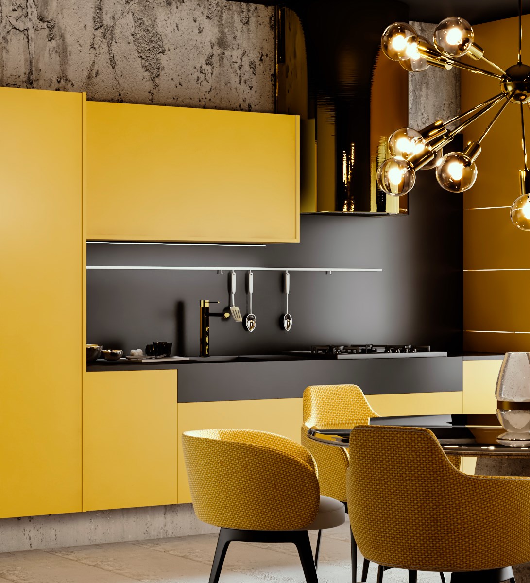
Black And Yellow Kitchen By Gabriel Domingos Giuntini.
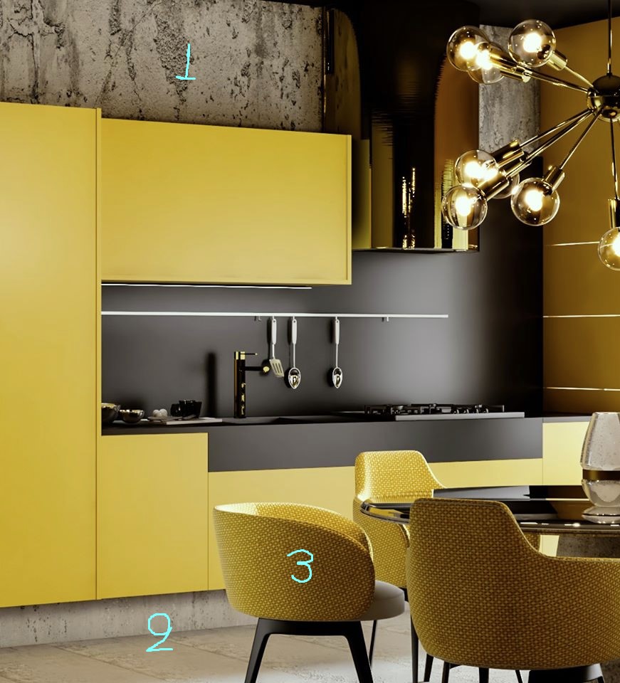
TIPS: I like a lot the color palette, lighting, and contrast of this set.
1. Very fake material. It looks like a blurry diffuse map, and that's all. No bump & displacement at all.
2. The same on the floor. Flat material, low-resolution map.
3. The fabric on the chair is wrong. Over-scaled & it has the wrong direction. Study harder UVW mapping.
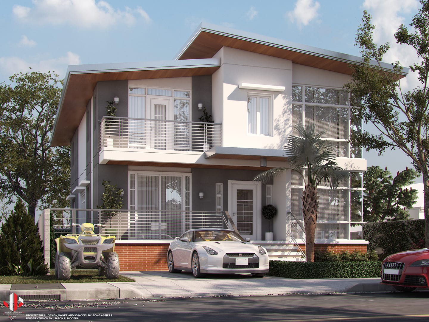
Bong Aspiras By Jason Diocera.
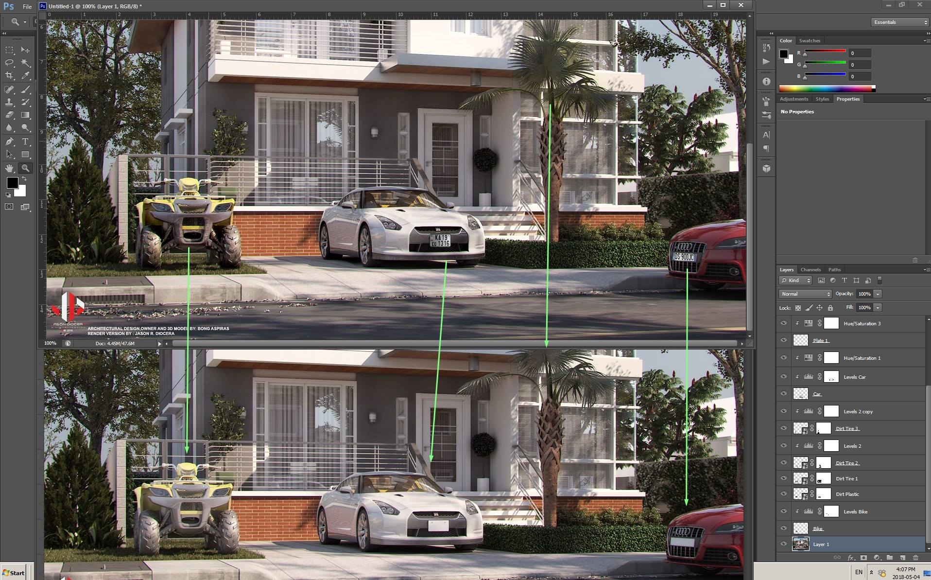
TIPS: Some parts of your image are nice. Try to work more on those three elements.
I would remove the white car and replace the palm tree with a better model, but even with the same composition, you could improve the look of those three objects by using simple post-production techniques.
You can download the PSD file, turn on and off each layer, you will see that it's not more than 15min work.
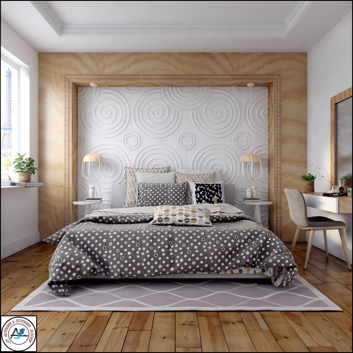
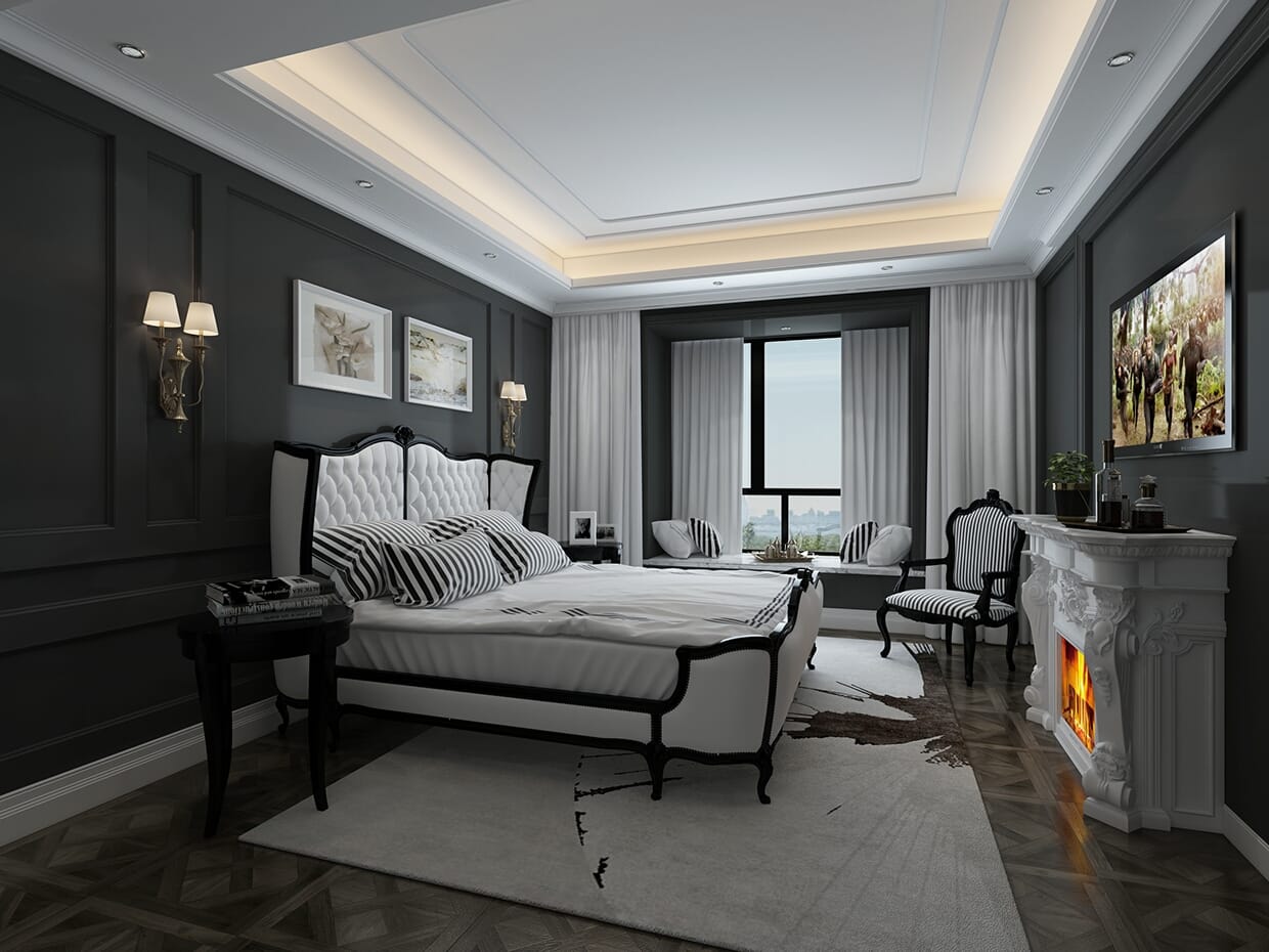
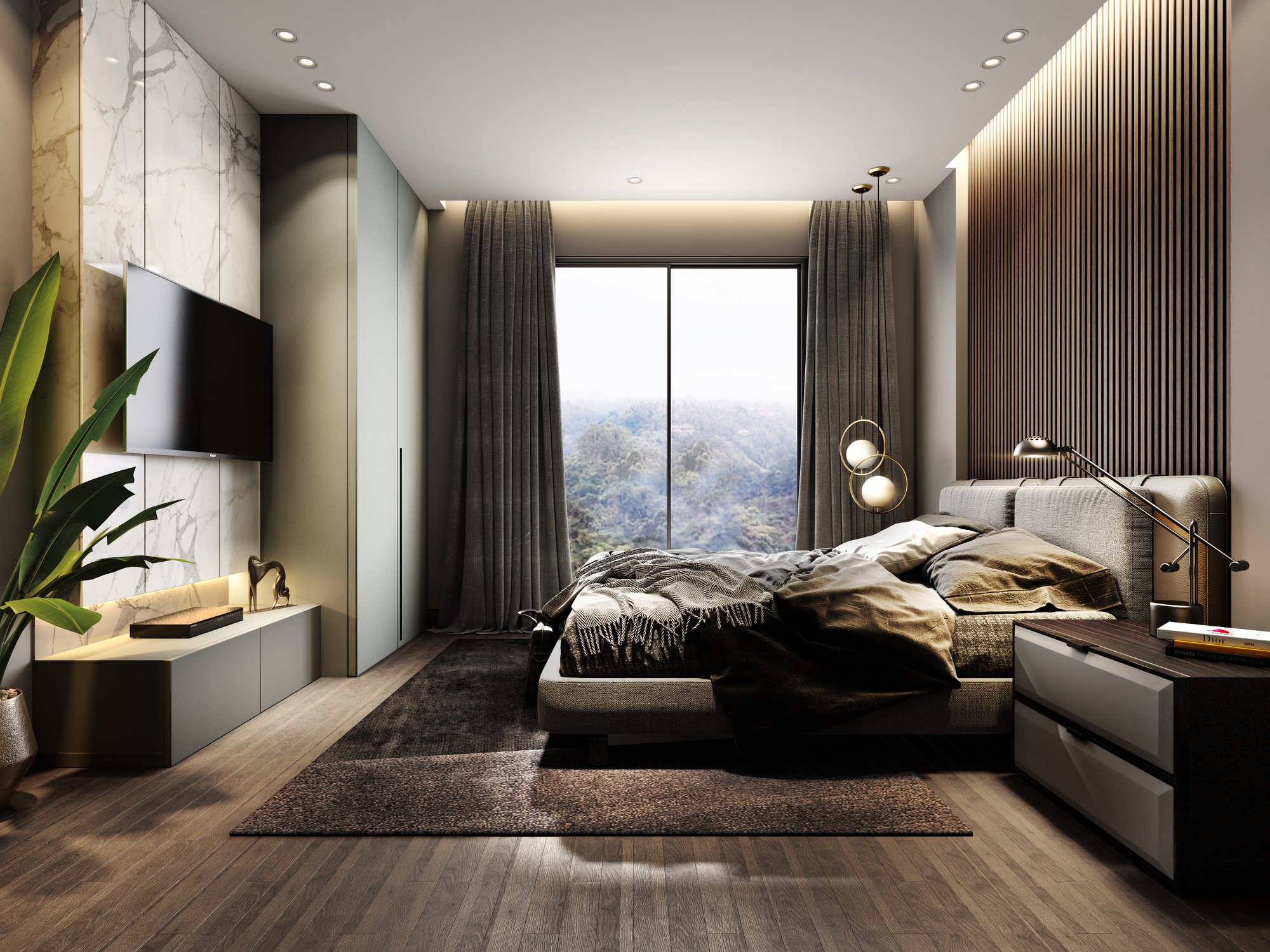
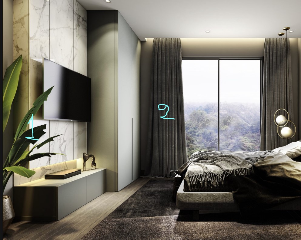
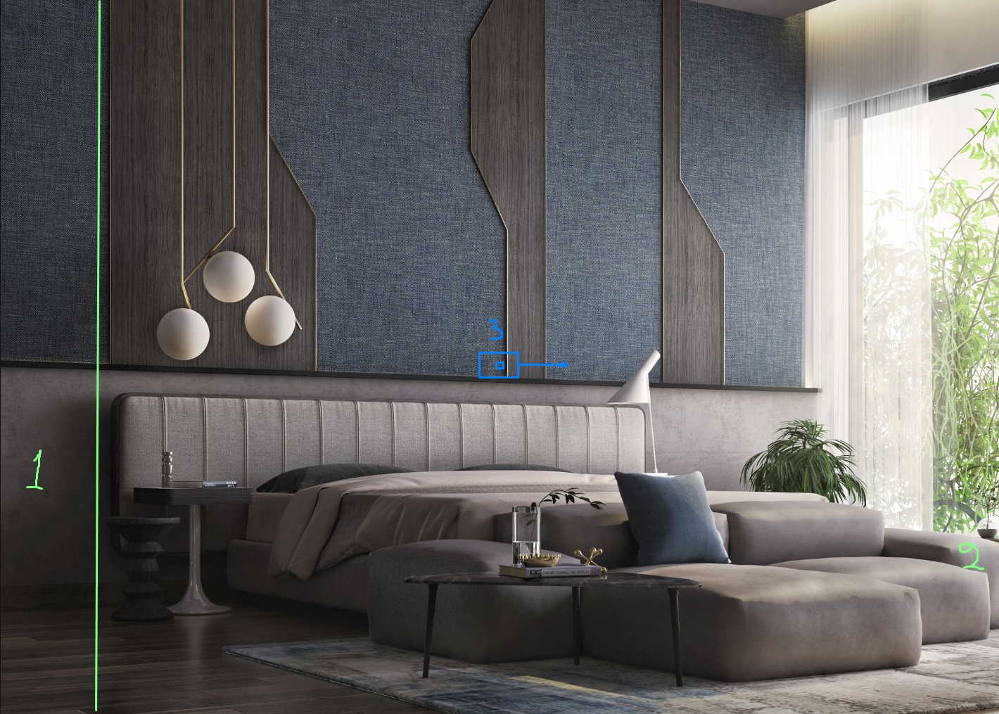
Bedroom By Ahmed Samir.
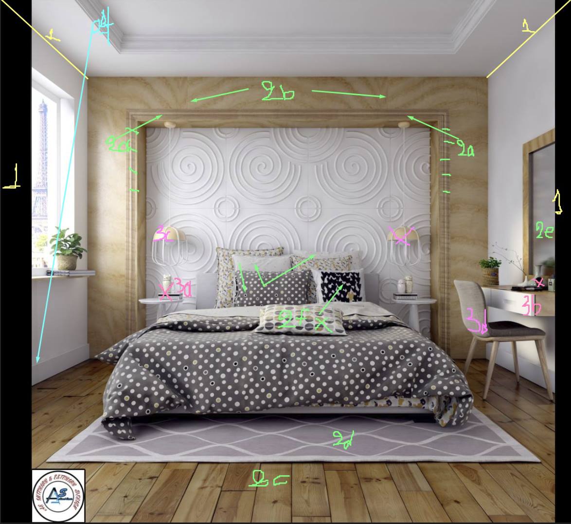
TIPS:
1. Camera. The position is good, but sometimes it's also good to use the lines for a better crop. Check out my cropped image, in this way I suppose that you could have a better crop for both sides ( Mirror & Window)
2. Materials.
a. I think that those horizontal grains on the vertical wooden parts aren't so pleasant. Look, for example, the horizontal part, it's smooth and fine. I suppose something wrong with UVW happened there.
b. Repeated texture. You could create a seamless texture or even correct it in PS with the clone stamp, the magic tool!
c. The floor material is good enough but with very visible black grouts. It's rough, and it seems more like a deck.
d. The carpet isn't bad, but it needs something like a stronger bump or even better a soft displacement map.
e. The mirror is very blur and strange. Check out if you have overlapped polygons between the wall and the mirror, or it's just a blur material.
f. I would play more with pillows only from a design perspective. I don't like the black one. Somehow it broke the symmetry of the image, and it created a spot point.
3. Composition.
a. It's just a copy-paste of objects. Try something else or even better nothing else, let it empty with one ceiling lamp above it.
b. Too many objects, I would remove the black one.
c. Those lamps are very similar to the wall panels. I would try to remove the right one and use another ceiling lamp more minimal.
d. The chair is nice, and it matches the rest scene, but I suppose that a nice pouf could work there in combination with the circles on the wall panel. This type of soft green fabric will give a charming and quiet result.
4. Modeling. Just a fine detail like the circled one on the top corner of the baseboard could provide a nice style there.
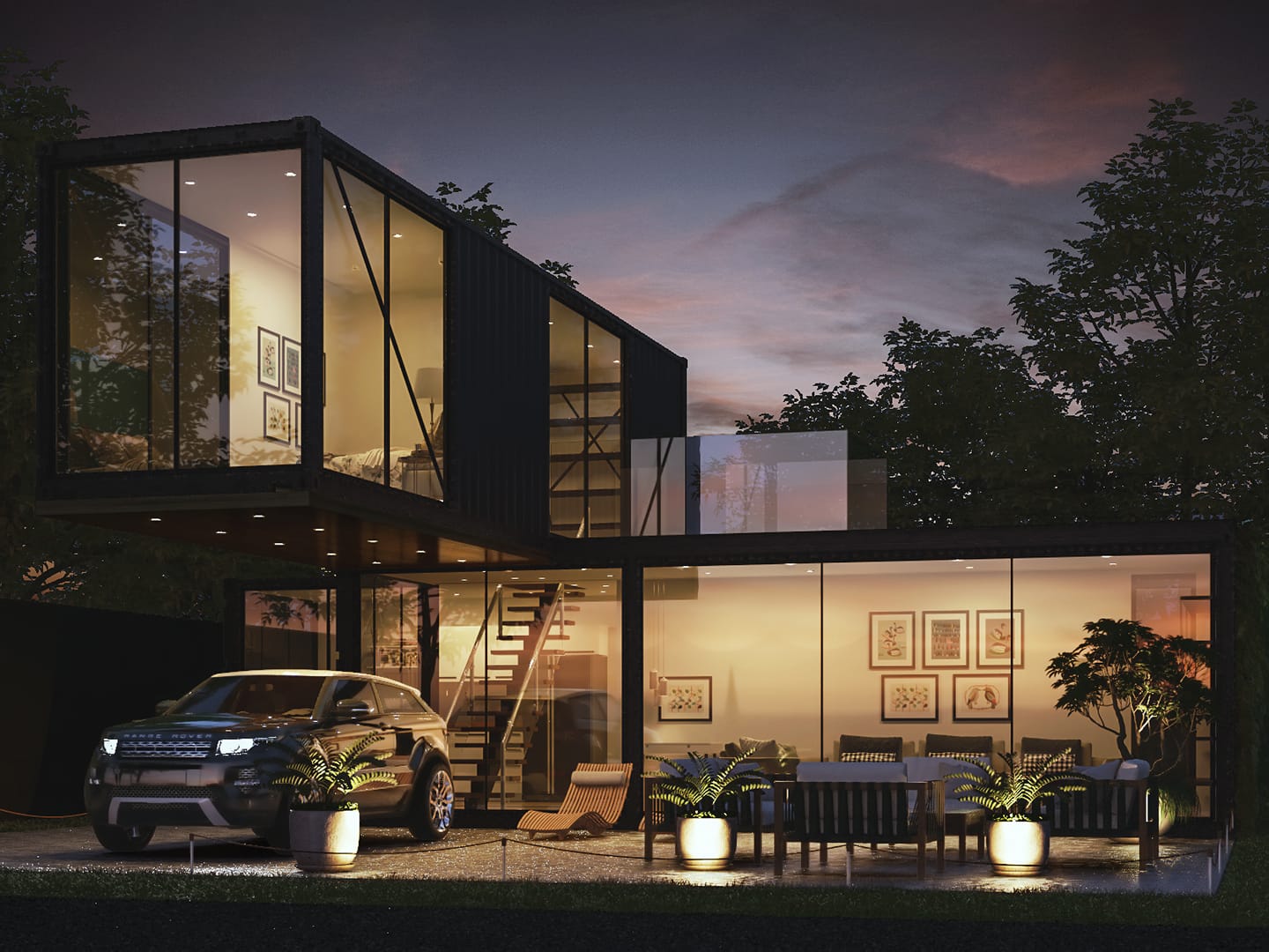
Casa Container By Guilherme De Laurentiis.
TIPS:
1. Lighting.
a. We could imagine that the sunset is behind the building. By using the proper HDR image, a soft light could hit this side of the container and highlight it somehow.
b. Interior lighting, randomize it a bit. For example, more warm lighting in the bedroom and a less warm in the living room.
c. These spotlights, which placed inside the grass, just strongly highlighted the plant pots. They've created a point of interest without interest. I would suggest you use only two spots and beside the plant pots. In this way, you can highlight the furniture set as well as the architecture.
d. Even in a realistic photographic scenario, you should get some bloom and glare on almost all the ceiling spots. By using bloom and glare, you could also have better antialiasing on the spots.
e. Τhe lights of the car haven't a realistic result. Better to turn them off.
2.Materials.
a. The glass material doesn't match the rest scene, and it's placed in the middle of the image.
b. Α car license plate could help here.
3. Composition.
a. I would remove this armchair to create a "welcome point" with the rest furniture. I also think that the armchair and the 3rd plant pot aren't necessary for an even better composition.
4. Post-production.
I would try to give a bit more contrast to the sky, with more visible colors. Sometimes, it's nice to use the "lines of the clouds" to enhance the shape of architecture. In this case, a flipped horizontal sky could travel harmonically in a parallel path with the upper part of the container.
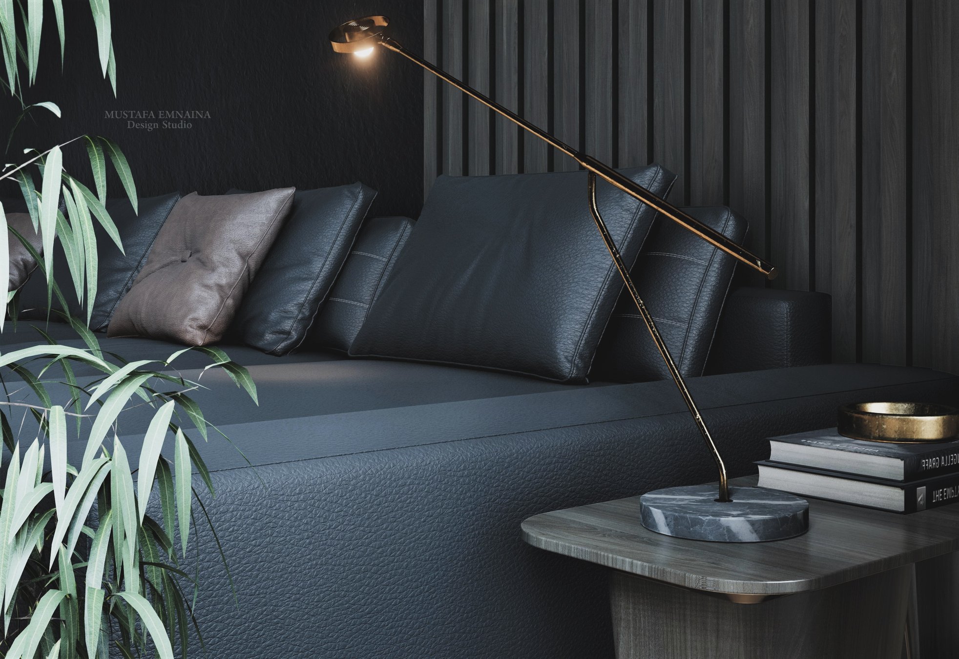
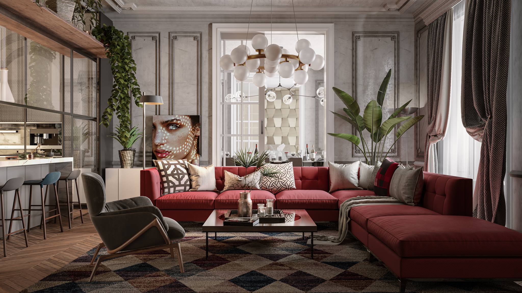
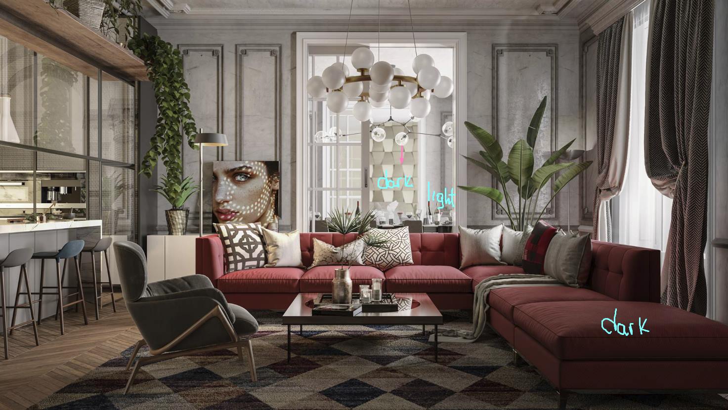
Dark Living By Mustafa Emnaina.
TIPS:
1. With a mesh-smooth modifier, the leaves would have much better geometry. DOF could also work nicely on the foreground. Although I wouldn't use this plant at all for a closeup shot. It's not a good model.
2. No good composition and the scaling relationship between the several objects aren't good at all. I would remove the poof, scale down the books, and try a better material for the vases on the disk. The background has the wrong perspective in all shots.
3. I would remove the books because they blocked the only small path of the scene. Three vases on a small side table posed like the soldiers of an army! Two of them are enough and the small one in front of the big one.
4. Not bad, but it doesn't match the overall presentation of the project.
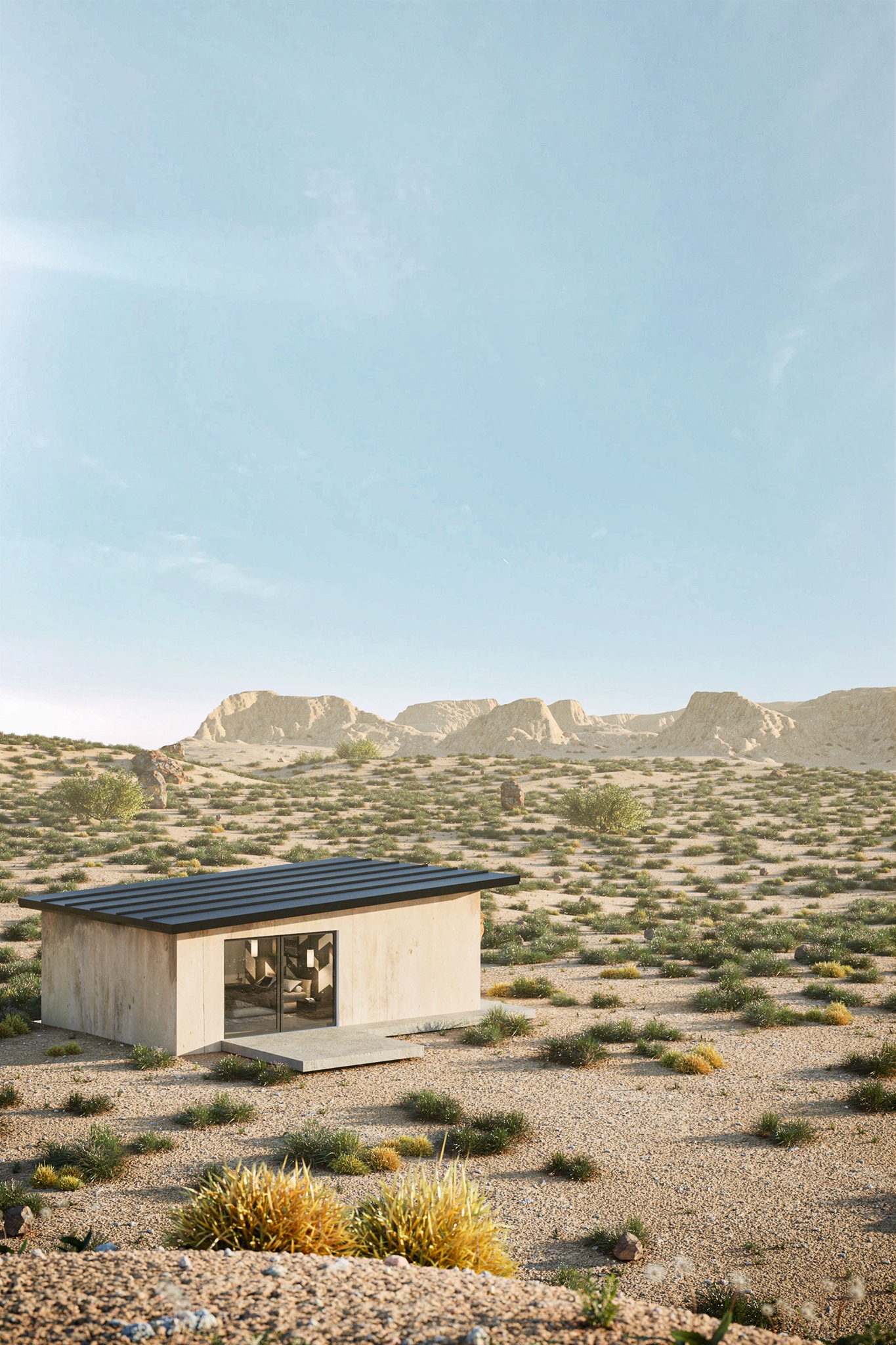
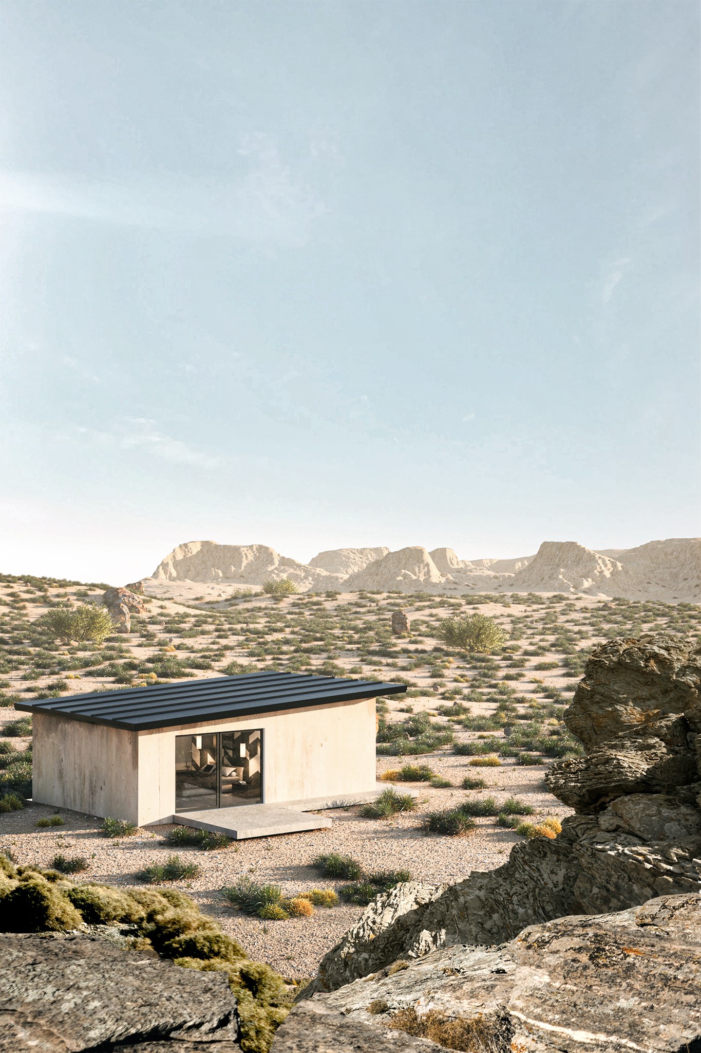
Cottage By Luan Nunes.
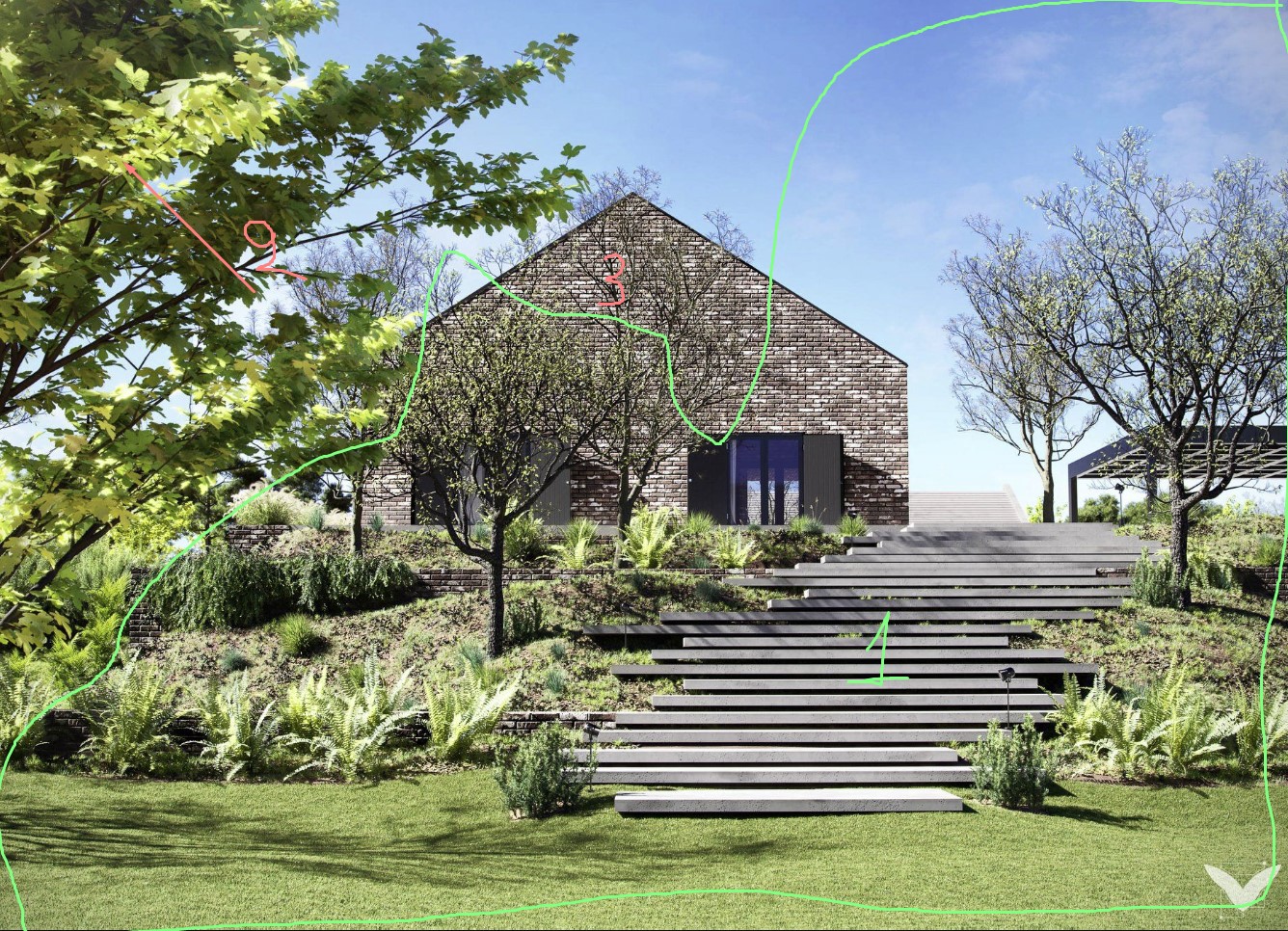
TIPS:
1. This part looks good! While the left part of the image a bit overload.
2. Always a nice and safe way to put something on the foreground, but in this case, it takes a big part of the image. Additionally, the tree has strong light on it, and for that reason, it breaks the attention of the target, which is the building. I would move it more on the left side and add another tree behind it (non-visible to the camera) to keep it in shadows.
3. Maybe, by totally removing this tree, the target point will become even more pleasant.
4. I would finally test a vertical format for this image by adding more sky and without the foreground tree at all.
Ferre Bedroom By Veysel Delen.
TIPS:
You can check out this PSD file. It will be better for you to try those improvements through the renderer and not PS. As a general comment, try to go deeper with lighting and materials and check out the cropped image. When you use a wide lens, you can avoid stretched maps & objects by using a cropped image. Additionally, In this way, you go more close to the subject.
Interior Apartment By Mario Osnaya.
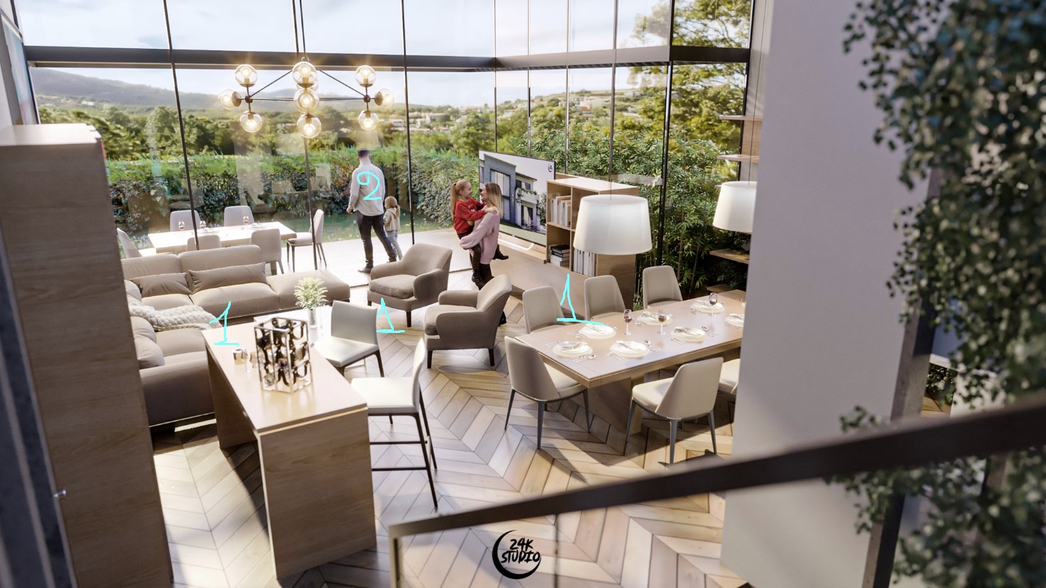
TIPS: Lovely lighting, materials, contrast, colors, and depth of field. Nevertheless, the position of view and composition isn't that good.
1. We have a space full of furniture and not visible paths that describe how space works.
2. We also have a scaling issue. The people in the interior space look a bit small while on the exterior look huge. Imagine the man sitting on this outdoor chair close to him.
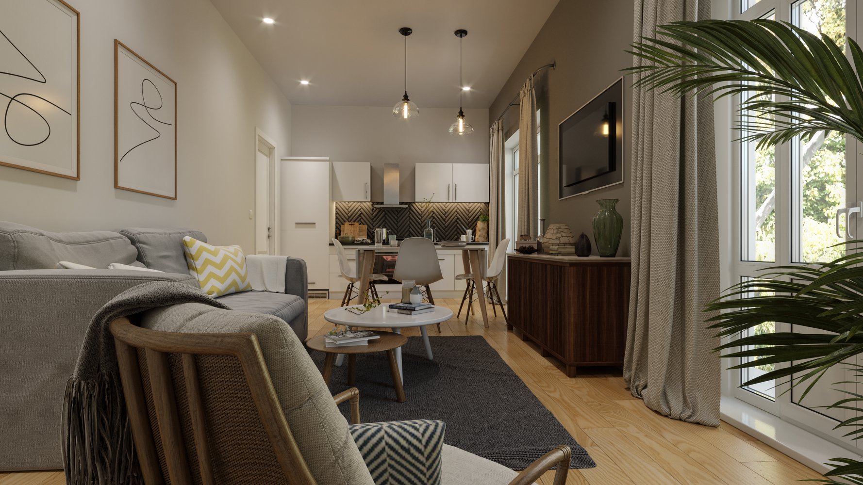
Interior Livingroom By Ines Dga.
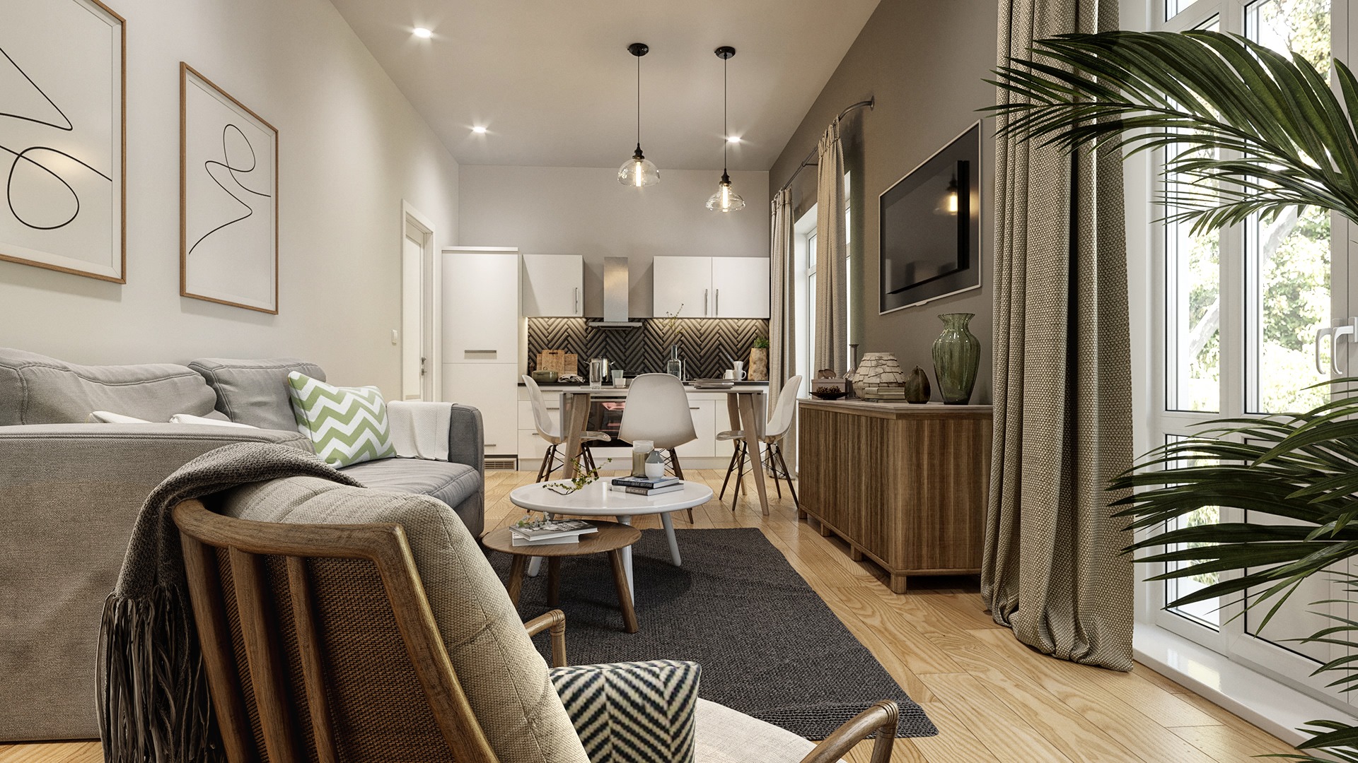
TIPS: The lighting looks very weak; you can improve it a lot by using simple post-production techniques.

Living Room By Aya Muhammad.

TIPS: The ceiling cameras are generally a trend that 3D Artists use very often during the last years even it is quite tricky because of the wide lens and composition.
1. Using one lamp behind the other doesn't offer a pleasant composition. I would remove the ceiling lamp or scale down the floor lamp.
2. Work more on the bulb. Maybe a warmer color and some slight glow effect.
3. The Falloff on the carpet is very white, creating an unnatural look, and the map hasn't a proper resolution. Wirecolor render layer -> select carpet -> give levels for contrast in PS. I guess it will be improved a lot.
4. Poor geometry, it is so visible. If the model has correct quad geometry, then give it a turbosmooth. If not, then find a better one.
5. Non-good geometry. Use a relax modifier to reduce the fake look of foldings. I would remove the plaid and move the pouf a bit on the left side. Probably a yellow color for the pouf could describe the color palette nicely.
6. Strong Falloff map again, which turns the dark areas to black while we can't see something similar (sharp contrast) in the rest scene.
7. Graphite modeling tools, probably relax brush to tweak the folding on this pillow because they look crispy.
8. Due to the wide lens, a big distortion appears in the armchair. Scale tool -> Local gizmo -> scale down in one axis (arrows).
9. An intense light is coming through the window of your scene. I suppose that light comes behind that building, and thus the background building could be less burned.
10. Small detail but unnecessary. Keep the floor in wood, which could be less yellow - desaturated.
11. Move the armchair close to the window and rotate it vertically (top view). In this way, your model poses better to your camera, and you describe how the space around the coffee table works.
12. The crop of the image on the right side isn't pleasant. I would give more pixes to see the beautiful shape (end) of the armchair.
Livingroom By Doann Phu Hai.
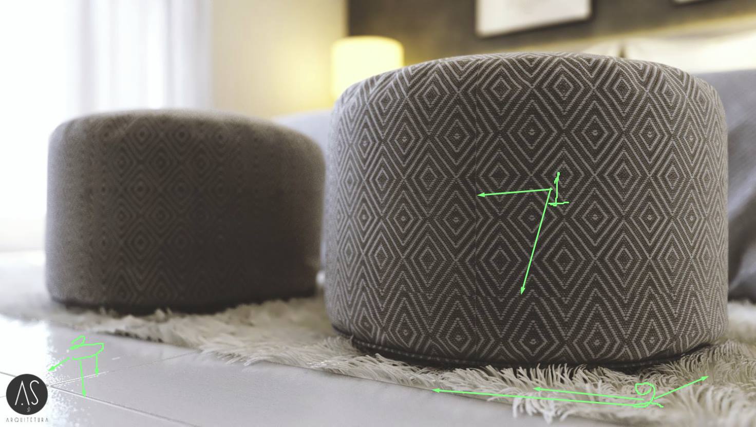
TIPS: I know this carpet, and it is not a good model. I want to give you two 1min. Tips to improve it.
Check out the model; you will notice that it has two elements. 1st is the base and 2nd the fur.
Tip 1. Copy - instance, the fur and rotate it 180 degrees. After this, you will get a result like the attached image.
Tip 2. Create a copy material of the fur, then add the same material on the base + a displacement map of 1-2 cm.
Livingroom By Wahyu Damar Prasetyo.
TIPS: Nice effort Wahyu, check out this PSD file. You have to install the Nik plugin for photoshop.
The lighting in your scene is weak, and thus, the colors and textures of the materials look flat. Try to give better contrast and points of intensity in your image. It 's a good practice trying to achieve a similar result through your renderer and not post-production.
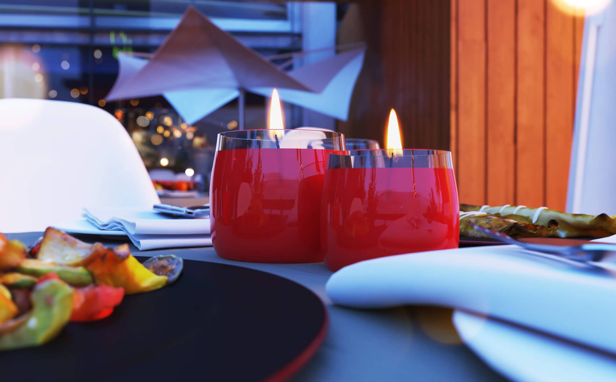
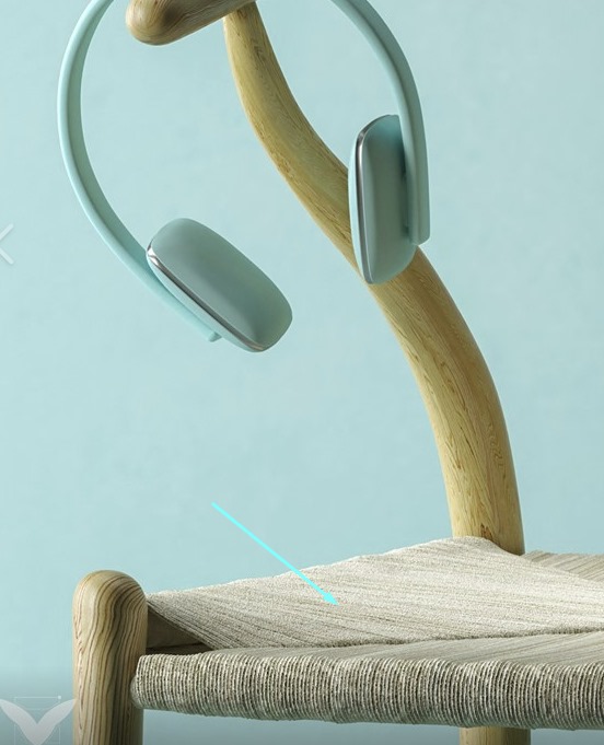
Love For Red By Imran Shehzad.
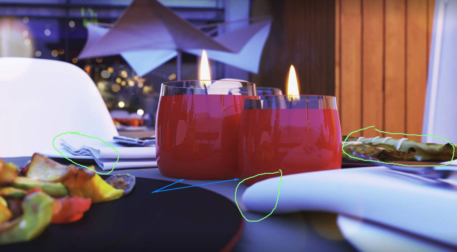
TIPS: As you went so close up, then try to add more geometry and create better materials in the green notes. Just a tip in blue: 0.1cm higher the candles. In this way, you ''ll get an adorable soft shadow at the bottom.
Madeira By Felipe Marques.
TIPS:
1. You need better placement for the pillows. Check out this TUTORIAL.
2. Confused composition of decors. Too many elements one behind the other. In any case, you present a minimal design so you could have fewer objects and better placed.
3. Strong glow effect, try to decrease it a bit as you do it photo-realistic.
4. No good light balance. Powerful daylight coming from the windows + solid artificial lighting. The result was to burn parts of your image and lose some nice shadows as well.
Magic Room By Gerbertho Delgado.

TIPS:
1. Both floor and ceiling maps are in low resolution, and thus they look a bit blurry. The same concerning the marble.
2. The foldings on the carpet look unrealistic. I think they are too many, and they give a "plastic" sense to the model. I would try to replace the map with fewer foldings to reduce this effect + a better bump-displacement map. On the other hand, I believe that this striped diffuse map doesn't match the rest design. Maybe a simple off-white carpet could be a good option, but anyway, this is a personal taste.
3. The plaid model isn't good as its shape-foldings are very tough. I would replace it with a softer one, and I would move the poof to the right (Half on the carpet and a half on the wooden floor) as it confuses the composition of coffee tables.
4. Bloom & Glare effect is powerful, maybe 25% less would give a more realistic result.
Mothers Bedroom By Aamir Raza.
TIPS:
1. This is not a good model, and it doesn't offer something good for your project. Remove it!
2. Try to fix the mapping on the curtains.
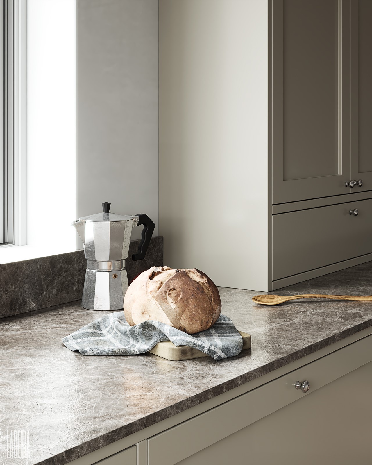
Nordic Kitchen By Mateus Ladeira.
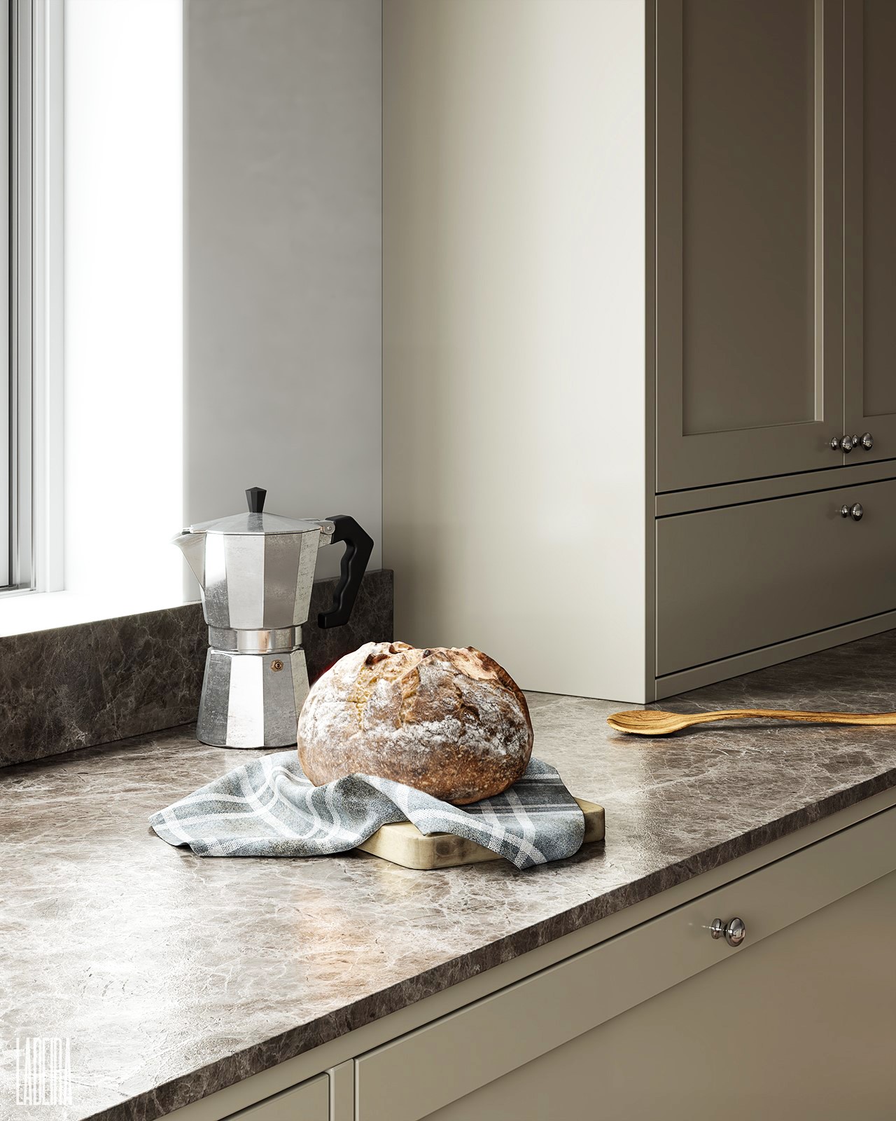
TIPS: Patching textures, a small tip for your close up.
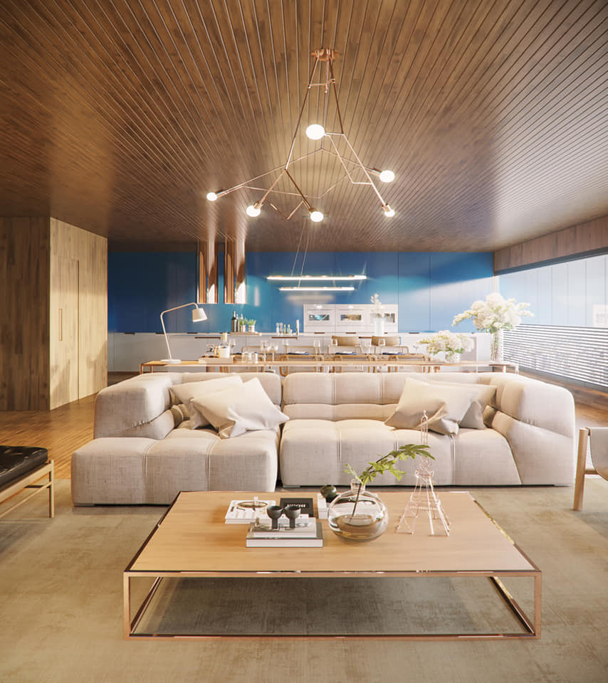
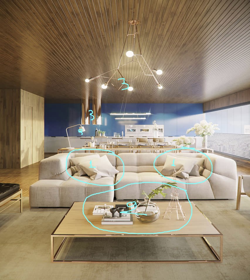
Personal Project By Francesco Matera.

TIPS: Nice set. I would suggest you test this:
Line1. Ceiling
Line2. Window Kitchen
Line3. End of the plant ( Scale down )
Line4. End of Picture - Frame.

R C Suite By Samuel Simon.
TIPS: The camera is good enough, and lighting pretty nice. As you would like to take a close-up shot:
1. Create a seamless texture and practice yourself in unwrap UVW mapping. I suppose that a cylindrical UVWmap could also work in this case, but the seamless texture is a must!
2. You need a bit more fur on the carpet and additionally a wider base, something like 0.5-1cm. If this is a hair and fur object, then export the fur as a geometry -> Make a copy and rotate it 180 degrees. In this way, you will get a randomized but also doubled amount of fur. Try to add some texture on the base with a strong bump or even a soft displacement.
3. Decrease a bit the reflection on the tiles and add a second id material for the grouts. Something mat, white, or light grey.
Close up shots have a meaning since we go deeper on details like modeling & materials. I hope you will find my suggestions helpful somehow.
Red Bureau By Rana Ezzat.
TIPS:
1. No information - an empty space.
2. Cropped information.
3. Keep the camera stable and move the target to the right.
4. Then keep the target stable -> move the camera 20-25 cm higher -> add guess vertical shift. In this way, you will center the subject (bed), and you will show a bit more of its upper part. I also like low height photography, but in this case, I think you went too low.
Renovation Of My Church By Tsiky Imanoela.
TIPS: I would suggest you go with the same mood as your reference image for better lighting & materials training.
When I go out for photography, I'm trying my best concerning the composition & crop of the image. Then I open my shots in photoshop, and I usually get disappointed, so I try to correct them with post-production techniques. This process has helped me a lot to improve my 3D POVs & Composition as well.
This reference was not bad at all, but I found a big empty space (wall of bricks) on the right side and a non-good cropped tree on the left one. Working a bit on it, I also changed the format by adding more sky and played with colors and contrast.

Study By Suelen Arantes.
TIPS: As you went so close, then try to do something on this wicker material.
Find another, better one, or even create your material. Try to correct the mapping and additionally its displacement map. Play with hair and fur to create thin hairs, randomly placed, and bent them.
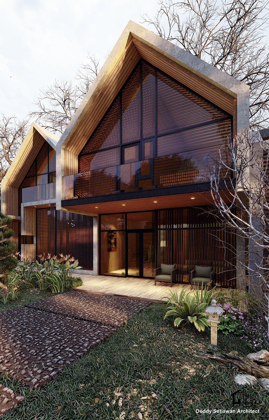
Tropical Modern House By Doddy Setiawan.
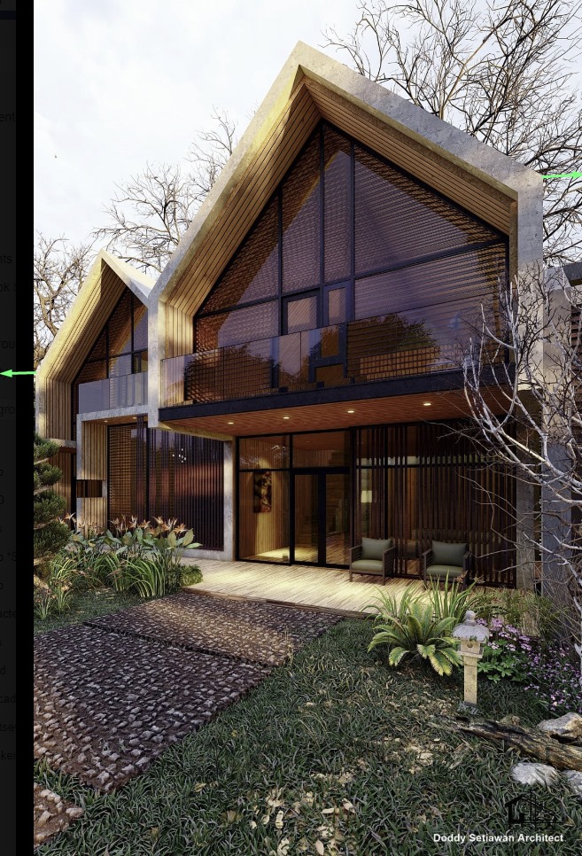
TIPS: I think you need more pixels on the left side of your image to balance the framing.
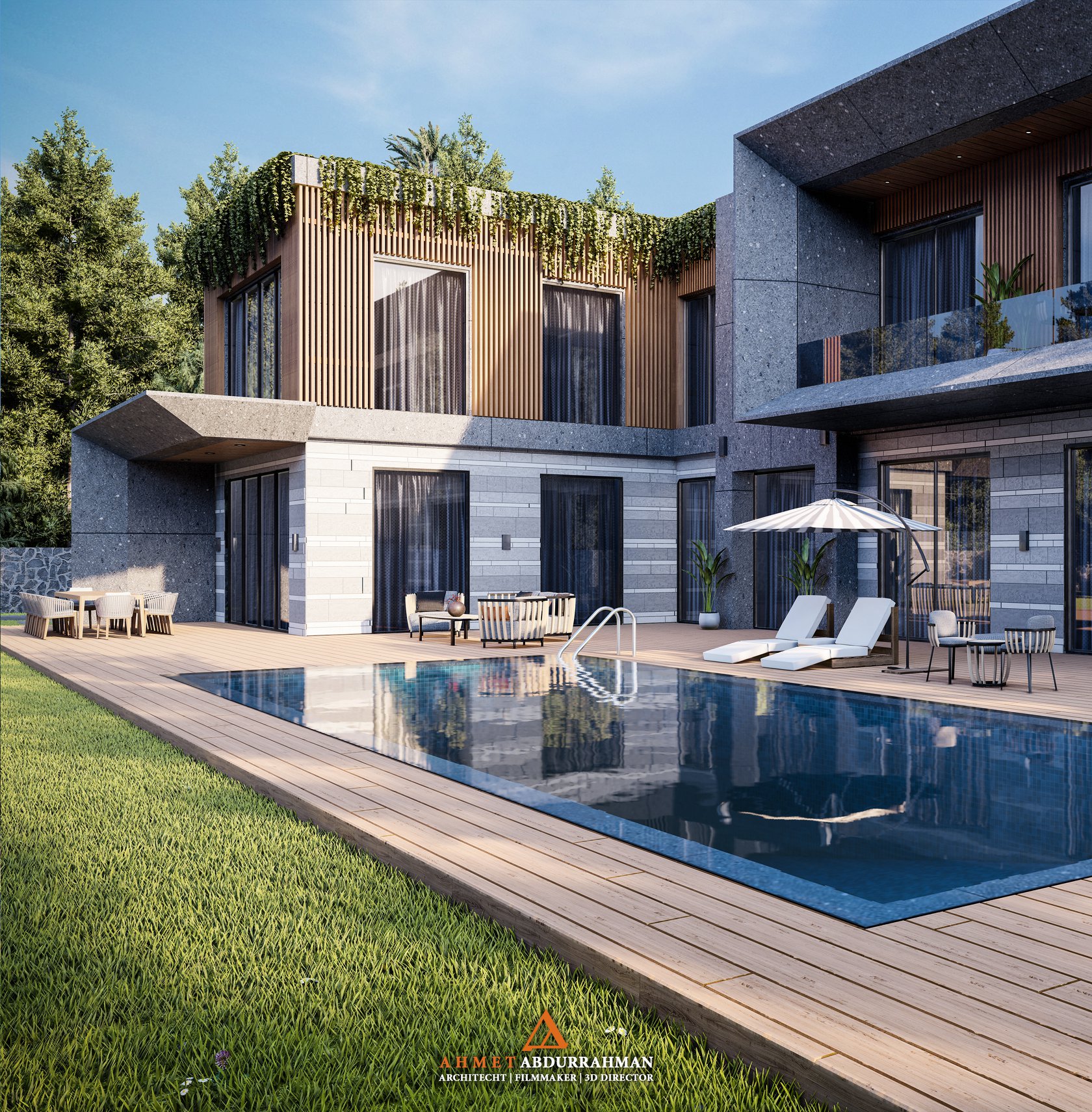
Villa Render By Ahmed Abdulrahman.
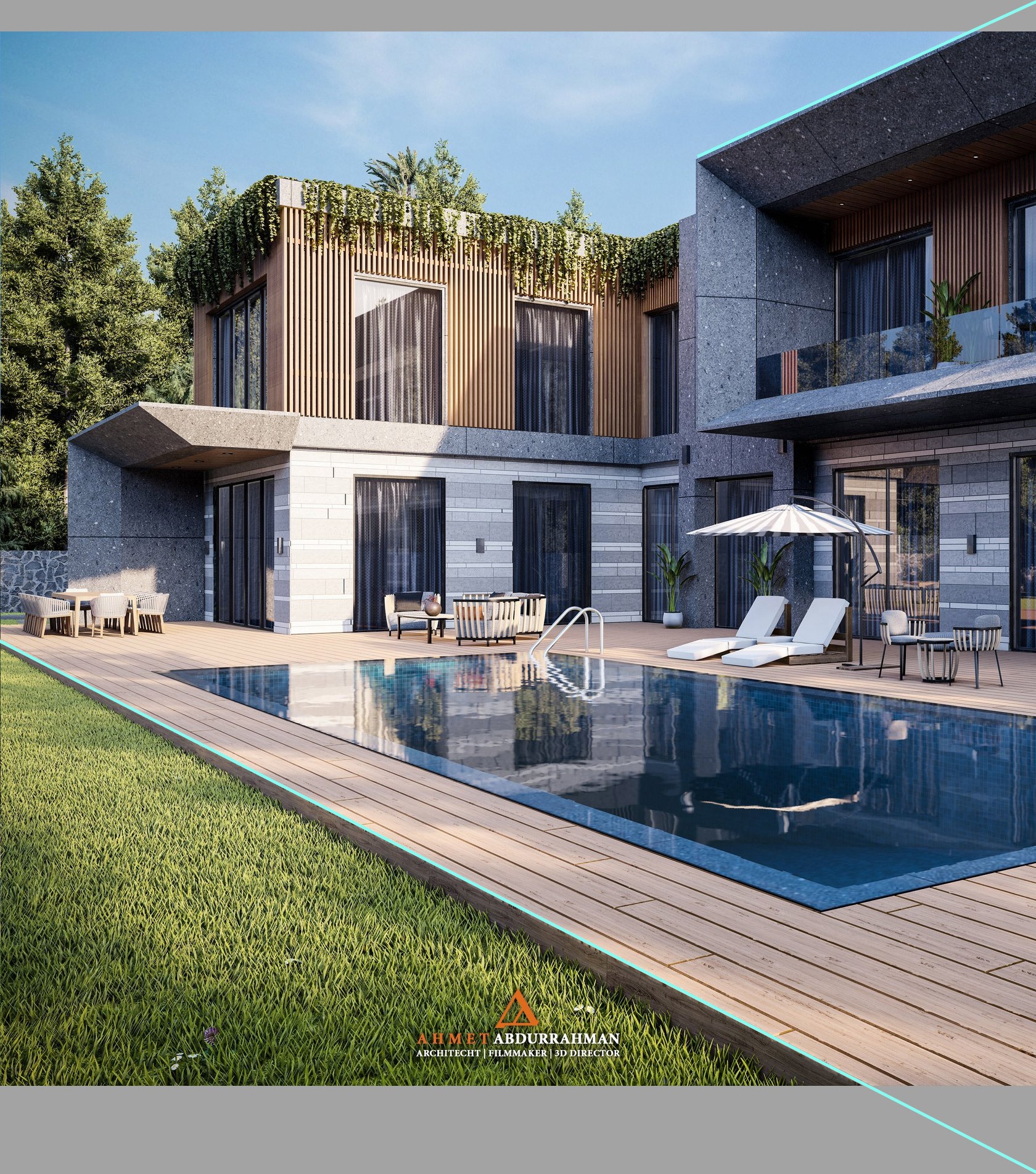
TIPS: With another set of furniture and well placed in the scene, you could have an adorable image. Keep it up! One small tip, try to use the architectural lines starting from your corners, whenever it is possible.
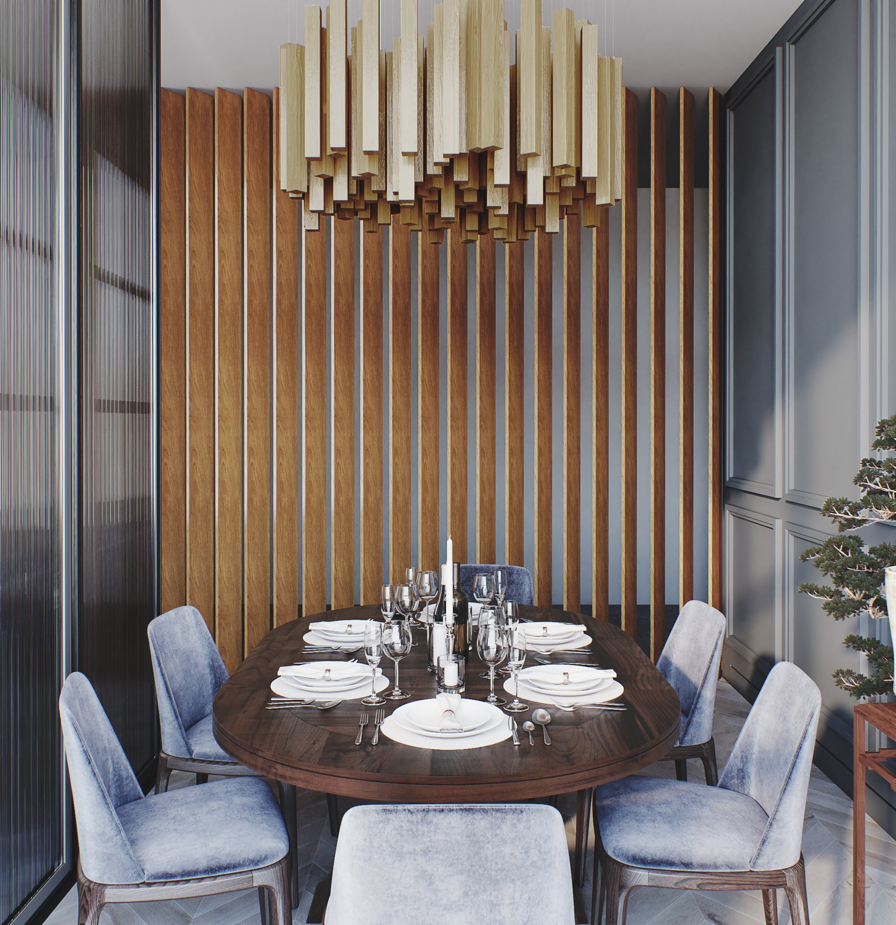
Vintage Dining Room By Drews Diego Drews.
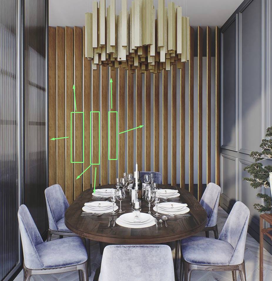
TIPS: I would like to give you a tip for better mapping there. You could improve it with unwrapping, but I will go with a tip for more lazy guys like me.
1. Attach all the wooden columns to an editable poly object.
2. Add a simple UVW map type box on it.
3. Add a new edit poly modifier on the stack & select only one element-column.
4. Copy-paste the UVW map on the chosen element & move it a bit on XYZ.
5. Repeat steps 3+4 for each wooden column.

White Livingroom By Nguyen Huu Duy.
TIPS: There is an easy, 5 minutes technique in Ps to improve your carpet's low-resolution diffuse map. Open it on Ps and enlarge it to 4000X4000px. Then follow the process below:
1. De-saturate 100% the map.
2. Add levels for a strong contrast.
3. Pick up the white color using the Color Range tool.
4. With feather and refine edges, you can smooth your selection.
5. Make a mask with your selection and paint it with pure white color.
6. Invert the mask and paint it with pure black color.
7. Find on google a high-resolution bump map. Let's say something like this EXAMPLE.
8. Add a new layer using the map above -> desaturate & levels to make it bright. ( You can use this texture also as a bump or displacement map.
9. Blend it with the B&W map that you created previously (Steps 1-6), using soft light, for example, and use it as your diffuse map.
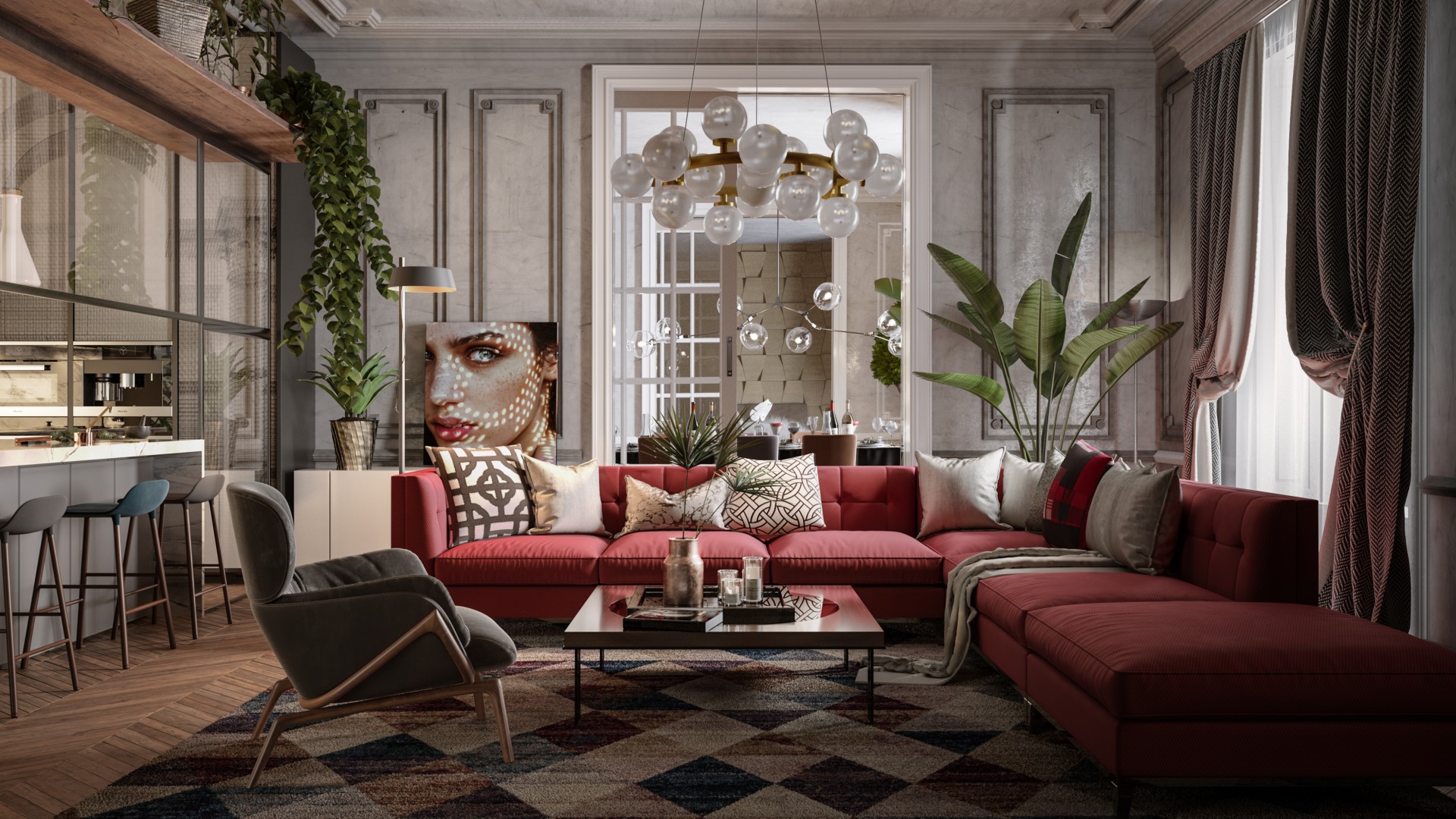
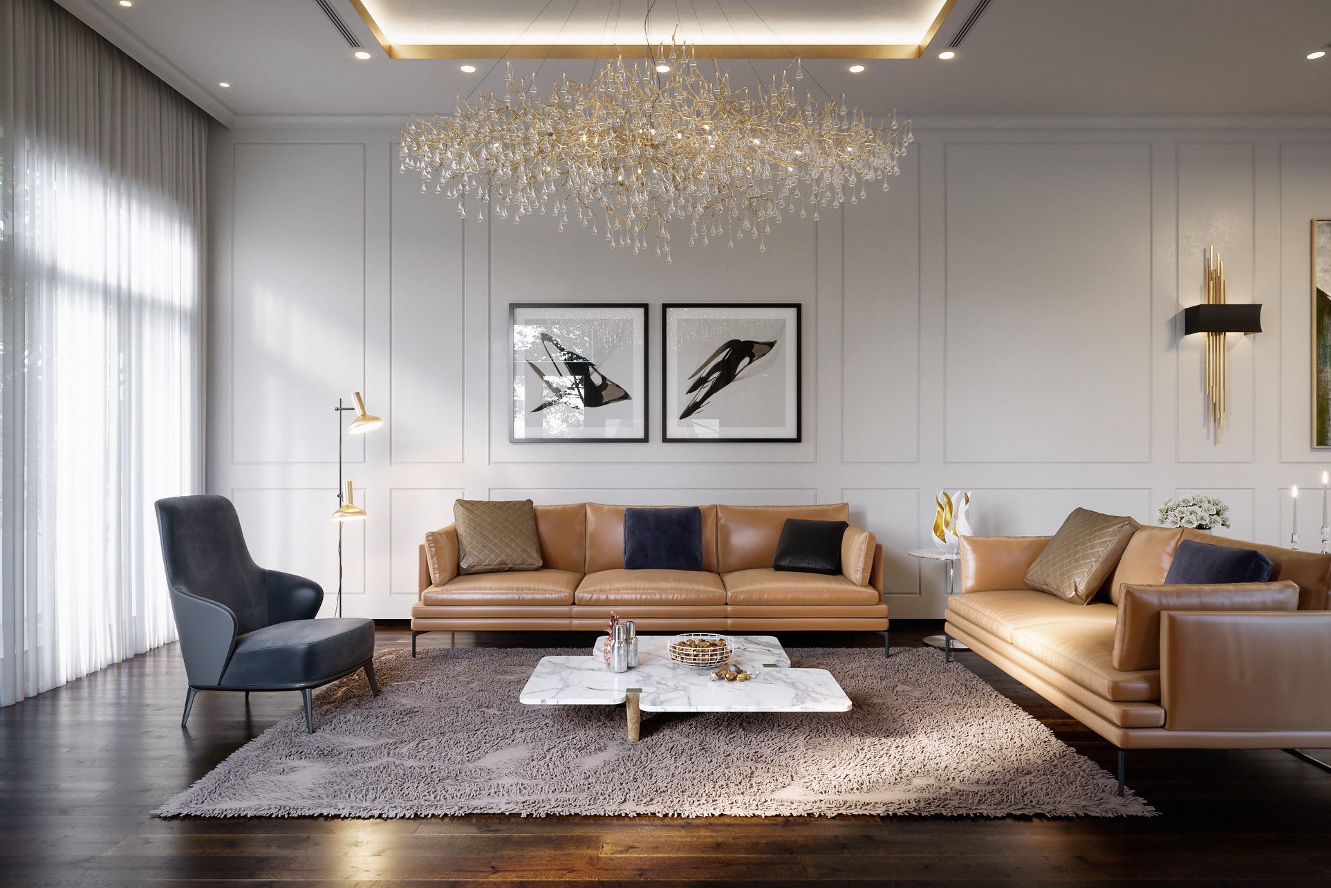
Classic Room Design By Daniele Spina.
TIPS:
1. Pink: Lower the ceiling lamp. ( The bottom part 150 cm from the floor) In this way, you will get a better minimal design, and you will avoid somehow the confusion between the two ceiling lamps ;)
2. Try a darker illumination in the third room. In this way, I guess you will get fantastic gradient lighting between the three different rooms.
RESULT.