An in-depth evaluation of the project "Minimal Interior" by Karnvir Gulati which didn't make it to enter the gallery due to our *Quality Standards.
5-10 rating system. In order to approve a project to be published on VWArtclub Group, it needs an average of 7+ rating.
Modeling: 6
Framing: 6
Lighting: 7.5
Materials: 6
Post Process: 7
Difficulty: 5.5
Total: 6.33
"Minimal Interior" by Karnvir Gulati.
Before we speak separately for each part of the rating, it would be essential to mention that this project is a simple scene, and for that reason, the artist owes to master the basic principles of 3D Art to get an approval. I recently saw a great example on our FB *Group by Martin Schropp; it's worthy of taking a more in-depth look at this PROJECT. I won't evaluate this one, but at first glance, it is a 9+ Rating project for me!
Light & Love by Martin Schropp.
Modeling: 6
In an interior space, we usually have to model some simple boxes as walls, piece of cake. Nevertheless, when you use bad-looking models, you don't get a good score. For example, the pillows and quilts. Details like cables, smooth geometry in close-ups, fillet on the walls, and so on.
The highest possible score in similar scenes is 8+, but you lost 2 points because:
1. A visible fillet on the wall is a must. The light will create a nice transition from dark to bright shadows precisely on the corners. In this way, you avoid the hard black and white flat effect on several sides of the wall.
2. The model you used has some kind of bug. A better map or a geometry correction could probably save it. All the rest models used in this scene don't look bad at all.
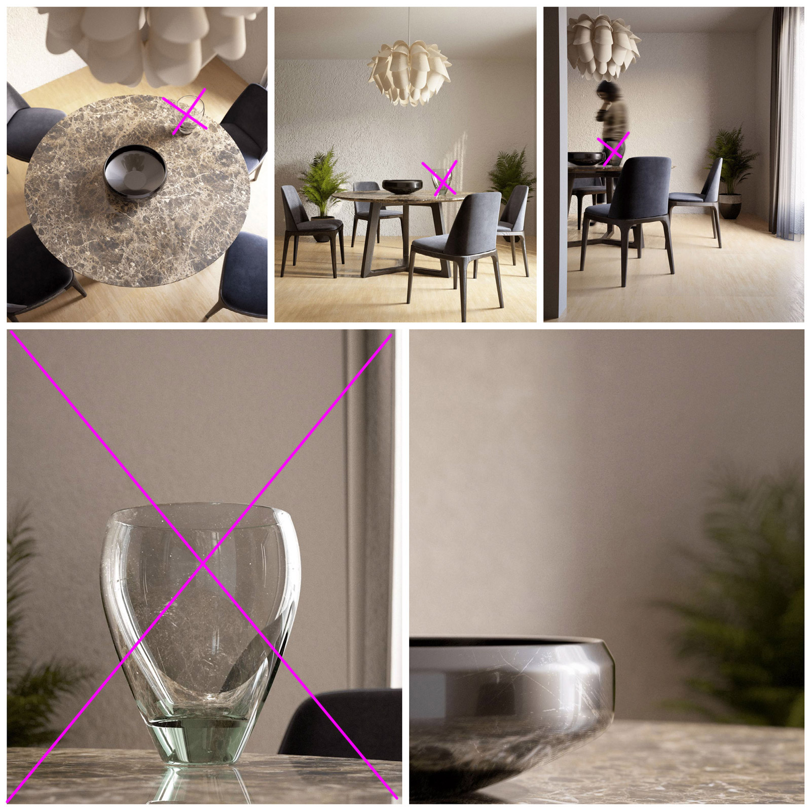
Framing: 6
What's the most important of VW *Quality Standards? "The Composition"
Why? "Because almost everything else sounds easy in our days."
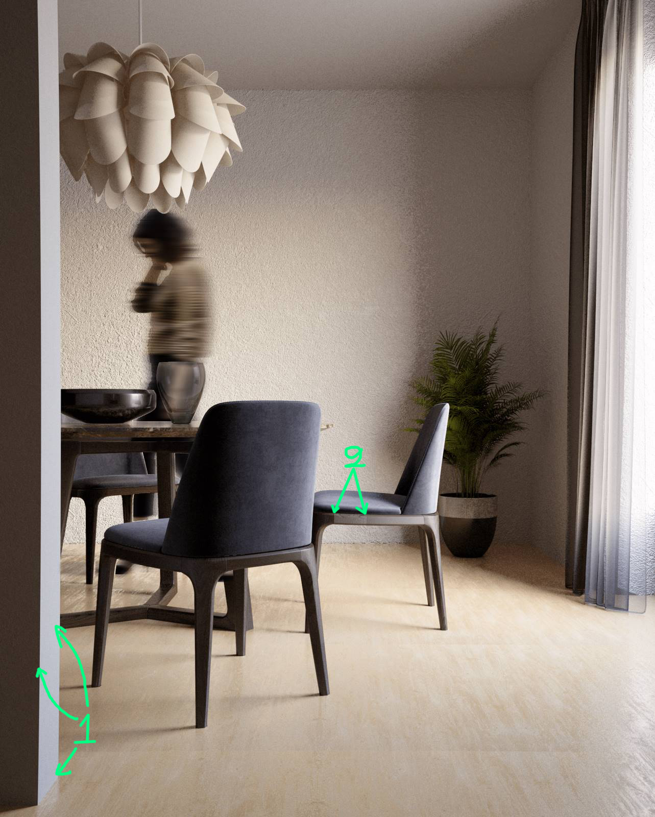
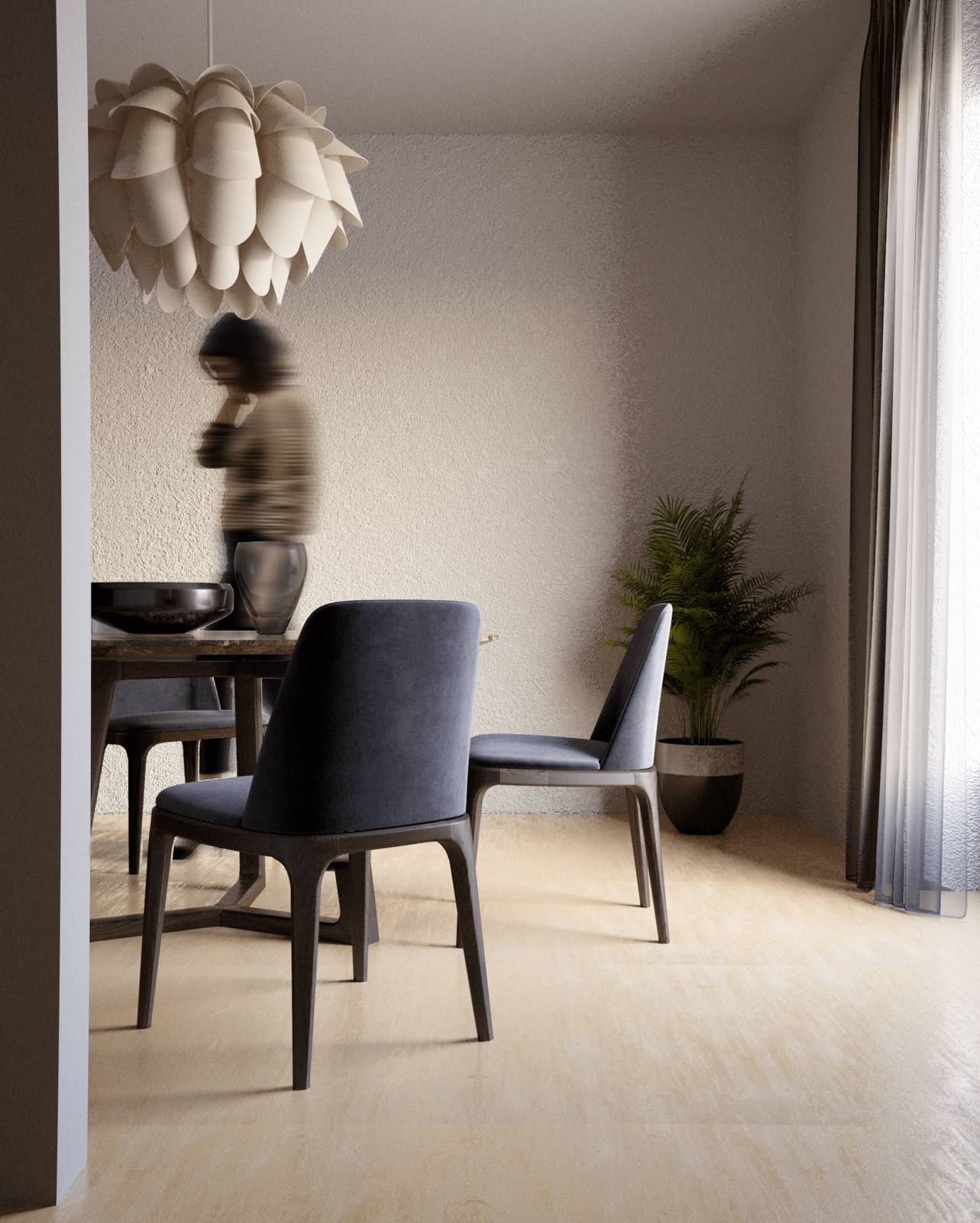
1. Only the shot below has a nice composition and enough balanced framing.
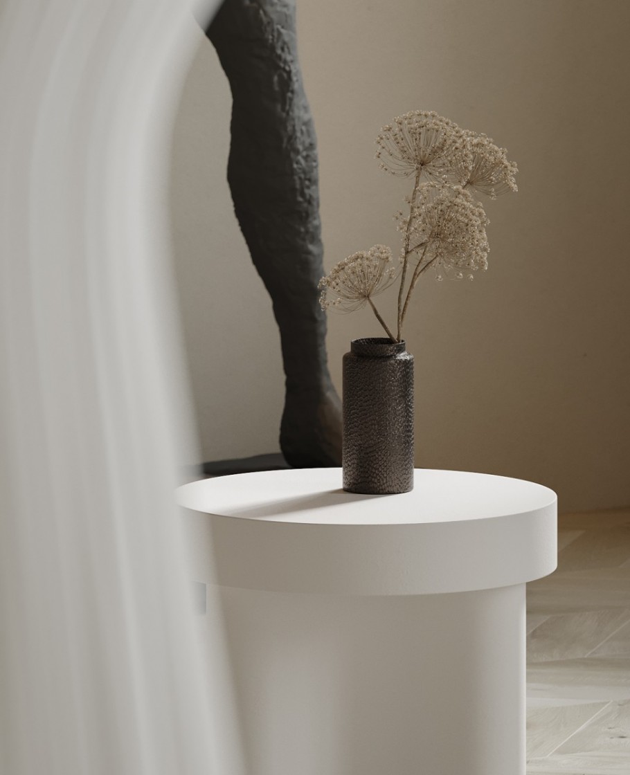
2. I would totally remove the glass vase from all shots because it breaks the balance or symmetry of the scene. The big "X" close up has no meaning at all. When you want to shoot a single object just imagine that you have a "Top Model" in front of you, and you have to "teach" it how to pose in your lens. That means you move it, you search the best possible corner for lighting and composition and you finally go deeper for an advanced material in order to attract the viewer.
It is also good to use this tip even for general shots where you have a lot of models looking at you. "Every model in your scene must pose nicely for a photograph."
For example, look at the image below. It has a Foreground -> target point -> Background. Perfect DOF (Depth Of Field) usage. A close-up shot with a meaning.
"Marrochino" by Roy Ghaya from Kframe
3. The Close-up below could be improved a lot with a couple of small revisions.
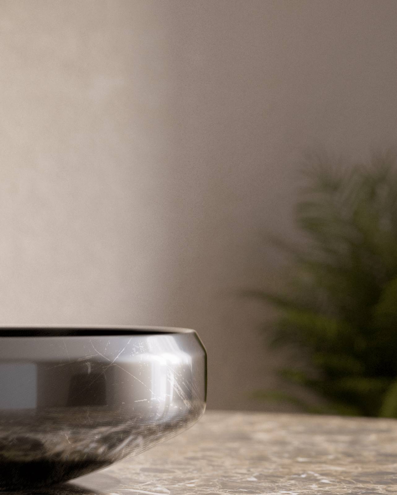
I would first change the format & crop just a bit even it's not that bad as it is.
And I would add something in it for decoration, "looking at me". Some leaves or branches could work. 
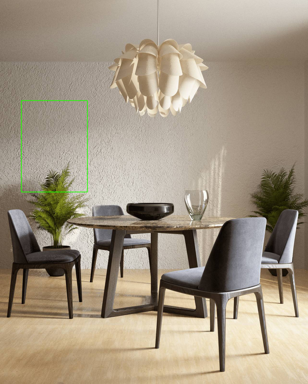
4. Here we see two similar plant pots. Sometimes, it works pretty nice, but in our case I think one is more than enough. On the other side, you can try a painting or a floor lamp or both of them.
Lighting: 7.5
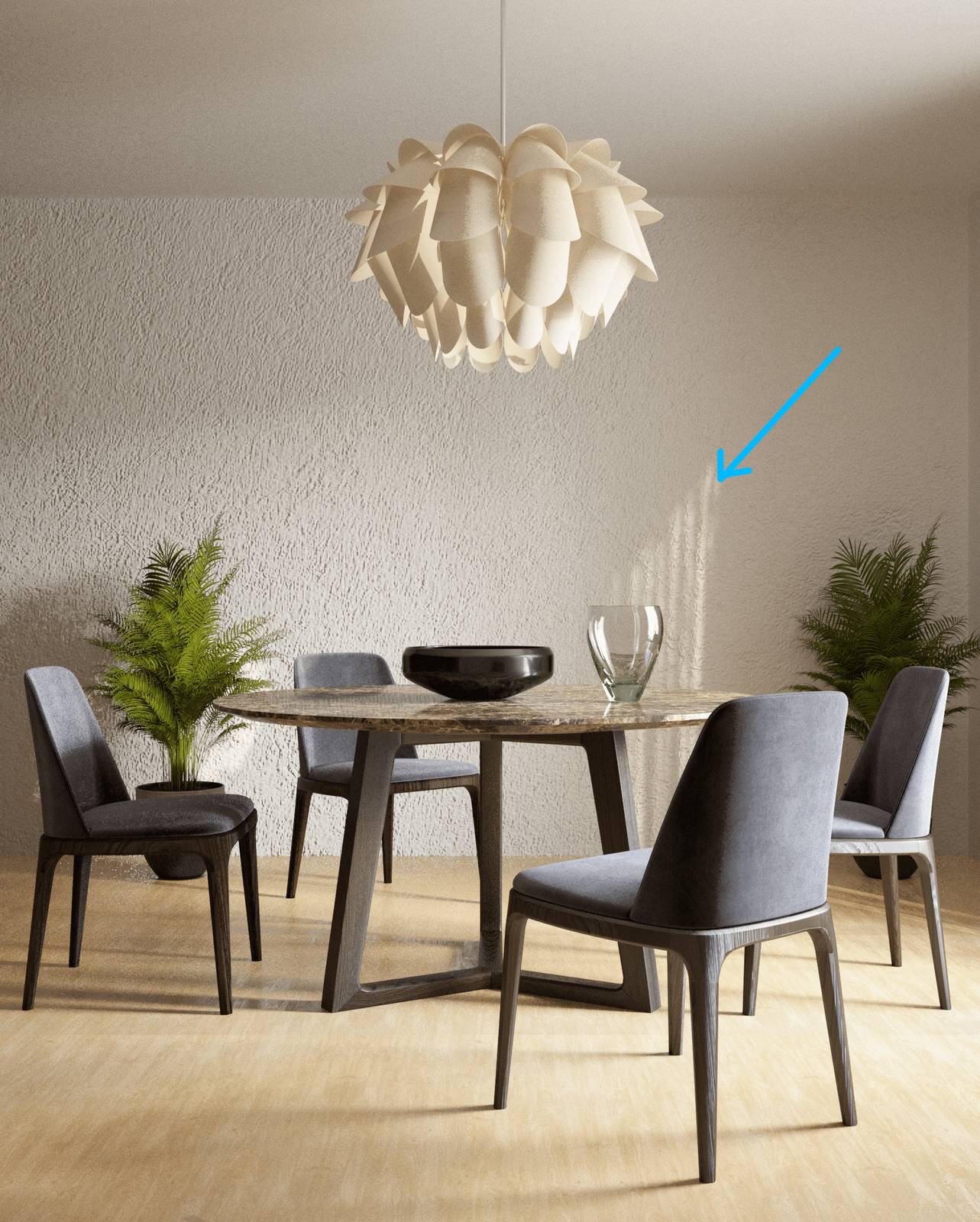
Common interior daylight. Nice with visible soft shadows even I can notice a small noise in some of your images which probably comes from the material of the curtains. If yes, then there is a trick to exclude them from your main lighting source and add another additional light that affects only the curtains. Otherwise, an override material could do the job. Finally, I don't like this sun result, the shape of the light on the wall.
Materials: 6
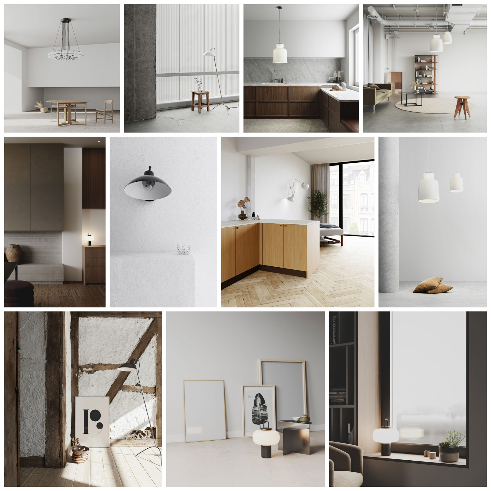
Generally speaking, I feel that you simply dragged and dropped some models which have enough good materials in your scene and that's all. Nevertheless, the ceiling lamp has a very basic material that is not good at all. The only two custom materials you had to create look almost fake (Floor and wall). Neither the texture nor the settings can satisfy an advanced 3D Artist. Additionally, I don't see any color palette. Just some random colors and materials. You need to study deeper the color and advanced materials creation. It is obviously your weakest point. You can check out the project below to understand what we mean with the term "Colour palette"
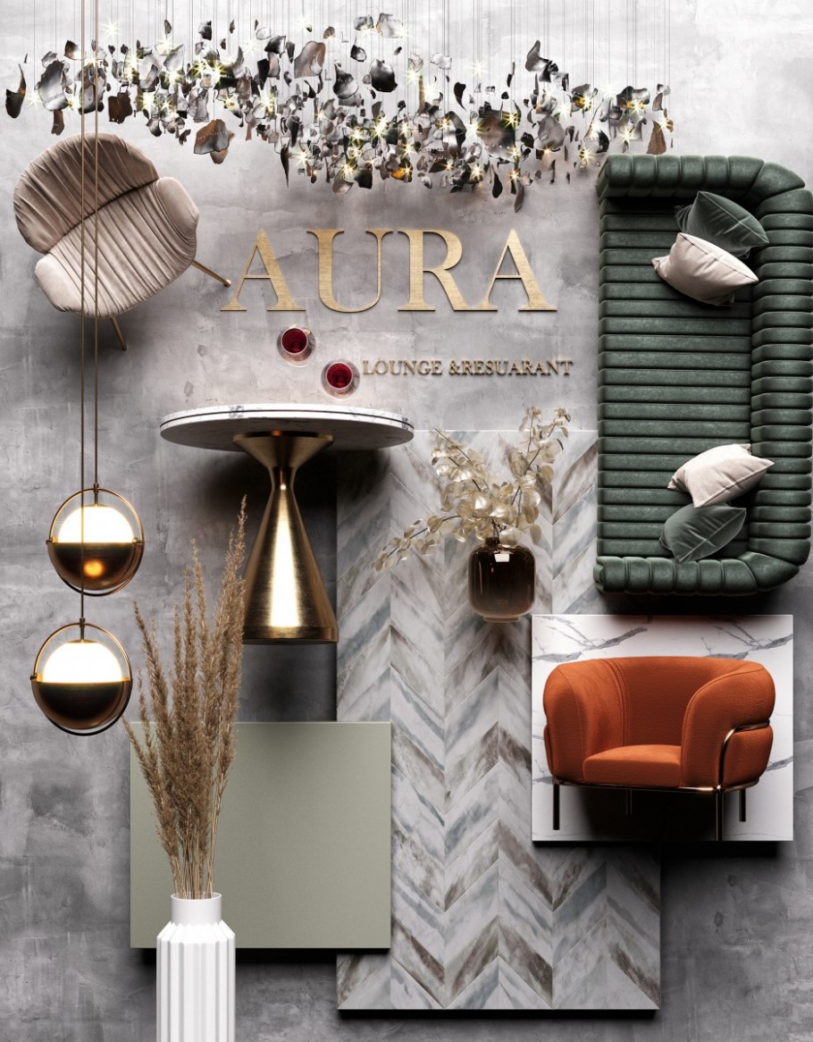
Aura Lounge by Ibrahim Fathy.
Post Process: 7
You can't do a lot of improvements in this simple scene, even if the white balance is not that good you have a nice contrast in all of your images.
Difficulty: 5.5
+0.5 points because you tried several shots. We speak about a very simple and easy scene.
Below you can find a very interesting & informative video tutorial.
Kind regards & Keep rendering!