An in-depth evaluation of the project "Master Bedroom" by Yazan Al Hafi which didn't make it to enter the gallery due to our *Quality Standards.
5-10 rating system. In order to approve a project to be published on VWArtclub Group, it needs an average of 7+ rating.
Modeling: 6
Framing: 7
Lighting: 7
Materials: 6.5
Post Process: 6
Difficulty: 6.5
Total: 6.5
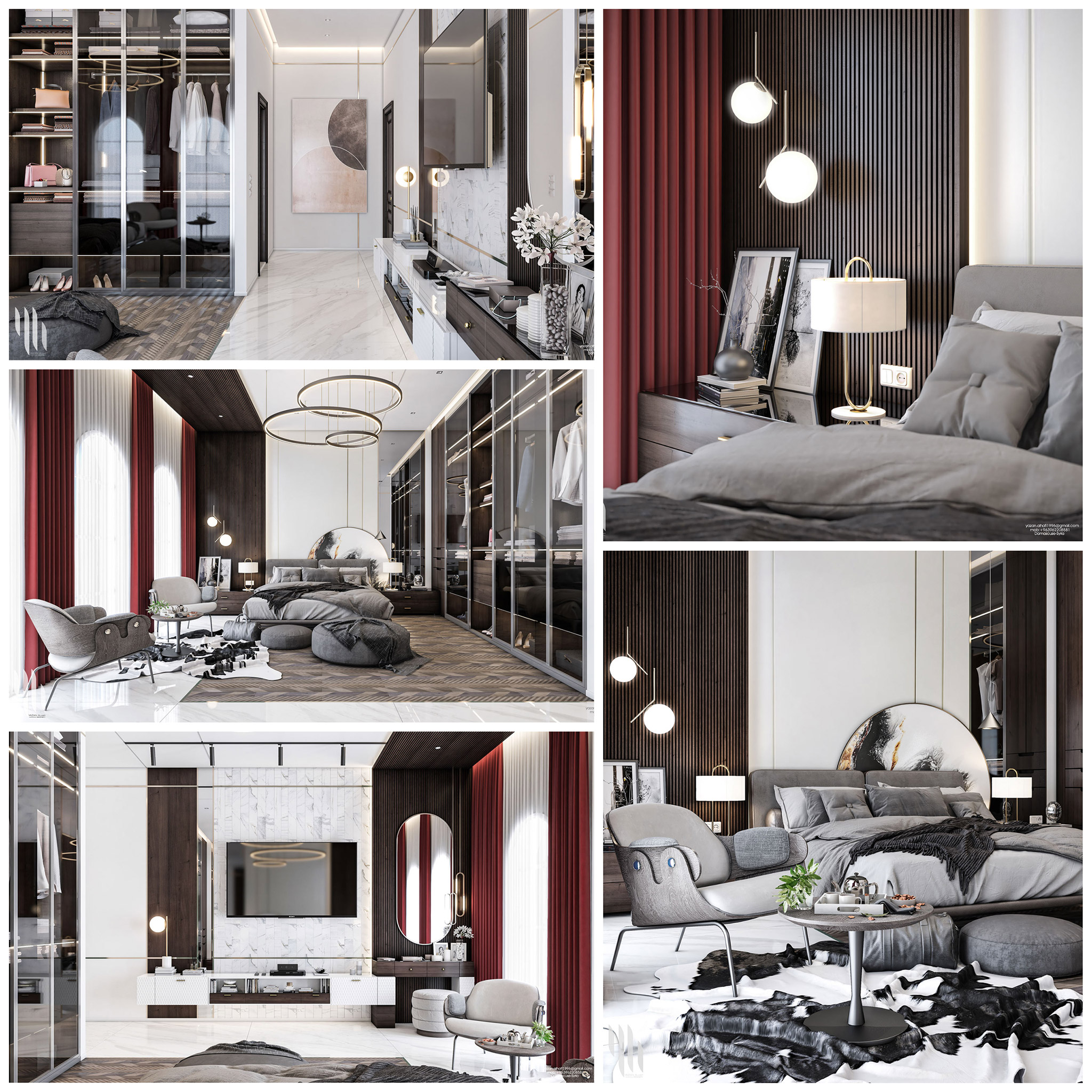
"Master Bedroom" by Yazan Al Hafi.
It is tough to come up with something fresh today. Every single day, people from all around the world push the standards further and further. The bar is very high if someone wants to challenge himself with the design classics. And considering nowadays standards- this project has good-enough parts, but it lacks the execution all along. We hope that year from now, you will look at these renderings and find even more ways to improve than we could today.
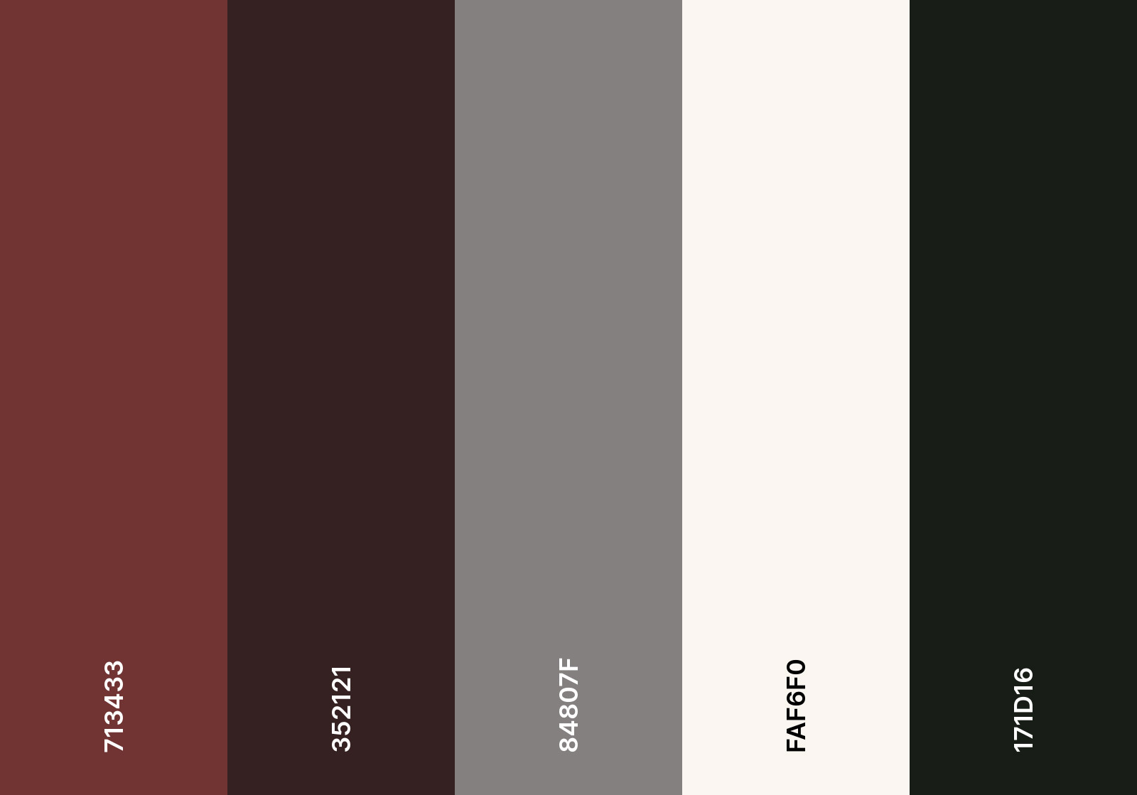
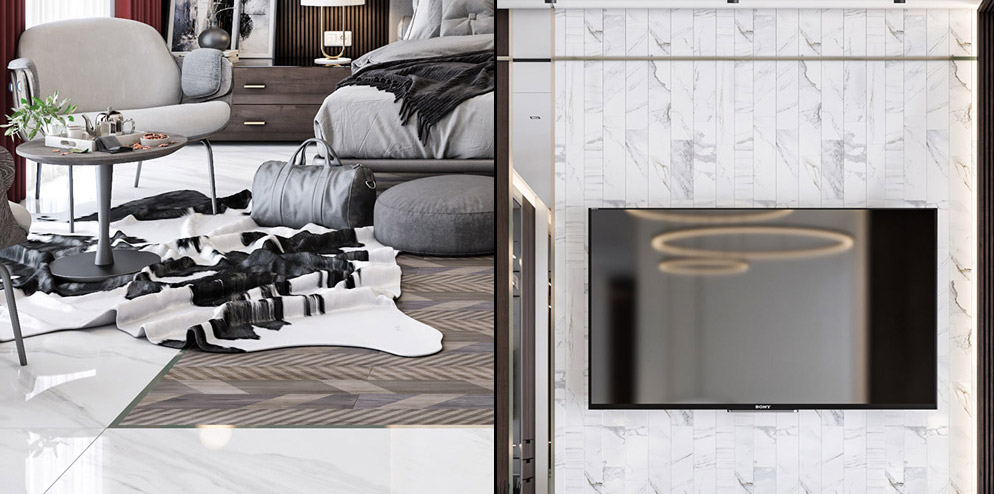
If we had to categorize the design of this bedroom, we would say it has a modern classy style. Of course, it looks more modern than classy but it moves somewhere there. The color palette is quite visible. Black, white, and grey with a strong burgundy red which feels somehow alone as it is placed only on the curtains and nowhere else. At first glance, the beige carpet is the design element that "kicked" us directly. We used coolors.co website to export the color palette that you used. After playing a bit with several options, I realized that this beige-brown looks like a "cheap color" comparing it with all the rest colors you used and for that reason, I didn't include in the color palette.
HOW TO USE COOLORS.CO?
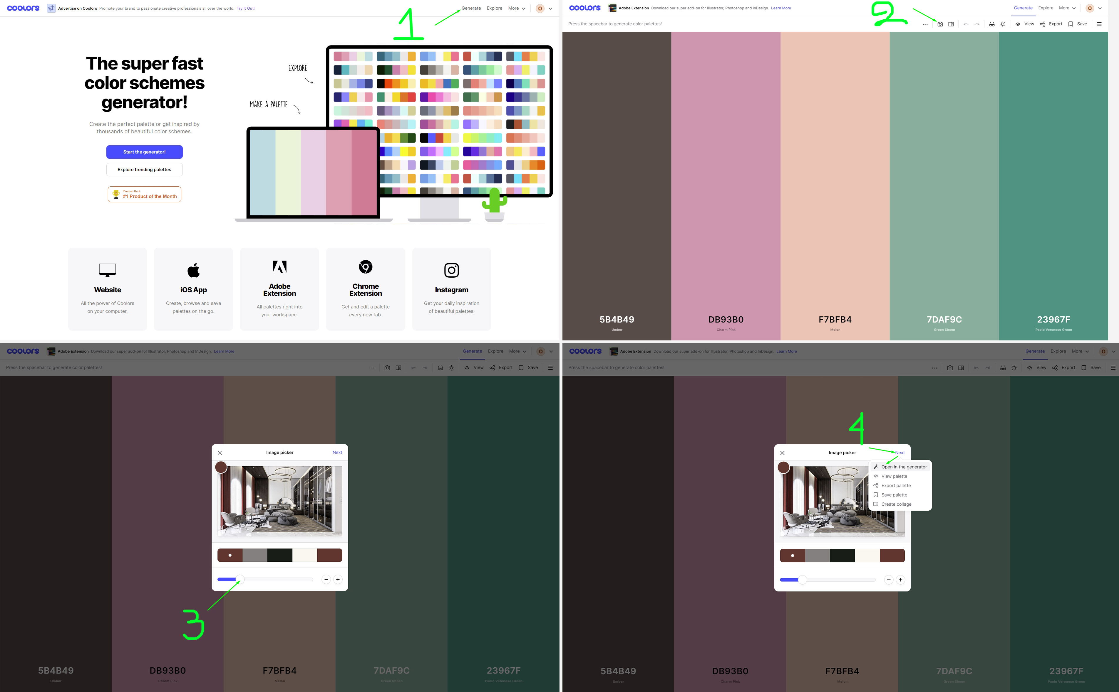
1. Generate.
2. Create Palette from photo.
3. Upload an image -> Play with the slider.
4. Next -> Open in the generator.
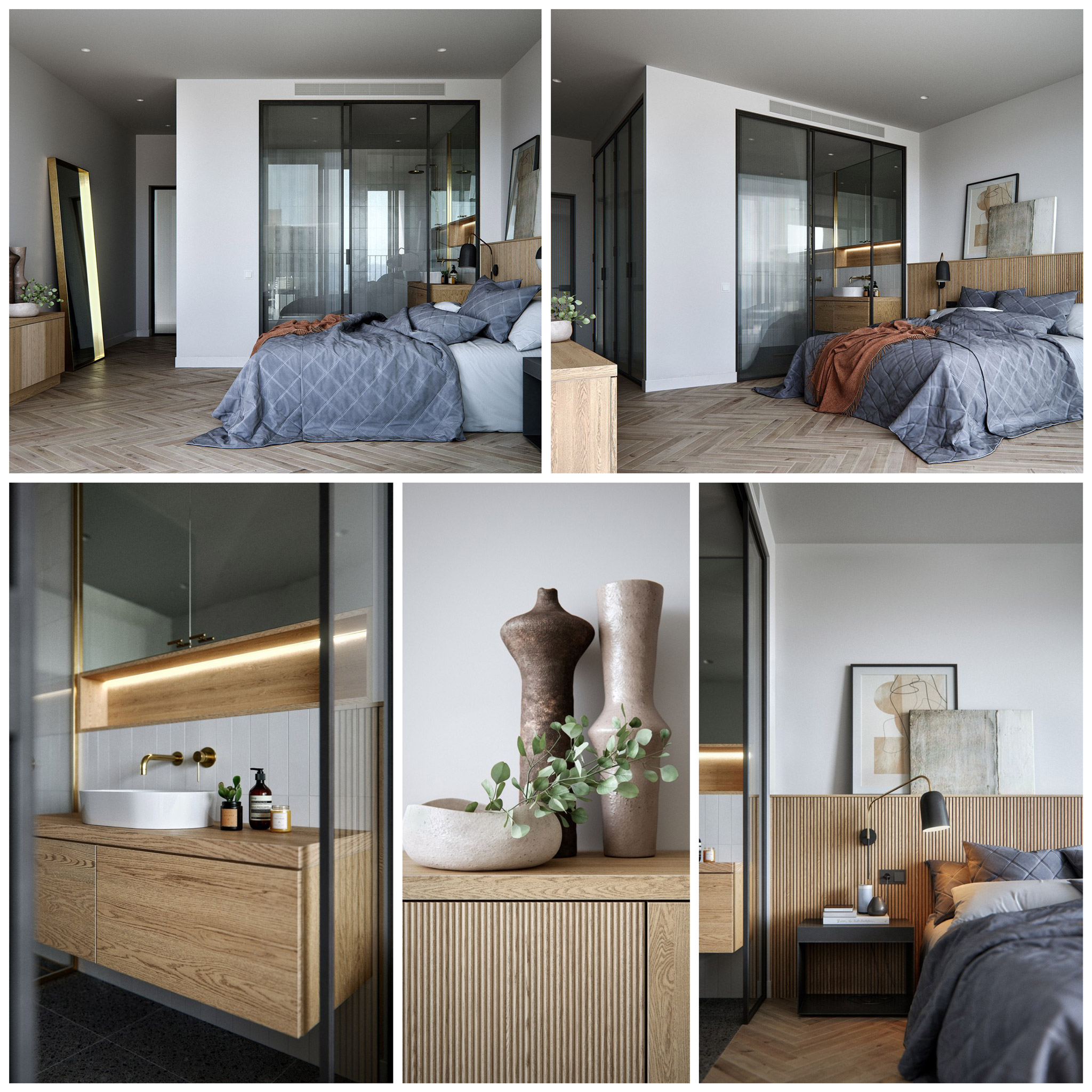
5. Play with each color individually using the view shades & drag tools until you'll be satisfied with a harmonic combination of colors. This is a good tip we learned from the Creative Lighting masterclass in order to grab a color palette from a beautiful reference image you found on the net. In our case, inverting the process we used it to easily understand what we don't like from this image, and we finally removed the beige-brown color of the carpet. We believe that an alternative option could be something like the one below concerning the colors and not the style of the carpet.
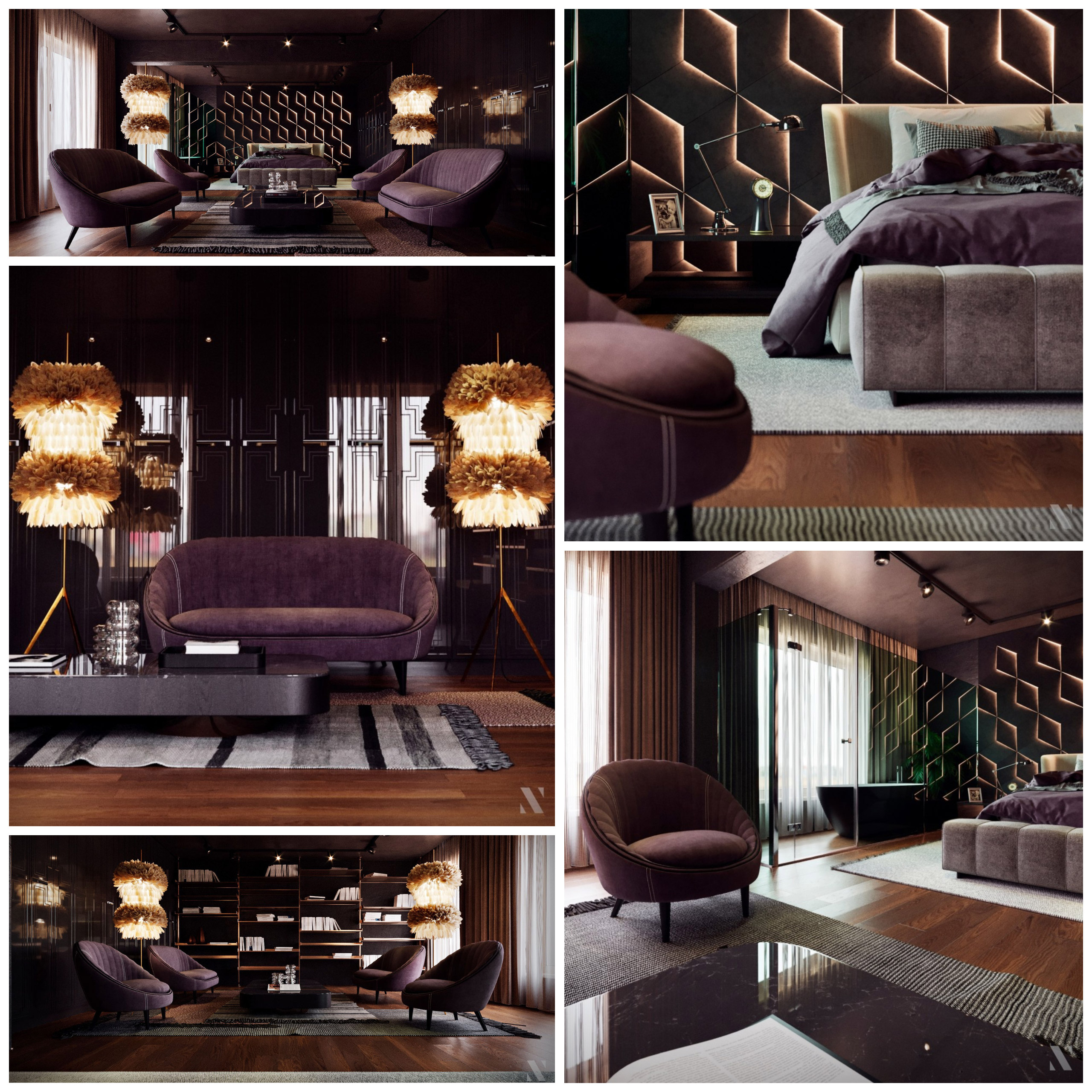
Before we speak separately for each part of the rating, it would be essential to mention that this project is a normal scene, and with mixed lighting conditions. We would like to show you a nice example by Oleg Rasshchepkin; it's worthy of taking a more in-depth look at this PROJECT. We suggest you observe the lighting, framing (position of views & composition), and the advanced materials which are supported by great mixed lighting (Natural & Artificial). A lighting scenario similar to yours.
"Modern Apartment" by Oleg Rasshchepkin.
We would strongly recommend you to refresh your 3d model database. Often we see projects that recycle the same old 3d models, which is not wrong. But one could argue that you could at least perfect the shaders instead of showcasing them as they were years ago. It’s nice to have a unique bed or sofa. You can always Frankenstein it using different pillows, blankets, and whatnot. But play around with models, look for new assets, and don’t be afraid to change them.
In an interior space, we usually have to model some simple boxes as walls, piece of cake. Nevertheless, when you use bad-looking models, you don't get a good score. For example, the pillows and quilts. Details like cables, smooth geometry in close-ups, fillet on the walls, and so on.
The highest possible score in similar scenes is 8+, but you missed some important details and you lost 2 points because:
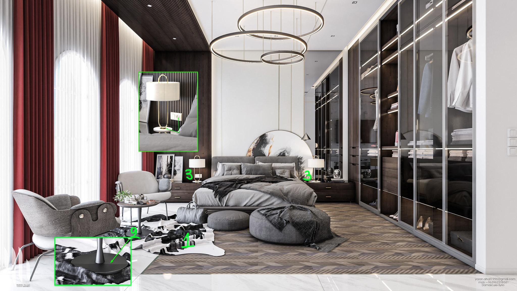
1. The carpet isn't a good model and it doesn't match the design of the rest scene. We don't think that you need an additional carpet except for the beige-brown one.
2. The side table isn't a detailed model and it has a bug with its geometry.
3. No cables for the lamps, visible in close-ups.
What's the most important of VW *Quality Standards? "The Composition"
Why? "Because almost everything else sounds easy in our days."
Before we get into the framing, we must discuss again the design. Make your life easier and add a counterbalance to the curtains. You can add red pillows or even a blouse to the wardrobe. Nevertheless, the composition always feels complete if you combine colors in pairs. That being said, most of the shots look pretty dull and overcrowded. Give some air between the objects and direct your viewer’s eye more precisely.
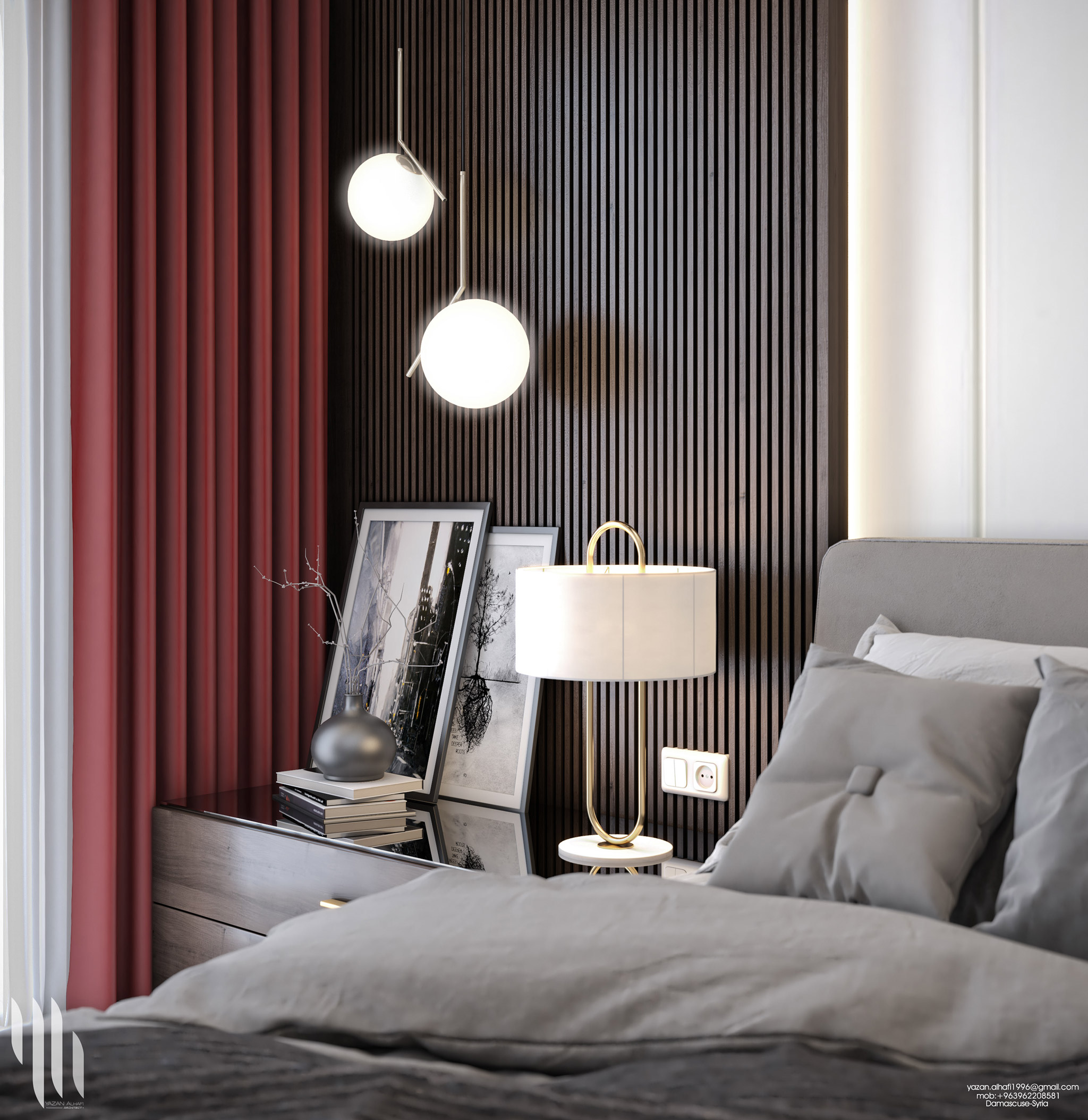
1. The POVs (positions of cameras) are fine but the composition in almost all the shots is a mess except the shot below which we could rate as an 8+ shot if you had modeled the cable (3D Laziness) and decreased a bit the intense and glow of ceiling lamps. Looking at the corner we see a nice depth of field with the target point on the lamps, well-balanced lighting & materials as well as the proper color palette applied, well done!

2a. As mentioned before the carpet isn't necessary for many reasons. Not good geometry, bad mapping, poor material and it doesn't match the rest design.
2b. There is a pressed situation all around the seating corner. Space doesn't work as there isn't a visible path. We have to climb above several furniture and decor objects in order to visit the left side of the room. Let's make it breathe a bit by moving the side table close to the armchair and keep only one or two decor objects on it.
2c. Delete the chair.
2d. Don't cut the switches like that. Simply cheat a bit and move them 5cm to the left.
2e. The bag could nicely lie on the pouf.
2f. Remove the small pouf and add a small side table that supports the big pouf like the one below with the dark wood material of the wooden wall construction.

2g. The mirror already reflects too many objects from the wardrobe and thus you don't need so many decors there. In this way, you avoid the confusion. Just remove everything except the table lamp which you can move in the middle of the bedside table.
3. This shot has a weak framing. Sometimes, it's very helpful to try different ratios in order to get the best possible result for our project.
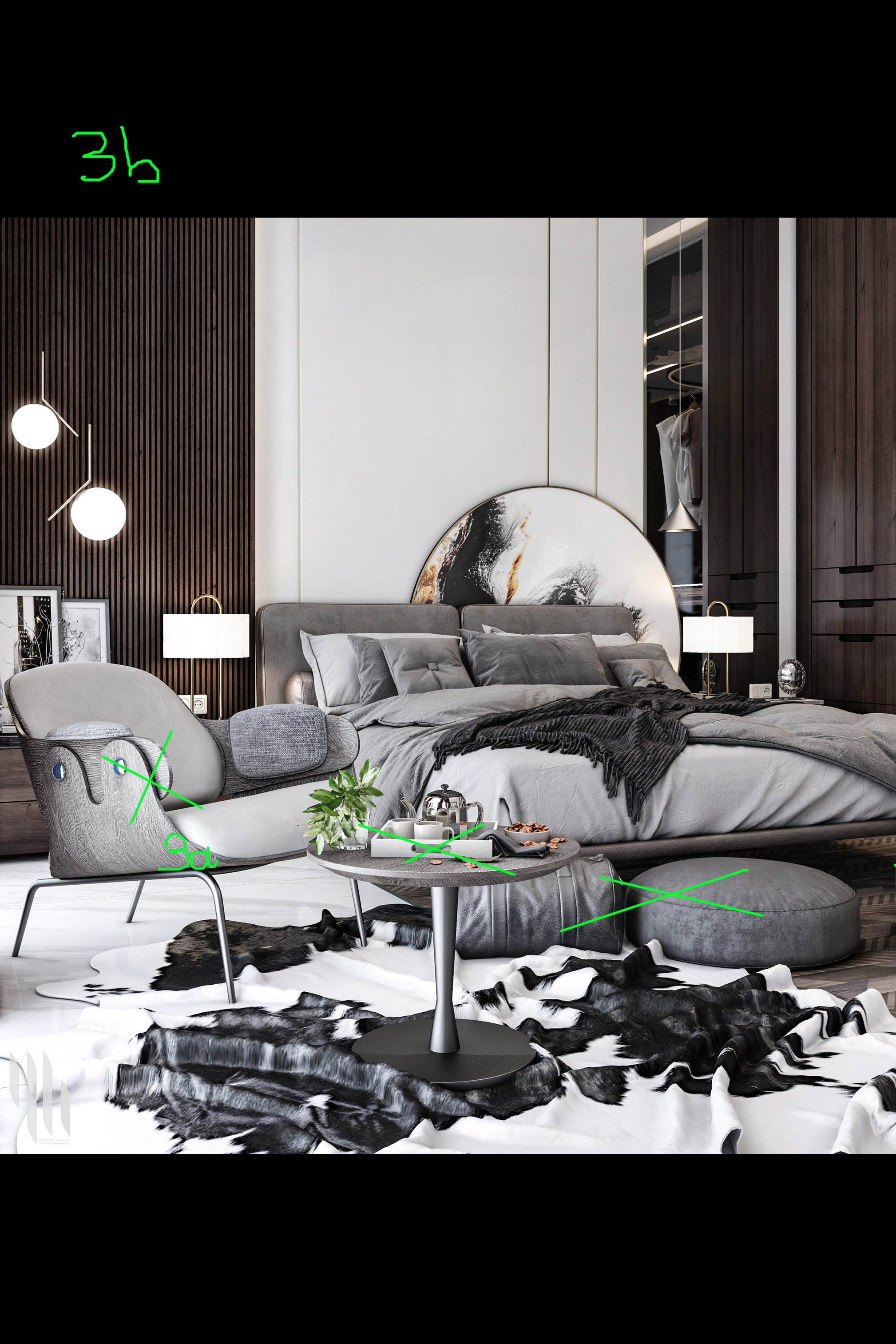
3a. Totally remove all these objects and make the beautiful bed your target.
3b. A vertical format for this shot could be probably a better option.
4. We don't like this camera a lot but we'll try to give a couple of tips for improvement.
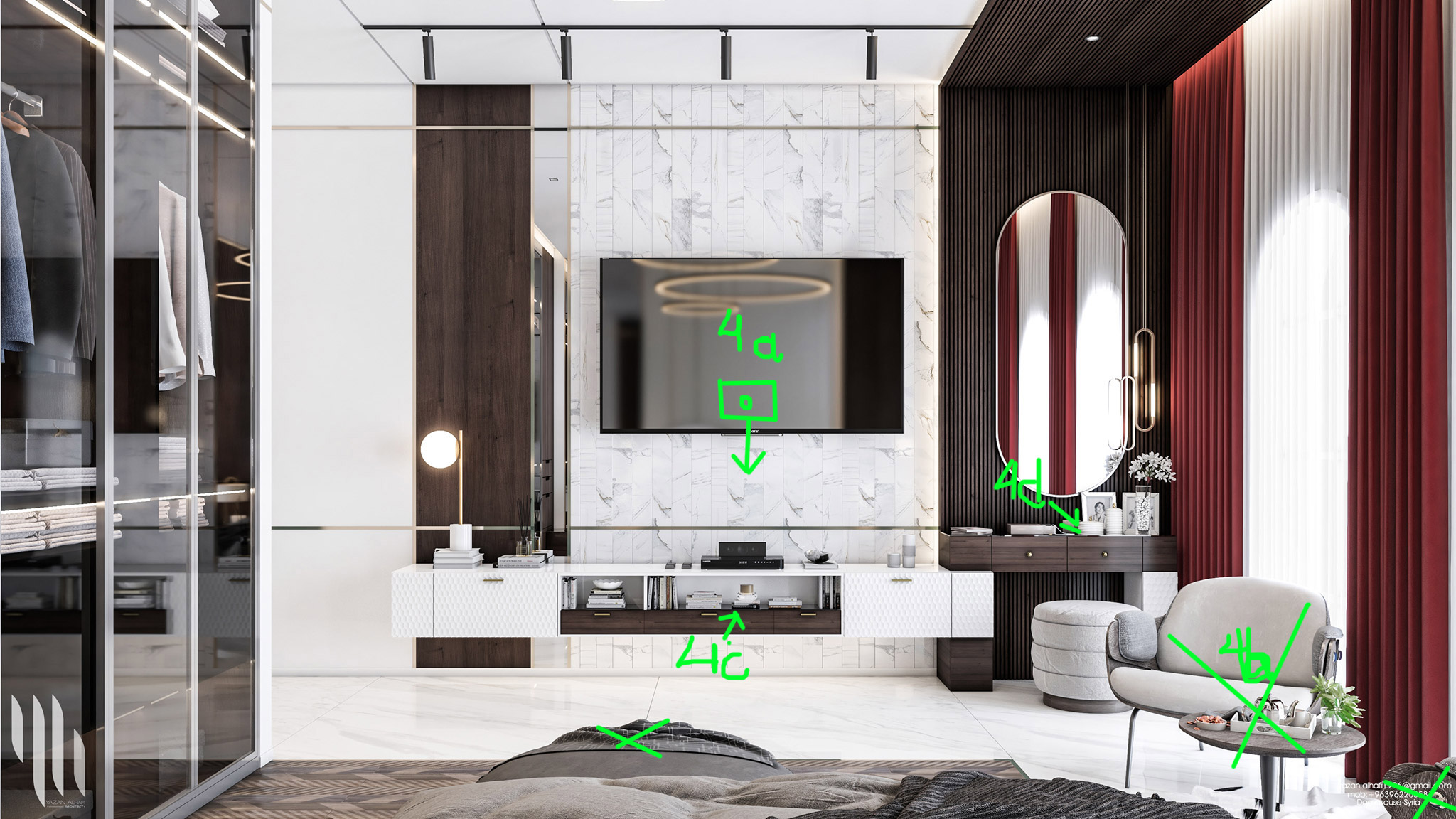
4a. First of all move the camera a bit lower.
4b. Remove these objects.
4c. These decors were scaled down a lot and they look really small. You will need another kind of decors with a normal scale.
4d. Too messy situation there, you can remove some assets.
The lighting feels very generic. The wall has no natural lighting gradient to it as well as the floor. Even though the curtains are illuminated well, we don’t feel the light laying down on the bed and the floor. We would also strongly recommend you not to use the default lighting when the window is behind the camera. It feels like a flash that is visible on the side of the chair. Use additional lighting (a simple rectangular plane), and relight the scene from an angle, just like on a movie set.
Nevertheless, due to the high-contrast color palette, the result isn't annoying at all. When you want to present a mixed lighting scenario then you have to decide which type of lighting will be the main source in order to avoid the "murder of the shadows".
For example, in Oleg's project above the environment light plays the main role and several lamps give a soft warm, and low-intensity light. On the other hand, you can go for an inverted lighting scenario like the one below where Ander Alencar decided to make the artificial lighting a protagonist in his scene with a lovely high-contrasted color palette.
CGI | SUITE MASTER By Ander Alencar.
It’s painful to say, but it is hard to see any effort put into shading. Overall the room looks "dry." The floor could have more richness to it; the wood on the chair looks like plastic. The bag
seems metallic, and the pouf looks like concrete. If you don’t feel confident enough about fur materials (which is fine), don’t use the cow carpet. It’s hard to do it properly, and it can backfire very quickly.
By simply drag and drop some models which have materials with the medium quality you can't have a big score. The custom materials you had to create look very poor. For example, the carpets have low-resolution maps and the marble texture behind the TV has a bad (repeated) tilling. We didn't notice even one advance material in the whole scene. We definitely suggest you study deeper both texturing and advanced materials creation.
It is hard to describe the color grading here since there was no apparent intention of the design and the lighting concept. If there were a better color palette and lighting coming through the windows, you could think about bringing those contrast forward. But at this very moment, you have the basic shaders with flat illumination. It is a hard position to let yourself into, especially in Photoshop.
Nevertheless, you can try some improvements in your scenes using simple post-production techniques. We observed that some of your images have a visible "lighting dust". That usually happens when we have several lighting sources and a strong glow effect, bloom and glare, and so on. At the end of the article, you can find an old post-production tutorial in which you can easily understand the technique and its know-how.
A simple commercial interior project with several shots. It could be rated as 8+ but you didn't try something special in your scene like advanced lighting & materials for example. Put more effort next time and we are sure it’s going to be better.
Kind regards & Keep rendering!