An in-depth evaluation of our member's project, Manos Vamvacoussis, "Villa" by K-Studio in Athens, Greece.
5-10 rating system. To approve a project to be published on VWArtclub Group, it needs an average of 7+ rating.
Modeling: 7.5
Framing: 5
Lighting: 6
Materials: 6.5
Post Process: 5
Difficulty: 6.5
Total: 6.1
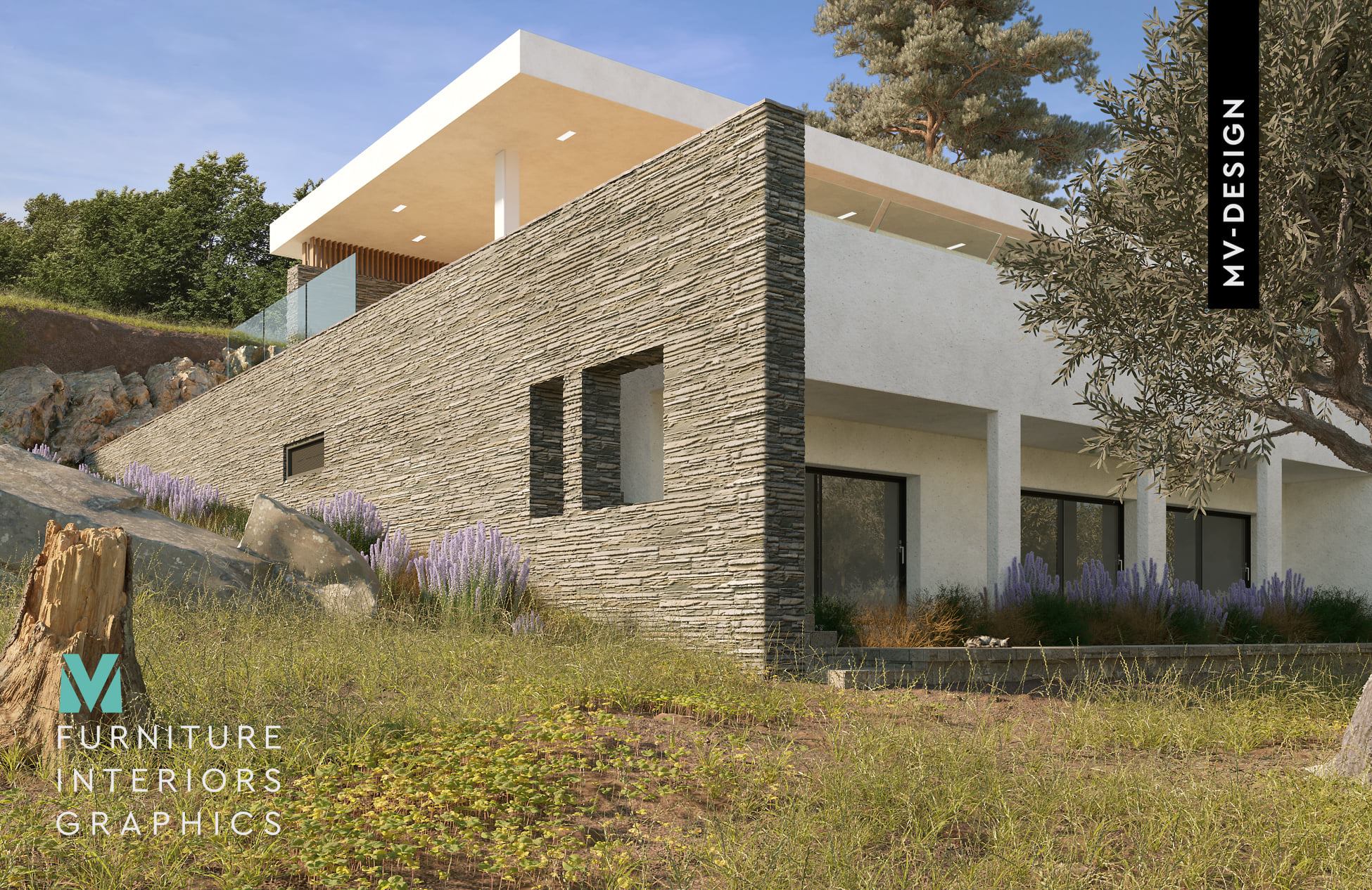
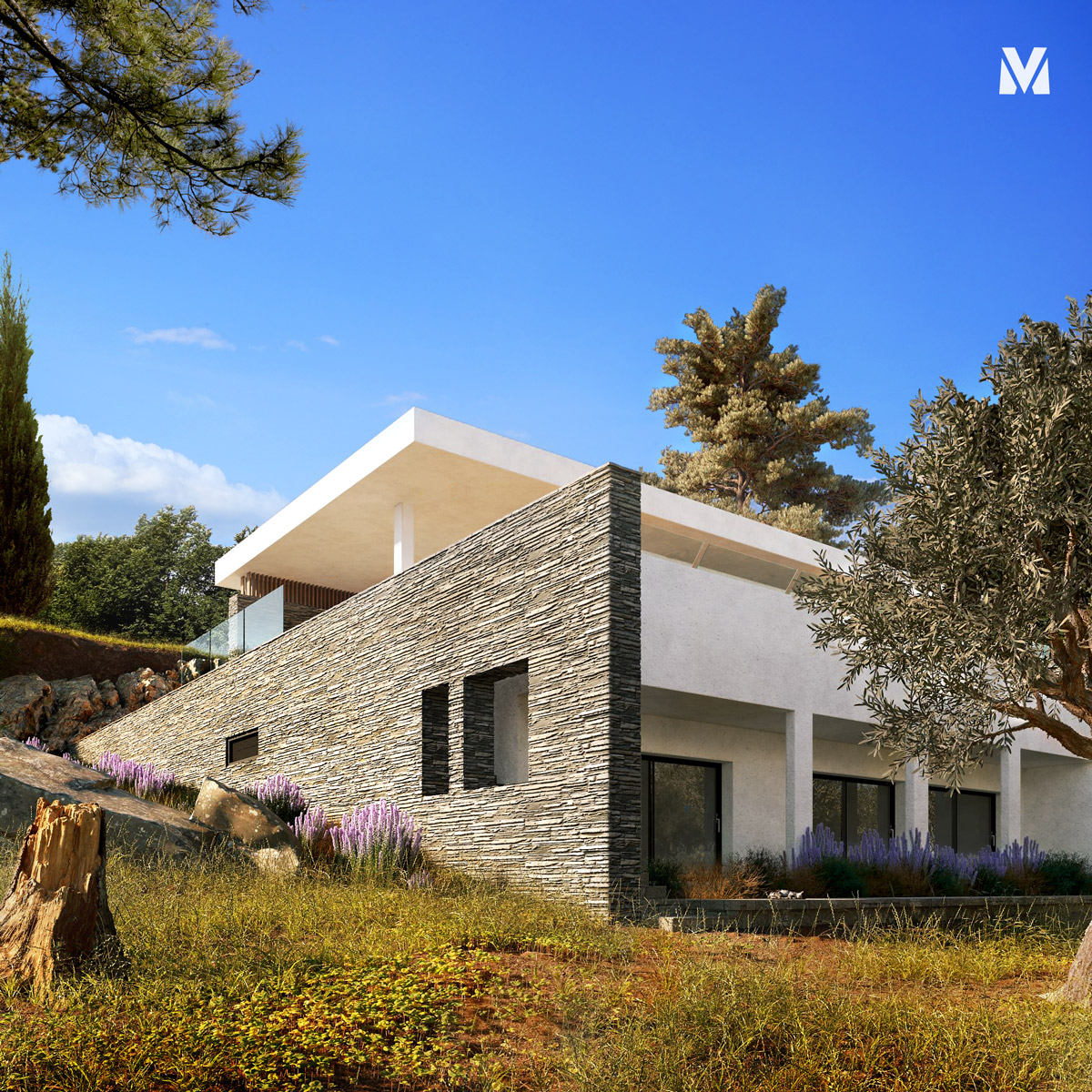
"Villa" by Manos Vamvacoussis.
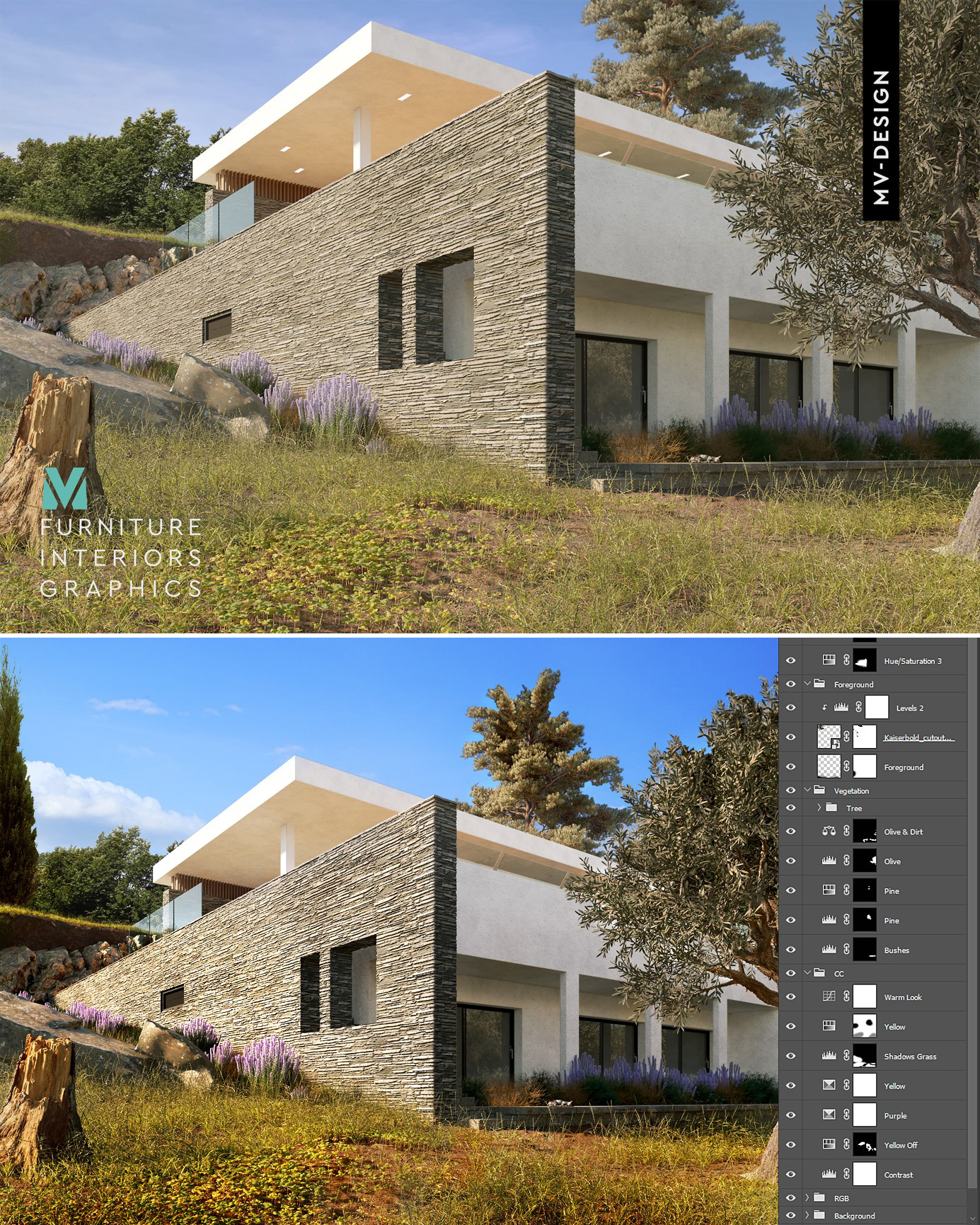
Below you see the result after only 30 minutes of post-production. If you wish, you can DOWNLOAD THE PSD FILE and study it, which is actually very simple. Sometimes, it's all about Composition & Colour, Framing & Contrast.
Manos asked us: "Is there a way to define at what level are my skills? I mean, for example, is this work a pro's job? Will this be OK for an architectural studio? I had an opportunity for a freelance collaboration, and they saw some of my projects that they liked. Still, then again, they started asking questions about the quality & skills, lights & composition. I guess you know what I'm talking about."
We answered: "It always depends on what the client is looking for, but the truth is that we can't consider this project as a pro one.
With the help of Artur Tamioła, we are going to give some tips for improvement.
Hello Manos!
Thank you for being a part of this breakdown, and I hope you’ll get a couple of new ideas to implement in future projects. First of all, congratulation on your solid effort; you definitely know the craft and understand how to use it. We can see some room for improvement in framing and color, but we’ll get into that. So in this episode, we’re mostly going to focus on the missed opportunities rather than pointing mistakes or flaws.
Great effort with the terrain. You can totally understand the site context of this building, which really helps ground the architecture. It would be even cooler to see a wider perspective, maybe more of a foreground? It obviously involves more work, but overall - more terrain helps to build the depth and adds to the value of the image.
The biggest missed opportunities are under composition and storytelling in general. You can consider light in the interior as storytelling, passing car, or obviously people. So try to sneak some attributes next that can help to build emotion. In terms of composition, the architecture begs for a space to breathe around it. There’s a nice way of thinking about the composition as a contrast of geometries. You can read more about it HERE: The angle seems to be in a state between an interior and exterior, so consider going closer or further for even more readability.

The overall vibe is there, even though there could be more magic to it. Personally, I like to have more of a translucency effect on the greenery (especially grass) connected to the light. Maybe a higher intensity sun could make the foreground more vivid and not so dry. The last thing is just turning the lights in the interior, so we set up some storytelling.
Again, solid job, even though a couple of missed opportunities. Rocks on the left seem flat, and that’s an easy fix, even with the corona built-in library. I’d try to push yourself and squeeze even more from the greenery materials. Hopefully, you can benefit from this article too. I would look for landscape references to level up your terrain-game, and make an even sweeter foreground.
The color palette has that Mediterranian vibe, and that’s great; I can definitely feel with your taste. If you look for more job opportunities, I will encourage you to create a more commercial color correction, which Vasilis did a fantastic job. I can only add a small comment that whenever there’s sky or greenery - try to nail down these colors as best as possible. They belong to a group of memory colors, and people have a certain expectation.
An exterior project with only one shot. It could be rated as 8+ if you had prepared 3-4 shots of this house in a similar good quality.
We really hope that you found something useful in this article which we prepared with love and respect for the members of the *Club.
Kind regards & Keep rendering!